常用样式
按最大的自适应对齐/宽高等于父级宽高
- 宽高等于父级的宽高
height: -webkit-fill-available;
width: -webkit-fill-available;
display: inline-block;
/* 或者 block*/
div {
  width: fit-content;
  background: #f1c;
  margin: auto;
  padding: 10px;
}
<template>
  <div>
    <main>
      <div>houdunren.com</div>
      <div>houdunren.com11111111111111</div>
    </main>
  </div>
</template>

<script lang="ts" setup></script>

<style lang="scss" scoped>
main {
  /* max-content  按最大的自适应对齐 */
  width: min-content;
  background: #9b5;
}
</style>
文本两段对齐
效果
- 作品名称: 宝贝儿
- 作品类型: 油画
- 艺术家: 张玉瀛
- 风格: 超现实
- 材质: 布面油画
- 题材: 人物
- 创作时间: 2011
- 所在位置: 华东
- 尺寸: 78x78cm
点击查看代码
<style>
  .arter1 span {
    height: 24px;
    line-height: 24px;
    width: 65px;
    text-align: justify;
    display: inline-block;
    overflow: hidden;
    vertical-align: top;
  }
  .arter1 span:after {
    content: " ";
    display: inline-block;
    width: 100%;
    height: 0px;
  }
</style>

<ul class="arter1">
  <li><span>作品名称</span>: 宝贝儿</li>
  <li><span>作品类型</span>: 油画</li>
  <li><span>艺术家</span>: 张玉瀛</li>
  <li><span>风格</span>: 超现实</li>
  <li><span>材质</span>: 布面油画</li>
  <li><span>题材</span>: 人物</li>
  <li><span>创作时间</span>: 2011</li>
  <li><span>所在位置</span>: 华东</li>
  <li><span>尺寸</span>: 78x78cm</li>
</ul>
多种居中
利用 calc
效果
代码
<style>
  .parent {
    width: 600px;
    height: 600px;
    background-color: red;
  }
  .child {
    width: 100px;
    height: 100px;
    padding: calc((100% - 100px) / 2);
    /* 注意 */
    background-clip: content-box;
    /* 只填充当前box */
    background-color: blue;
  }
</style>
<div class="parent">
  <div class="child"></div>
</div>
利用 before 伪类
效果
代码
<div class="parent">
  <div class="child"></div>
</div>

<style>

  .parent{
      height:200px;
      text-align:center;
      background-color:red;
  }
  .child{
      width:100px;
      height:100px;
      display:inline-block;/_主要_/
      vertical-align:middle;/_主要_/
      background-color:blue;
  }
  .parent::before{
      content:"";
      width:20px;
      height:200px;
      display:inline-block;/_主要_/
      vertical-align:middle;/_主要_/
      background-color:yellow;
  }
</style>
常用 flex
效果
代码
<div class="parent-2">
  <div class="child-2"></div>
</div>

<style>
  .parent-2 {
    height: 200px;
    display: flex;
    align-item: center;
    justify-content: center;
    background-color: red;
  }
  .child-2 {
    width: 100px;
    height: 100px;
    background-color: blue;
  }
</style>
利用 padding
效果
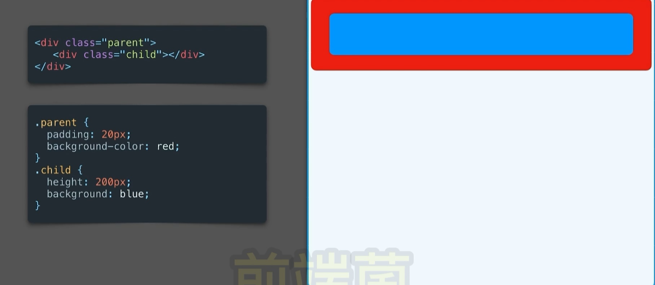
代码
<div class="parent">
  <div class="child"></div>
</div>
<style>
  .parent {
    padding: 20px;
    background-color: red;
  }
  .child {
    height: 200px;
    background: blue;
  }
</style>
利用 relative 和 absolute
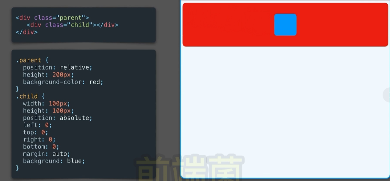
<div class="parent">
  <div class="child"></div>
</div>
<style>
  .parent {
    position: relative;
    height: 200px;
    background-color: red;
  }
  .child {
    width: 100px;
    height: 100px;
    position: absolute;
    left: 0;
    top: 0;
    right: 0;
    bottom: 0;
    margin: auto; /*主要*/
    background: blue;
  }
</style>
常用 利用 transform: translate
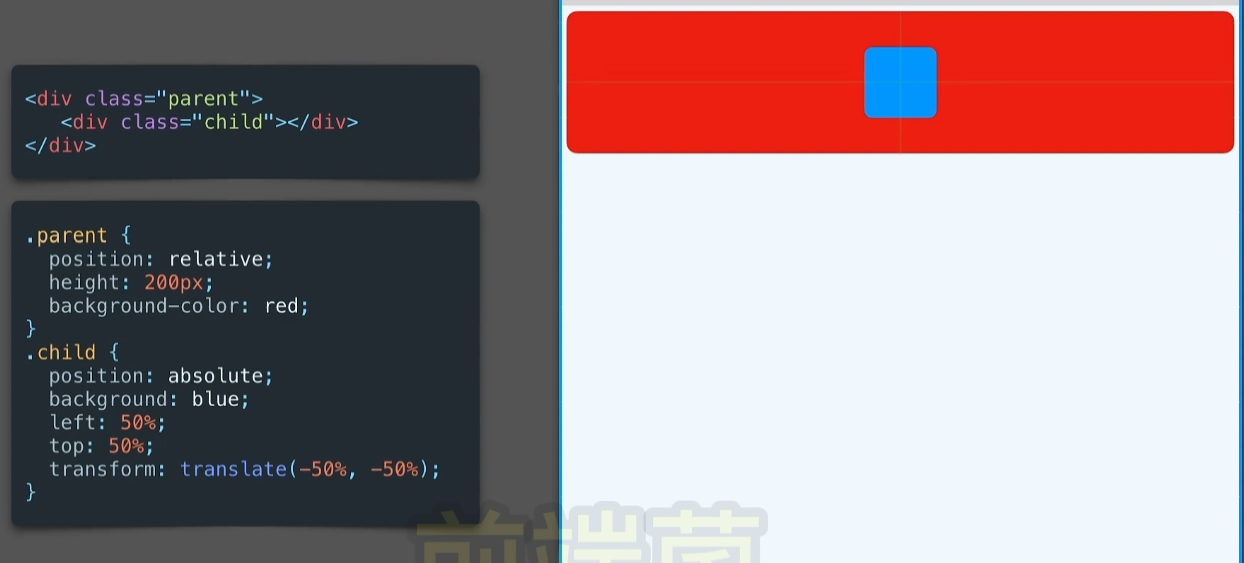
<div class="parent">
  <div class="child"></div>
</div>
<style>
  .parent {
    position: relative;
    height: 200px;
    background-color: red;
  }

  .child {
    position: absolute;
    background-color: blue;
    left: 50%;
    top: 50%;
    transform: translate(-50%, -50%);
    width: 100px;
    height: 100px;
  }
</style>
相对定位+calc
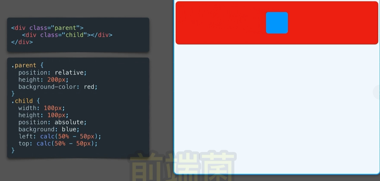
<div class="parent">
  <div class="child"></div>
</div>
<style>
  .parent {
    position: relative;
    height: 200px;
    background-color: red;
  }

  .child {
    width: 100px;
    height: 100px;
    position: absolute;
    background: blue;
    left: calc(50% - 50px);
    top: calc(50% - 50px);
  }
</style>
相对定位
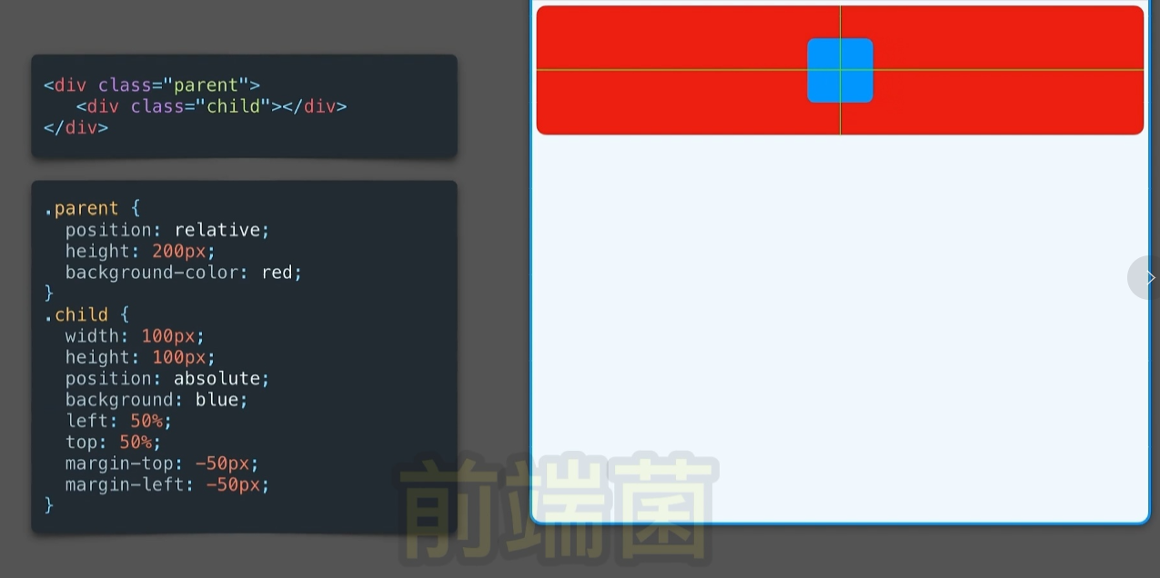
<div class="parent">
  <div class="child"></div>
</div>
<style>
  .parent {
    position: relative;
    height: 200px;
    background-color: red;
  }
  .child {
    width: 100px;
    height: 100px;
    position: absolute;
    background: blue;
    left: 50%;
    top: 50%;
    margin-top: -50px;
    margin-left: -50px;
  }
</style>
margin:auto
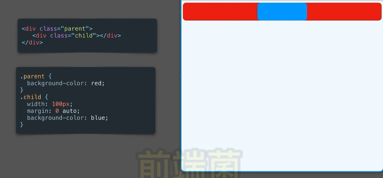
<div class="parent">
  <div class="child"></div>
</div>
<style>
  .parent {
    background-color: red;
    height: 600px;
    width: 600px;
  }

  .child {
    width: 100px;
    height: 100px;
    margin: 0 auto;
    background-color: blue;
  }
</style>
line-height
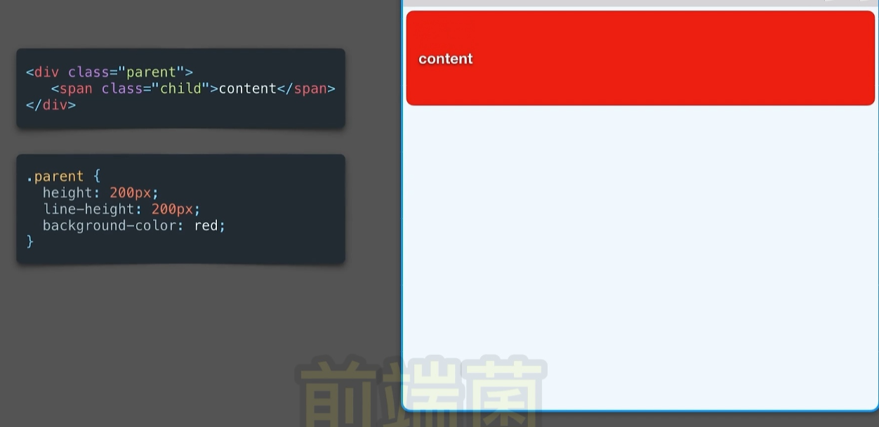
<div class="parent">
  <div class="child">content</div>
</div>
<style>
  .parent {
    height: 200px;
    line-height: 200px;
    background-color: red;
  }
</style>
text-align:center
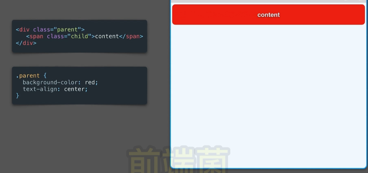
<div class="parent">
  <div class="child">content</div>
</div>
<style>
  .parent {
    background-color: red;
    text-align: center;
  }
</style>
有问题
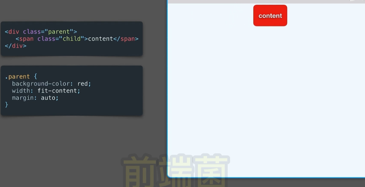
<div class="parent">
  <div class="child"></div>
</div>
<style>
  .parent {
    background-color: red;
    width: fit-content;
    margin: auto;
  }

  .parent {
    background-color: red;
    /* width: fit-content; */
    margin: auto;
    height: 200px;
    width: 200px;
  }
</style>