css:变形;伪类;旋转;倾斜;透视;动画延迟;媒体;图标
基础知识
#坐标系统
要使用元素变形操作需要掌握坐标轴,然后通过改变不同坐标来控制元素的变形。
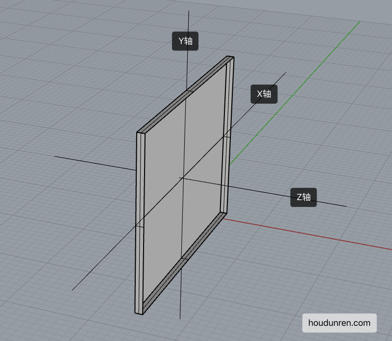
- X 轴是水平轴
- Y 轴是垂直轴
- Z 轴是纵深轴
#变形操作
使用 transform 规则控制元素的变形操作,包括控制移动、旋转、倾斜、3D 转换等,下面会详细介绍每一个知识点。
下面是 CSS 提供的变形动作。
| 选项 | 说明 |
|---|---|
| none | 定义不进行转换。 |
| translate(x,y) | 定义 2D 转换。 |
| translate3d(x,y,z) | 定义 3D 转换。 |
| translateX(x) | 定义转换,只是用 X 轴的值。 |
| translateY(y) | 定义转换,只是用 Y 轴的值。 |
| translateZ(z) | 定义 3D 转换,只是用 Z 轴的值。 |
| scale(x,y) | 定义 2D 缩放转换。 |
| scale3d(x,y,z) | 定义 3D 缩放转换。 |
| scaleX(x) | 通过设置 X 轴的值来定义缩放转换。 |
| scaleY(y) | 通过设置 Y 轴的值来定义缩放转换。 |
| scaleZ(z) | 通过设置 Z 轴的值来定义 3D 缩放转换。 |
| rotate(angle) | 定义 2D 旋转,在参数中规定角度。 |
| rotate3d(x,y,z,angle) | 定义 3D 旋转。 |
| rotateX(angle) | 定义沿着 X 轴的 3D 旋转。 |
| rotateY(angle) | 定义沿着 Y 轴的 3D 旋转。 |
| rotateZ(angle) | 定义沿着 Z 轴的 3D 旋转。 |
| skew(x-angle,y-angle) | 定义沿着 X 和 Y 轴的 2D 倾斜转换。 |
| skewX(angle) | 定义沿着 X 轴的 2D 倾斜转换。 |
| skewY(angle) | 定义沿着 Y 轴的 2D 倾斜转换。 |
| perspective(n) | 为 3D 转换元素定义透视视图。 |
#变形叠加
重复设置变形操作时只在原形态上操作。
#默认处理
下面设置了两次移动,并不会移动 550px 而是只移动 50px。
<style>
    div {
        transform: translateX(500px);
        width: 100px;
        height: 100px;
        background: #9b59b6;
    }

    div:nth-child(1) {
        transform: translateX(50px);
    }
</style>

<div></div>
#伪类叠加
<style>
    div {
        transition: 2s;
        transform: translateX(200px) translateX(50px);
        width: 100px;
        height: 100px;
        background: #9b59b6;
    }

    div:hover {
        transition: 2s;
        transform: translateX(100px);
    }
</style>

<div></div>
#行级元素
行级元素不产生变形效果,将其转为 inline-block 或 block 以及弹性元素时都可以产生变化效果。

<style>
    span {
        display: inline-block;
        transition: 2s;
        transform: translateX(100px) translateX(50px);
        width: 100px;
        height: 100px;
        background: #9b59b6;
    }

    span:hover {
        transition: 2s;
        transform: translateX(100px);
    }
</style>

<span>hdcms</span>
#伪类状态
#:hover
鼠标移动上后发生改变。

article div:nth-child(2):hover {
  transform: rotate(180deg);
}
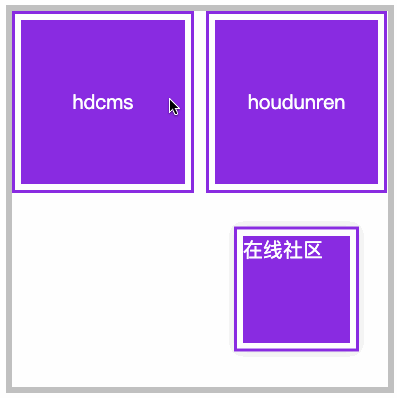
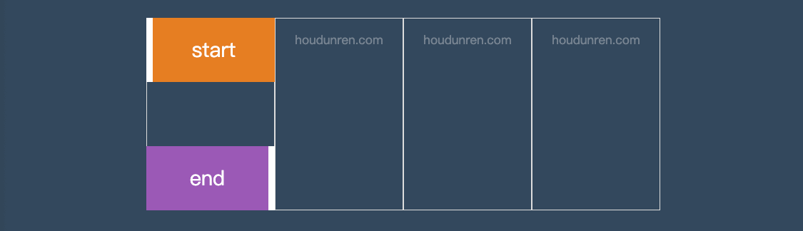
#:target
以下操作变化时间为零秒,通过掌握后面的过渡动画可以控制变化时间。
<style>
    article {
        width: 300px;
        height: 300px;
        display: grid;
        gap: 10px;
        grid-template-columns: repeat(2, 1fr);
        grid-template-rows: repeat(2, 1fr);
        position: relative;
        border: solid 5px silver;
        color: white;
    }

    article div a {
        color: white;
        text-decoration: none;
    }

    article div,
    article div aside {
        background: blueviolet;
        background-clip: content-box;
        padding: 5px;
        border: solid 2px blueviolet;
        box-sizing: border-box;
        display: flex;
        justify-content: center;
        align-items: center;
        position: relative;
    }

    article div aside {
        position: absolute;
        display: none;
        width: 100px;
        height: 100px;
    }

    aside:target {
        display: block;
        transform: translateY(150px);
        box-shadow: 0 0 10px #ddd;
    }
</style>

<article>
    <div>
        <a href="#hdcms">hdcms</a>
        <aside id="hdcms">
            内容管理系统
        </aside>
    </div>
    <div>
        <a href="#houdunren">houdunren</a>
        <aside id="houdunren">
            在线社区
        </aside>
    </div>
</article>
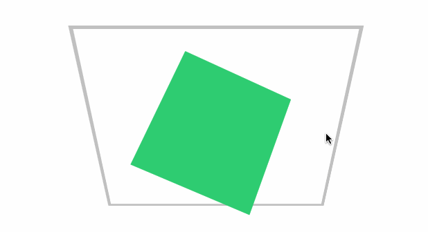
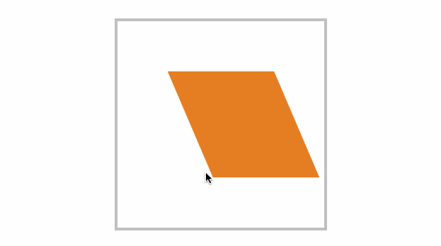
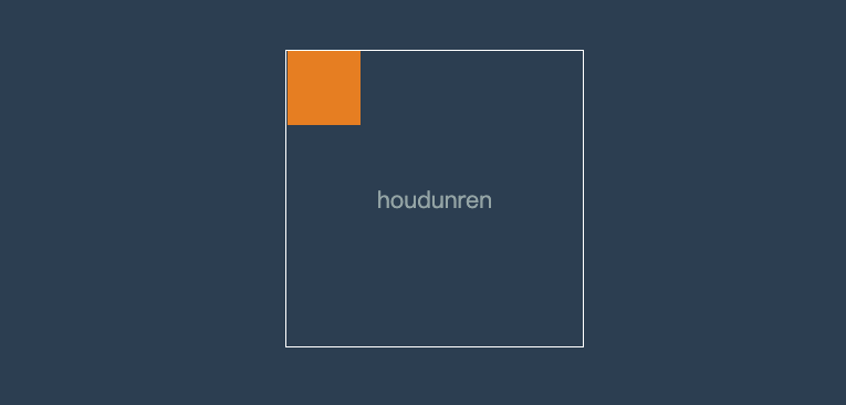
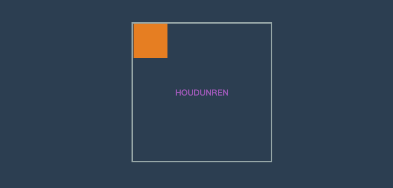
#移动元素
- 沿 X 轴移动时正值向右移动、负值向左移动
- 沿 Y 轴移动时正值向下移动、负值向上移动
- 如果使用百分数将控制元素的原尺寸计算百分比然后移动
- 可同时设置多个值,解析器会从左向右依次执行
- 变形是在原基础上更改,即第二次设置值时不是在第一次值上变化
#translateX
正值向右移动、负值向左移动。

<style>
    article {
        width: 300px;
        height: 300px;
        position: relative;
        border: solid 5px silver;
    }

    article div {
        width: 100px;
        height: 100px;
        background: blueviolet;
        box-sizing: border-box;
        position: absolute;
        left: 50%;
        margin-left: -50px;
        top: 50%;
        margin-top: -50px;
    }

    article div:nth-child(1) {
        background: #e9dddd;
    }

    article div:nth-child(2) {
        transform: translateX(100px);
    }
</style>
...

<article>
    <div></div>
    <div></div>
</article>
#translateY
正值向下移动、负值向上移动。

article div:nth-child(2) {
  transform: translateY(100px);
}
#translate
使用 translate 可以控制按 X、Y 同时移动操作,第一个值控制 X 移动,第二个值控制 Y 移动。

article div:nth-child(2) {
  transform: translate(100px, -100px);
}
#百分比移动
元素宽度为 100px 设置 50%时将移动 50px,即百分比是指元素的尺寸的百分比。

article div:nth-child(2) {
  transform: translateX(50%);
}
#元素居中
居中可以使用多种方式,如弹性布局、定位操作,下面来看使用移动操作居中。

<style>
    body {
        height: 100vh;
    }

    main {
        width: 400px;
        height: 400px;
        border: solid 5px silver;
        position: relative;
    }

    main div {
        width: 100px;
        height: 100px;
        background: blueviolet;
        position: absolute;
        left: 50%;
        top: 50%;
        transform: translate(-50%, -50%);
    }
</style>

<main>
    <div></div>
</main>
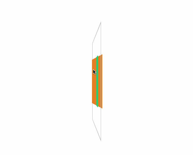
#translateZ
控制 Z 轴移动,正数向外、负数向里移动。因为 Z 轴是透视轴没有像 X/Y 一样的固定尺寸,所以不能使用百分数。
<style>
    * {
        padding: 0;
        margin: 0;
        box-sizing: border-box;
        list-style: none;
    }

    body {
        width: 100vw;
        height: 100vh;
        background: #34495e;
    }

    main {
        position: absolute;
        left: 50%;
        top: 50%;
        width: 200px;
        height: 200px;
        transform-style: preserve-3d;
        transition: 2s;
        transform: perspective(900px) rotateY(60deg);
    }

    body:hover main {
        transform: perspective(600px) rotateY(60deg) scaleZ(5);
    }

    div {
        position: absolute;
        top: 0;
        left: 0;
        width: 100%;
        height: 100%;
        background: #f1c40f;
    }

    div.b {
        background: #8e44ad;
        transform: translateZ(-100px);
    }
</style>

<main>
    <div class="f"></div>
    <div class="b"></div>
</main>
#translate3d
用于同时控制 X/Y/Z 轴的移动,三个值必须输入如果某个轴不需要移动时设置为零。

<style>
    * {
        padding: 0;
        margin: 0;
        box-sizing: border-box;
        list-style: none;
    }

    body {
        width: 100vw;
        height: 100vh;
        background: #34495e;
    }

    main {
        position: absolute;
        left: 50%;
        top: 50%;
        width: 200px;
        height: 200px;
        background: #f1c40f;
        perspective: 600px;
        transform: perspective(600px) rotateY(35deg);
        transition: 2s;
    }

    body:hover main {
        transform: perspective(600px) rotateY(35deg) translate3d(50%, 50%, 200px);
    }
</style>

<main>
    <div></div>
</main>
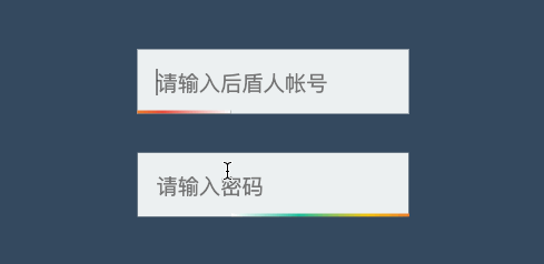
#渐变表单
<style>
    * {
        padding: 0;
        margin: 0;
        box-sizing: border-box;
    }

    body {
        width: 100vw;
        height: 100vh;
        background: #34495e;
    }

    main {
        position: absolute;
        left: 50%;
        top: 50%;
        transform: translate(-50%, -50%);
        width: 300px;
        height: 300px;
        border: solid 5px silver;
        display: flex;
        flex-direction: column;
        justify-content: center;
        align-items: center;
    }

    .field {
        position: relative;
        overflow: hidden;
        margin-bottom: 20px;
    }

    .field::before {
        content: '';
        position: absolute;
        left: 0;
        height: 2px;
        bottom: 0;
        width: 100%;
        background: linear-gradient(to right, white, #1abc9c, #f1c40f, #e74c3c, white);
        transform: translateX(-100%);
        transition: 2s;
    }

    .field:hover::before {
        transform: translateX(100%);
    }

    .field input {
        border: none;
        outline: none;
        background: #ecf0f1;
        padding: 10px;
    }
</style>

<main>
    <div class="field">
        <input type="text" placeholder="请输入厚道人帐号">
    </div>
    <div class="field">
        <input type="text" placeholder="请输入密码">
    </div>
</main>
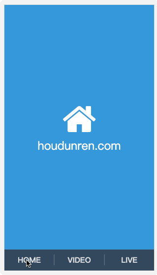
#页面切换
下面是使用移动效果制作的页面切换效果。
<link rel="stylesheet" href="https://maxcdn.bootstrapcdn.com/font-awesome/4.7.0/css/font-awesome.min.css">
<style>
    * {
        padding: 0;
        margin: 0;
    }

    a {
        text-decoration: none;
    }

    body {
        display: flex;
        width: 100vw;
        height: 100vh;
        flex-direction: column;
    }

    main {
        position: relative;
        background: #f3f3f3;
        flex: 1;
        overflow: hidden;
    }

    nav {
        display: flex;
        justify-content: space-around;
        align-items: center;
        height: 8vh;
        text-align: center;
        background: #34495e;
    }

    nav a {
        flex: 1;
        font-size: 1.3em;
        text-transform: uppercase;
        font-weight: bold;
        opacity: .8;
        color: white;
    }

    nav a:nth-child(2) {
        border-right: solid 1px #aaa;
        border-left: solid 1px #aaa;
    }

    main>div {
        position: absolute;
        left: 0;
        top: 0;
        width: 100%;
        height: 100%;
        transition: all 1s;
        z-index: 1;
        background: #f3f3f3;
        opacity: 0;
        display: flex;
        flex-direction: column;
        justify-content: center;
        align-items: center;
        transform: translate(0, -100%);
        color: white;
        font-size: 2em;
    }

    main>div:target {
        opacity: 1;
        transform: translate(0%, 0%);
    }

    main>div:nth-of-type(1):target {
        background: #3498db;
    }

    main>div:nth-of-type(2):target {
        background: #9b59b6;
    }

    main>div:nth-of-type(3):target {
        background: #16a085;
    }

    div i[class^="fa"] {
        font-size: 100px;
        color: white;
    }
</style>

<body>
    <main>
        <div id="home">
            <i class="fa fa-home" aria-hidden="true"></i>
            houdunren.com
        </div>
        <div id="video">
            <i class="fa fa-vimeo" aria-hidden="true"></i>
        </div>
        <div id="live">
            <i class="fa fa-viadeo" aria-hidden="true"></i>
        </div>
    </main>
    <nav>
        <a href="#home">home</a>
        <a href="#video">video</a>
        <a href="#live">live</a>
    </nav>
</body>
#缩放元素
比如数值为 2 时表示为原尺寸的两倍。
#scaleX
下面是沿 X 轴缩放一半。

article div:nth-child(2) {
  transform: scaleX(0.5);
}
#scaleY
下面是沿 Y 轴缩放一半。

article div:nth-child(2) {
  transform: scaleY(0.5);
}
#scale
使用 scale 可同时设置 X/Y 轴的缩放,如果只设置一个值时表示两轴缩放相同。
使用数值定义缩放,如 .5 表示缩小一半,2 表示放大两倍。

article div:nth-child(2) {
  transform: scale(0.5, 2);
}
#scaleZ
沿 Z 轴缩放元素,需要有 3D 透视才可以查看到效果。
<style>
    * {
        padding: 0;
        margin: 0;
        box-sizing: border-box;
    }

    body {
        width: 100vw;
        height: 100vh;
    }

    main {
        position: absolute;
        left: 50%;
        top: 50%;
        transform: translate(-50%, -50%);
        width: 400px;
        height: 400px;
        border: solid 5px silver;
        transform-style: preserve-3d;
        transform: perspective(900px) rotateY(45deg);
        transition: 3s;
    }

    div {
        position: absolute;
        left: 50%;
        top: 50%;
        margin-left: -100px;
        margin-top: -100px;
        width: 200px;
        height: 200px;
    }

    div:nth-child(1) {
        background: #2ecc71;
    }

    div:nth-child(2) {
        background: #e67e22;
        transition: 1s;
        transform: translateZ(-300px);
    }

    body:hover main {

        transform: perspective(900px) rotateY(45deg) scaleZ(3);
    }
</style>

<main>
    <div></div>
    <div></div>
</main>
#scale3d
沿 X/Y/Z 三个轴绽放元素。

<style>
    * {
        padding: 0;
        margin: 0;
        box-sizing: border-box;
        list-style: none;
    }

    body {
        width: 100vw;
        height: 100vh;
        background: #34495e;
    }

    main {
        position: absolute;
        left: 50%;
        top: 50%;
        width: 200px;
        height: 200px;
        transform-style: preserve-3d;
        transition: 2s;
        transform: perspective(900px) rotateY(60deg)
    }

    body:hover main {
        transform: perspective(600px) rotateY(60deg) scale3d(2, 2, 4);
    }

    div {
        position: absolute;
        top: 0;
        left: 0;
        width: 100%;
        height: 100%;
        background: #f1c40f;
    }

    div.b {
        background: #8e44ad;
        transform: translateZ(-100px);
    }
</style>

<main>
    <div class="f"></div>
    <div class="b"></div>
</main>
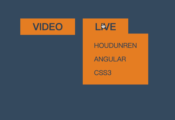
#菜单缩放
<style>
    * {
        padding: 0;
        margin: 0;
    }

    body {
        background: #34495e;
    }

    main {
        position: absolute;
        left: 50%;
        top: 50%;
        transform: translate(-50%, -50%);
    }

    ul {
        list-style: none;
        display: flex;
        justify-content: space-evenly;
        width: 200px;
    }

    ul li {
        position: relative;
    }

    ul li strong {
        background: #e67e22;
        color: #2c3e50;
        padding: 2px 20px;
        cursor: pointer;
        text-transform: uppercase;
    }

    ul li strong+div {
        border: solid 2px #e67e22;
        display: flex;
        flex-direction: column;
        padding: 10px 20px;
        position: absolute;
        transform-origin: left top;
        transform: scale(0);
        z-index: -1;
        transition: .6s;
        background: #e67e22;
    }

    ul li strong+div a {
        display: inline-block;
        padding: 5px;
        font-size: 1em;
        color: #2c3e50;
        text-decoration: none;
        text-transform: uppercase;
    }

    ul li:hover strong+div {
        transform: scale(1);
    }
</style>

<main>
    <ul>
        <li>
            <strong>VIDEO</strong>
            <div>
                <a href="">PHP</a>
                <a href="">hdcms</a>
                <a href="">laravel</a>
            </div>
        </li>
        <li>
            <strong>LIVE</strong>
            <div>
                <a href="">houdunren</a>
                <a href="">angular</a>
                <a href="">css3</a>
            </div>
        </li>
    </ul>
</main>
#相册放大
下面是使用缩放开发相册放大效果的示例。

<style>
    body {
        display: flex;
        justify-content: center;
        align-items: center;
        height: 100vh;
        background: #ddd;
    }

    main {
        display: flex;
        justify-content: center;
        align-items: center;
    }

    main div {
        height: 200px;
        width: 200px;
        background: white;
        border: solid 1px #ddd;
        transition: all .5s;
        display: flex;
        justify-content: center;
        align-items: center;
        font-size: 1.5em;
        text-transform: uppercase;
        color: blueviolet;
        overflow: hidden;
        border: solid 3px #555;
        box-sizing: border-box;
    }

    main div img {
        height: 100%;
    }

    main:hover div {
        transform: scale(.8) translateY(-30px);
        cursor: pointer;
        filter: blur(15px);
    }

    main div:hover {
        transform: scale(1.6);
        color: white;
        filter: none;
        z-index: 2;
    }

    main div:hover::after {
        content: '';
        position: absolute;
        background: #000;
        width: 100%;
        height: 100%;
        z-index: -1;
        box-shadow: 0 0 5px rgba(0, 0, 0, .3);
    }
</style>

<main>
    <div>
        <img src="1.jpg" alt="">
    </div>
    <div> <img src="2.jpg" alt=""></div>
    <div> <img src="3.jpg" alt=""></div>
</main>
#旋转操作
使用 CSS 可以控制元素按照不同坐标轴进行旋转。
#rotateX
控制元素按照 X 轴进行旋转操作。
#基本使用
按水平轴发生旋转,如果旋转 90deg 将不可见。

article div:nth-child(2) {
  transform: rotateX(180deg);
}
下面是旋转 89deg 后,只会看到一条线。

#父级透视
当 X 旋转 90 度后无法看到元素,这时可以控制父级旋转从上看子元素。
<style>
    * {
        padding: 0;
        margin: 0;
        box-sizing: border-box;
    }

    main {
        position: absolute;
        left: 50%;
        top: 50%;
        margin-left: -200px;
        margin-top: -200px;
        width: 400px;
        height: 400px;
        border: solid 5px silver;
        transform-style: preserve-3d;
        transform: perspective(900px) rotateX(-45deg);
    }

    div {
        position: absolute;
        left: 50%;
        top: 50%;
        margin-left: -100px;
        margin-top: -100px;
        width: 200px;
        height: 200px;
        transition: 1s;
    }

    div:nth-child(1) {
        background: #2ecc71;
    }

    main:hover div:nth-child(1) {
        transform: perspective(900px) rotateX(90deg) rotateY(25deg) rotateZ(45deg);
    }
</style>

<main>
    <div></div>
</main>
#rotateY
按垂直轴旋转,如果旋转 90deg 将不可见。

article div:nth-child(2) {
  transform: rotateY(180deg);
}
#rotateZ
没 Z 轴旋转元素,效果就是沿 X/Y 轴的平面旋转。

<style>
    * {
        padding: 0;
        margin: 0;
        box-sizing: border-box;
        list-style: none;
    }

    body {
        width: 100vw;
        height: 100vh;
        background: #34495e;
    }

    main {
        position: absolute;
        left: 50%;
        top: 50%;
        width: 200px;
        height: 200px;
        background: #f1c40f;
        perspective: 600px;
        transform: perspective(600px) rotateY(35deg);
        transition: 2s;
    }

    body:hover main {
        transform: perspective(600px) rotateY(35deg) rotateZ(160deg);
    }
</style>

<main>
    <div></div>
</main>
#rotate
在 X 与 Y 轴平面旋转,效果与使用 rotateZ 相同。

article div:nth-child(2) {
  transform: rotate(90deg);
}
#rotate3d
同时设置 X/Y/Z 轴的旋转向量值来控制元素的旋转。
需要同时设置如下四个参数
rotate3d(tx,ty,tz,angle)
#只转 X 轴
<style>
    * {
        padding: 0;
        margin: 0;
        box-sizing: border-box;
        list-style: none;
    }

    body {
        width: 100vw;
        height: 100vh;
        background: #34495e;
    }

    main {
        position: absolute;
        left: 50%;
        top: 50%;
        width: 200px;
        height: 200px;
        background: #f1c40f;
        perspective: 600px;
        transform: perspective(600px) rotateY(35deg);
        transition: 2s;
    }

    body:hover main {
        transform: perspective(600px) rotateY(35deg) rotate3d(1, 0, 0, -645deg);
    }
</style>

<main>
    <div></div>
</main>
#只转 Y 轴

body:hover main {
  transform: perspective(600px) rotateY(-645deg);
}
#只转 Z 轴
#XY 旋转
body:hover main {
  transform: perspective(600px) rotateY(35deg) rotate3d(1, 1, 0, -645deg);
}
#XZ 转换
加入适当的 Z 向量值,可增加元素沿 Z 轴旋转的力度。

body:hover main {
  transform: perspective(600px) rotateY(35deg) rotate3d(1, 0, 0.5, -245deg);
}
#参数顺序
可以同时设置多个旋转规则,顺序不同结果也会不同。
article div:nth-child(2) {
  transform: rotateX(30deg) rotateY(30deg);
}
#旋转文字

<style>
    * {
        padding: 0;
        margin: 0;
    }

    body {
        height: 100vh;
        display: flex;
        flex-direction: column;
        justify-content: center;
        align-items: center;
    }

    main {
        margin: 0 auto;
        width: 400px;
        height: 50vh;
        display: flex;
        flex-direction: column;
        justify-content: center;
        align-items: center;
        background: #535c68;
    }

    main div {
        color: #c7ecee;
        cursor: pointer;
    }

    main div strong {
        display: inline-block;
        width: 25px;
        height: 25px;
        margin: 0 3px;
        background: #000;
        border-radius: 50%;
        transition: 2s;
        color: white;
        text-align: center;
        box-shadow: 0 2px 10px rgba(0, 0, 0, .3);
    }

    main div strong:nth-of-type(1) {
        background: #f0932b;
    }

    main div strong:nth-of-type(2) {
        background: #6ab04c;
    }

    main div:hover strong:nth-of-type(1) {
        transform: rotate(360deg);
    }

    main div:hover strong:nth-of-type(2) {
        transform: rotate(-360deg);
    }
</style>

<main>
    <div>
        <strong>h</strong>ou<strong>d</strong>unren.com
    </div>
</main>
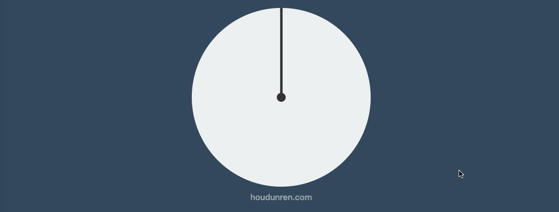
#电子时钟

<style>
    body {
        display: flex;
        justify-content: center;
        align-items: center;
        height: 100vh;
        background: #34495e;
    }

    main {
        position: relative;
        width: 400px;
        height: 400px;
        background: #34495e;
        border-radius: 50%;
        box-shadow: 0 0 10px rgba(0, 0, 0, .7);
    }

    main::before {
        position: absolute;
        left: 0;
        top: 0;
        content: '';
        width: 100%;
        height: 100%;
        border-radius: 50%;
        transform: scale(1.2);
        background: radial-gradient(at right, #27ae60, #e67e22, #e74c3c, #e67e22, #27ae60);
        z-index: -1;
    }

    main .line>div {
        position: absolute;
        left: 50%;
        top: 50%;
        width: 10px;
        height: 95%;
        background: white;
    }

    main .line>div:nth-child(1) {
        transform: translate(-50%, -50%) rotate(0deg);
    }

    main .line>div:nth-child(2) {
        transform: translate(-50%, -50%) rotate(30deg);
    }

    main .line>div:nth-child(3) {
        transform: translate(-50%, -50%) rotate(60deg);
    }

    main .line>div:nth-child(4) {
        transform: translate(-50%, -50%) rotate(90deg);
    }

    main .line>div:nth-child(5) {
        transform: translate(-50%, -50%) rotate(120deg);
    }

    main .line>div:nth-child(6) {
        transform: translate(-50%, -50%) rotate(150deg);
    }

    main>div[class="mark"] {
        position: absolute;
        width: 100%;
        height: 100%;
        left: 0%;
        top: 0%;
        background: #34495e;
        border-radius: 50%;
        transform: scale(.8);
    }

    main>.point {
        width: 20px;
        height: 20px;
        background: #e74c3c;
        border-radius: 50%;
        position: absolute;
        top: 50%;
        left: 50%;
        transform: translate(-50%, -50%);
        z-index: 2;
    }

    main .hour {
        width: 15px;
        position: absolute;
        height: 25%;
        background: #95a5a6;
        left: 50%;
        bottom: 50%;
        transform: translate(-50%, 0);
    }

    main .minute {
        width: 8px;
        position: absolute;
        height: 35%;
        background: #3498db;
        left: 50%;
        bottom: 50%;
        transform-origin: left bottom;
        transform: translate(-50%, 0) rotate(60deg);
    }

    main .second {
        width: 2px;
        position: absolute;
        height: 35%;
        background: #f1c40f;
        left: 50%;
        bottom: 50%;
        transform-origin: left bottom;
        transform: translate(-50%, 0) rotate(90deg);
    }

    main:hover .second {
        transition: 10s;
        transform: rotate(260deg);
    }

    main .text {
        font-size: 1.2em;
        color: white;
        position: absolute;
        top: 50%;
        left: 50%;
        transform: translate(-50%, 20px);
        text-transform: uppercase;
        opacity: .5;
        text-align: center;
    }
</style>

<main>
    <section class="line">
        <div></div>
        <div></div>
        <div></div>
        <div></div>
        <div></div>
        <div></div>
    </section>
    <div class="mark"></div>
    <div class="point"></div>
    <div class="hour"></div>
    <div class="minute"></div>
    <div class="second"></div>
    <div class="text">
        houdunren.com <br>
        大军大叔
    </div>
</main>
#倾斜操作
#skewX
没 X 轴倾斜元素

article div:nth-child(2) {
  transform: skewX(30deg);
}
#skewY
沿 Y 轴倾斜元素

article div:nth-child(2) {
  transform: skewY(30deg);
}
#skew
同时设置 X/Y 轴倾斜操作,不指定第二个参数时 Y 轴倾斜为零。

article div:nth-child(2) {
  transform: skew(30deg, 30deg);
}
#按钮特效
<style>
    * {
        padding: 0;
        margin: 0;
    }

    body {
        background: #34495e;
    }

    main {
        position: absolute;
        left: 50%;
        top: 50%;
        transform: translate(-50%, -50%);
    }

    main .btn {
        display: block;
        height: 30px;
        width: 150px;
        border: solid 2px #e74c3c;
        background: none;
        color: white;
        position: relative;
        text-align: center;
        display: flex;
        justify-content: center;
        align-items: center;
        overflow: hidden;
        cursor: pointer;
        box-shadow: 0 3px 8px rgba(0, 0, 0, .3);
    }

    main .btn::before {
        transition: all .8s;
        align-self: center;
        content: '';
        position: absolute;
        width: 0;
        height: 100%;
        background: #e74c3c;
        z-index: -1;
        transform: skewX(-45deg);
    }

    main .btn:hover::before {
        width: 200%;
    }
</style>

<main>
    <a class="btn">
        HOUDUNREN
    </a>
</main>
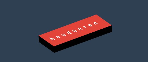
#立体按钮
<style>
    * {
        padding: 0;
        margin: 0;
        box-sizing: border-box;
    }

    body {
        background: #2c3e50;
        width: 100vw;
        height: 100vh;
        display: flex;
        justify-content: center;
        align-items: center;
    }

    .btn {
        color: #ecf0f1;
        text-decoration: none;
        width: 200px;
        height: 40px;
        background: #e74c3c;
        display: flex;
        justify-content: center;
        align-items: center;
        position: relative;
        transform: skewX(25deg) rotate(-15deg);
        letter-spacing: .5em;
        text-transform: uppercase;
        font-weight: bold;
    }

    .btn::before {
        content: '';
        width: 10px;
        height: 100%;
        left: -10px;
        background: #000;
        position: absolute;
        transform: skewY(-45deg) translate(0, 5px);
    }

    .btn::after {
        content: '';
        width: 100%;
        height: 10px;
        bottom: -10px;
        background: #000;
        position: absolute;
        transform: skewX(-45deg) translate(-5px, 0);
    }
</style>

<a href="" class="btn"> houdunren</a>
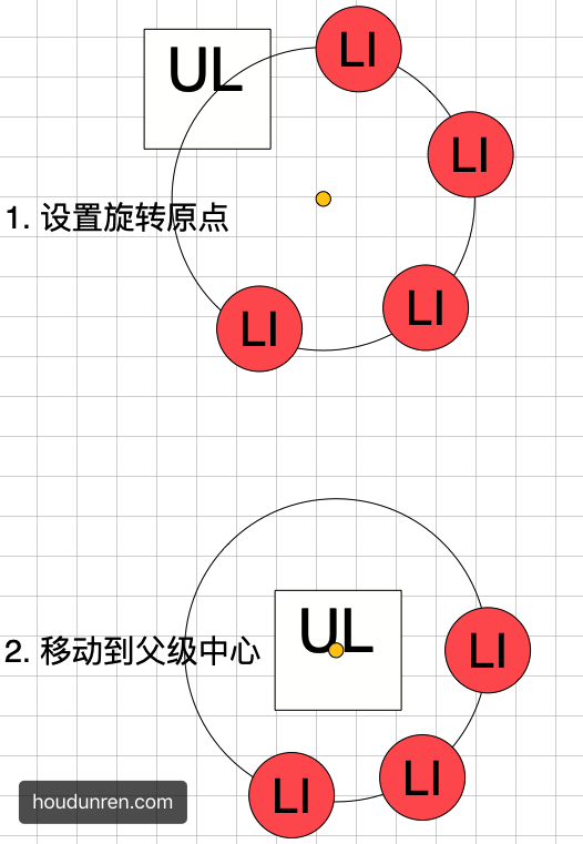
#变形基点
使用 transform-origin 设置元素的 X/YZ 操作的基点,用于控制旋转、倾斜等操作。
- 旋转默认以元素中心进行旋转,改变基点后可控制旋转点位置
- 元素移动不受变形基点所影响
- 基点是元素原始空间位,而不是 translate 移动后的空间位
#平面旋转
<style>
    * {
        padding: 0;
        margin: 0;
        box-sizing: border-box;
    }

    main {
        position: absolute;
        left: 50%;
        top: 50%;
        margin-left: -200px;
        margin-top: -200px;
        width: 400px;
        height: 400px;
        border: solid 5px silver;
    }

    div {
        position: absolute;
        left: 50%;
        top: 50%;
        margin-left: -100px;
        margin-top: -100px;
        width: 200px;
        height: 200px;
        transform-origin: right bottom;
    }

    div:nth-child(1) {
        background: #2ecc71;
    }

    div:nth-child(2) {
        background: #e67e22;
        transition: 1s;
    }

    main:hover div:nth-child(2) {
        transform: rotate(-45deg);
    }
</style>

<main>
    <div></div>
    <div></div>
</main>
#倾斜控制
参考右上角控制倾斜。
<style>
    * {
        padding: 0;
        margin: 0;
        box-sizing: border-box;
    }

    main {
        position: absolute;
        left: 50%;
        top: 50%;
        margin-left: -200px;
        margin-top: -200px;
        width: 400px;
        height: 400px;
        border: solid 5px silver;
    }

    div {
        position: absolute;
        left: 50%;
        top: 50%;
        margin-left: -100px;
        margin-top: -100px;
        width: 200px;
        height: 200px;
        transform-origin: top left;
    }

    div:nth-child(1) {
        background: #fff;
    }

    div:nth-child(2) {
        background: #e67e22;
        transition: 1s;
    }

    main:hover div:nth-child(2) {
        transform: skew(45deg);
    }
</style>

<main>
    <div></div>
    <div></div>
</main>
#三维旋转
<style>
    * {
        padding: 0;
        margin: 0;
        box-sizing: border-box;
    }

    main {
        position: absolute;
        left: 50%;
        top: 50%;
        margin-left: -200px;
        margin-top: -200px;
        width: 400px;
        height: 400px;
        border: solid 5px silver;
        transform-style: preserve-3d;
        transform: perspective(900px) rotateY(95deg);
    }

    div {
        position: absolute;
        left: 50%;
        top: 50%;
        margin-left: -100px;
        margin-top: -100px;
        width: 200px;
        height: 200px;
        transform-origin: center center 200px;
    }

    div:nth-child(1) {
        background: #2ecc71;
    }

    div:nth-child(2) {
        background: #e67e22;
        transition: 1s;
    }

    main:hover div:nth-child(2) {
        transform: rotateY(360deg);
    }
</style>

<main>
    <div></div>
    <div></div>
</main>
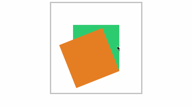
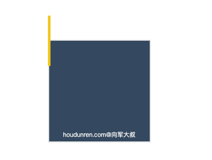
#变形顺序的影响
设置 transform 变形的前后顺序对变形结果是有影响
我们通过下面的示例来说明这个问题
- 下面先写 rotate 后写 translate,即先按原位置的
transform-origin: top left进行旋转,再按原位置的transform-origin: top left进行移动
<style>
  body {
    width: 100vw;
    height: 100vh;
    display: flex;
    justify-content: center;
    align-items: center;
  }
  article {
    width: 200px;
    height: 200px;
    border: solid 2px #ddd;
    position: relative;
    background: #34495e;
  }
  article div {
    width: 5px;
    height: 100px;
    background: #000;
    transition: 2s;
    position: absolute;
    transform-origin: top left;
    transform: rotate(0deg) translate(-50%, -50%);
    background-color: #f1c40f;
  }
  article::after {
    content: 'houdunren.com@大军大叔';
    width: 100%;
    color: #f3f3f3;
    font-size: 12px;
    position: absolute;
    bottom: 5px;
    text-align: center;
  }
  article:hover div {
    transform: rotate(360deg) translate(-50%, -50%);
  }
</style>

<article>
  <div></div>
</article>
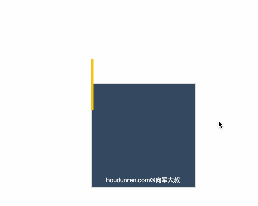
现在交换 rotate 与 translate的顺序后,表示先移动元素,这时候旋转就是参考移动后的位置的 transform-origin: top left;结果如下
<style>
  body {
    width: 100vw;
    height: 100vh;
    display: flex;
    justify-content: center;
    align-items: center;
  }
  article {
    width: 200px;
    height: 200px;
    border: solid 2px #ddd;
    position: relative;
    background: #34495e;
  }
  article div {
    width: 5px;
    height: 100px;
    background: #000;
    transition: 2s;
    position: absolute;
    transform-origin: top left;
    transform: translate(-50%, -50%) rotate(0deg);
    background-color: #f1c40f;
  }
  article::after {
    content: 'houdunren.com@大军大叔';
    width: 100%;
    color: #f3f3f3;
    font-size: 12px;
    position: absolute;
    bottom: 5px;
    text-align: center;
  }
  article:hover div {
    transform: translate(-50%, -50%) rotate(360deg);
  }
</style>

<article>
  <div></div>
</article>
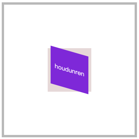
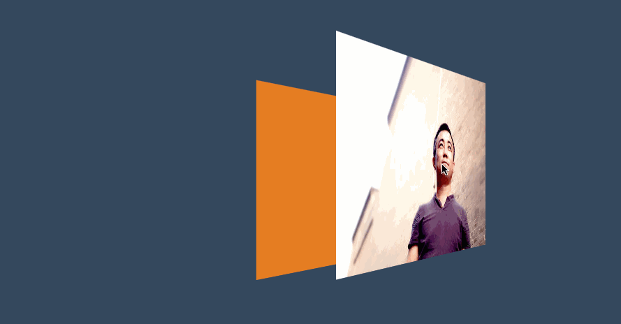
#新年贺卡
下面是通过设置基点来制作贺卡的效果。

<style>
    * {
        padding: 0;
        margin: 0;
        box-sizing: border-box;
    }

    body {
        width: 100vw;
        height: 100vh;
        background: #34495e;
        display: flex;
        justify-content: center;
        align-items: center;
    }

    main {
        width: 300px;
        height: 200px;
        transform-style: preserve-3d;
        transform: perspective(600px) rotateX(35deg) rotateY(15deg);
    }

    .card {
        width: 300px;
        height: 200px;
        background: #e67e22;
        display: flex;
        justify-content: center;
        align-items: center;
        font-size: 3em;
        color: whitesmoke;
        position: relative;

    }

    .card::before,
    .card::after {
        transition: 1s;
        background: #e74c3c;
        line-height: 4em;
    }

    .card::before {
        content: '新年';
        width: 150px;
        height: 100%;
        left: 0px;
        top: 0;
        text-align: right;
        position: absolute;
        transform-origin: left bottom;
    }

    .card::after {
        content: '快乐';
        width: 150px;
        height: 100%;
        left: 150px;
        top: 0;
        position: absolute;
        transform-origin: right bottom;
    }

    .card:hover::before {
        transform: rotateY(-179deg);
    }

    .card:hover::after {
        transform: rotateY(179deg);
    }
</style>

<main>
    <div class="card">houdunren</div>
</main>
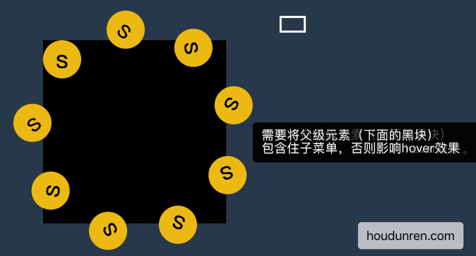
#动感菜单
为了让大家清楚理解,下面把思路给大家解析一下。
#父级有宽度
设置父级 ul 有宽度,每层都是居中对齐。

<style>
    * {
        padding: 0;
        margin: 0;
        list-style: none;
    }

    body {
        width: 100vw;
        height: 100vh;
        background: #2c3e50;
        display: flex;
        justify-content: center;
        align-items: center;
    }

    nav {
        width: 400px;
        height: 400px;
        background: transparent;
        display: flex;
        justify-content: center;
        align-items: center;
        position: relative;

    }

    nav::after {
        content: '大军老师';
        color: #ecf0f1;
        position: absolute;
        display: flex;
        justify-content: center;
        align-items: center;
        font-size: 2em;
        font-weight: bold;
        text-shadow: 3px 3px 0px #34495e;
        z-index: 1;
    }

    nav::before {
        content: '';
        width: 200px;
        height: 200px;
        background: #e74c3c;
        border-radius: 50%;
        position: absolute;
        left: 50%;
        top: 50%;
        transform: translate(-50%, -50%);
        z-index: 1;
    }

    nav:hover ul {
        transform: scale(1);
    }

    ul {
        width: 300px;
        height: 300px;
        transform: scale(0);
        transition: .5s;
    }

    ul li {
        width: 80px;
        height: 80px;
        background: #e74c3c;
        border-radius: 50%;
        position: absolute;
        display: flex;
        justify-content: center;
        align-items: center;
        font-size: 2.5em;
        color: white;
        transition: 1s;
        transform-origin: 150px 150px;
        box-shadow: 0 0 15px rgba(0, 0, 0.8);
    }

    ul li span {
        transition: 1s;
    }

    nav:hover li:nth-child(1) {
        transform: rotate(40deg);
    }

    nav:hover li:nth-child(1)>span {
        transform: rotate(1040deg);
    }

    nav:hover li:nth-child(2) {
        transform: rotate(80deg);
    }

    nav:hover li:nth-child(2)>span {
        transform: rotate(1000deg);
    }

    nav:hover li:nth-child(3) {
        transform: rotate(120deg);
    }

    nav:hover li:nth-child(3)>span {
        transform: rotate(960deg);
    }

    nav:hover li:nth-child(4) {
        transform: rotate(160deg);
    }

    nav:hover li:nth-child(4)>span {
        transform: rotate(720deg);
    }

    nav:hover li:nth-child(5) {
        transform: rotate(200deg);
    }

    nav:hover li:nth-child(5)>span {
        transform: rotate(880deg);
    }

    nav:hover li:nth-child(6) {
        transform: rotate(240deg);
    }

    nav:hover li:nth-child(6)>span {
        transform: rotate(1680deg);
    }

    nav:hover li:nth-child(7) {
        transform: rotate(280deg);
    }

    nav:hover li:nth-child(7)>span {
        transform: rotate(1920deg);
    }

    nav:hover li:nth-child(8) {
        transform: rotate(320deg);
    }

    nav:hover li:nth-child(8)>span {
        transform: rotate(2200deg);
    }

    nav:hover li:nth-child(9) {
        transform: rotate(360deg);
    }

    nav:hover li:nth-child(9)>span {
        transform: rotate(2520deg);
    }
</style>

<nav>
    <ul>
        <li><span><i class="fa fa-address-book" aria-hidden="true"></i></span></li>
        <li><span><i class="fa fa-adjust" aria-hidden="true"></i></span></li>
        <li><span><i class="fa fa-bars" aria-hidden="true"></i></span></li>
        <li><span><i class="fa fa-book" aria-hidden="true"></i></span></li>
        <li><span><i class="fa fa-bug" aria-hidden="true"></i></span></li>
        <li><span><i class="fa fa-compress" aria-hidden="true"></i></span></li>
        <li><span><i class="fa fa-ban" aria-hidden="true"></i></span></li>
        <li><span><i class="fa fa-beer" aria-hidden="true"></i></span></li>
        <li><span><i class="fa fa-bus" aria-hidden="true"></i></span></li>
    </ul>
</nav>
#父级无宽度
下面代码父级 UL 没有设置宽度,而是使用边框撑开了空间的效果,基本原理和上面一样。

<style>
    * {
        padding: 0;
        margin: 0;
        box-sizing: border-box;
        list-style: none;
    }

    body {
        background: #34495e;
    }

    nav {
        position: absolute;
        margin: 0 auto;
        left: 50%;
        top: 50%;
        width: 180px;
        height: 180px;
        background: #34495e;
        border-radius: 50%;
        text-align: center;
        line-height: 180px;
        color: #2c3e50;
        font-weight: bold;
        font-size: 2em;
        background: #f1c40f;
        box-shadow: 0 0 15px rgba(0, 0, 0, .5);
        cursor: pointer;
        display: flex;
        justify-content: center;
        align-items: center;
    }

    nav strong {
        position: absolute;
    }

    nav:hover ul {
        transform: scale(1.3);
    }

    ul {
        transform: scale(0);
        border: 150px solid transparent;
        transition: .5s;
        cursor: pointer;
        z-index: -1;
    }

    ul li {
        position: absolute;
        top: -100px;
        left: -100px;
        width: 50px;
        height: 50px;
        background: #e67e22;
        border-radius: 50%;
        display: flex;
        justify-content: center;
        align-content: center;
        line-height: 1.5em;
        transition: all 1s;
        transform-origin: 100px 100px;
        box-shadow: 0 0 15px rgba(0, 0, 0, .8);
    }

    ul li span {
        transition: all 1s;
    }

    nav:hover ul li:nth-child(1) {
        transform: rotate(40deg);
    }

    nav:hover ul li:nth-child(1) span {
        transform: rotate(1040deg);
    }

    nav:hover ul li:nth-child(2) {
        transform: rotate(80deg);
    }

    nav:hover ul li:nth-child(2) span {
        transform: rotate(1000deg);
    }

    nav:hover ul li:nth-child(3) {
        transform: rotate(120deg);
    }

    nav:hover ul li:nth-child(3) span {
        transform: rotate(1680deg);
    }

    nav:hover ul li:nth-child(4) {
        transform: rotate(160deg);
    }

    nav:hover ul li:nth-child(4) span {
        transform: rotate(560deg);
    }

    nav:hover ul li:nth-child(5) {
        transform: rotate(200deg);
    }

    nav:hover ul li:nth-child(5) span {
        transform: rotate(520deg);
    }

    nav:hover ul li:nth-child(6) {
        transform: rotate(240deg);
    }

    nav:hover ul li:nth-child(6) span {
        transform: rotate(480deg);
    }

    nav:hover ul li:nth-child(7) {
        transform: rotate(280deg);
    }

    nav:hover ul li:nth-child(7) span {
        transform: rotate(440deg);
    }

    nav:hover ul li:nth-child(8) {
        transform: rotate(320deg);
    }

    nav:hover ul li:nth-child(8) span {
        transform: rotate(400deg);
    }

    nav:hover ul li:nth-child(9) {
        transform: rotate(360deg);
    }

    nav:hover ul li:nth-child(9) span {
        transform: rotate(720deg);
    }
</style>


<nav>
    大军大叔
    <ul>
        <li><span><i class="fa fa-address-book" aria-hidden="true"></i></span></li>
        <li><span><i class="fa fa-adjust" aria-hidden="true"></i></span></li>
        <li><span><i class="fa fa-bars" aria-hidden="true"></i></span></li>
        <li><span><i class="fa fa-book" aria-hidden="true"></i></span></li>
        <li><span><i class="fa fa-bug" aria-hidden="true"></i></span></li>
        <li><span><i class="fa fa-compress" aria-hidden="true"></i></span></li>
        <li><span><i class="fa fa-ban" aria-hidden="true"></i></span></li>
        <li><span><i class="fa fa-beer" aria-hidden="true"></i></span></li>
        <li><span><i class="fa fa-bus" aria-hidden="true"></i></span></li>
    </ul>
</nav>
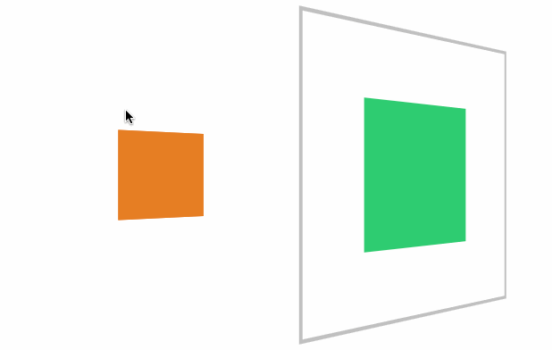
#透视景深
#perspective
- 使用
perspective来控制元素的透视景深 perspective规则为舞台元素控制景深,perspective属性为控制单个元素
#舞台透视
perspective 规则用于将父级整个做为透视元素,会造成里面的每个子元素的透视是不一样的。就像现实中摆一排杯子,是使用统一透视的,每个杯子的透视不一样,造成有大有小。

<style>
    article {
        margin: 0 auto;
        margin-top: 150px;
        width: 400px;
        height: 200px;
        position: relative;
        border: solid 5px silver;
        perspective: 200px;
    }

    article div {
        width: 100px;
        height: 100px;
        background: blueviolet;
        box-sizing: border-box;
        margin-right: 80px;
        float: left;
        transform: rotateY(60deg);
    }
</style>

<article>
    <div></div>
    <div></div>
</article>
#单独透视
perspective 函数用于为元素设置单独透视,下面是为元素单独设置透视参数,每个元素的透视效果是一样的。

article div {
  width: 100px;
  height: 100px;
  background: blueviolet;
  box-sizing: border-box;
  margin-right: 80px;
  float: left;
  transform: perspective(100px) rotateY(60deg);
}
#3D 透视
#transform-style
使用 transform-style 用于控制 3d 透视。
- 应用于舞台即变形元素的父级元素
- 设置
overflow:visible时preserve-3d才无效
| 选项 | 说明 |
|---|---|
| flat | 2D 平面舞台 |
| preserve-3d | 3D 透视舞台 |
#效果体验
下面是设置3D舞台后看到的效果。
<style>
    * {
        padding: 0;
        margin: 0;
        box-sizing: border-box;
    }

    body {
        background: #34495e;

    }

    main {
        position: relative;
        width: 100vw;
        height: 100vh;
    }

    div {
        position: absolute;
        left: 50%;
        top: 50%;
        height: 200px;
        width: 200px;
        transition: 1s;
        background: #e67e22;
        transform-style: preserve-3d;

    }

    div img {
        height: 80%;
        transform: perspective(500px) translateZ(100px);
    }

    div:hover {
        transform: perspective(600px) rotateY(50deg);
    }
</style>

<main>
    <div>
        <img src="5.jpg" alt="">
    </div>
</main>
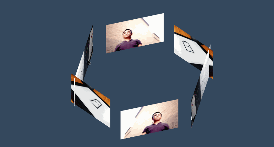
#三维图集
<style>
    body {
        background: #34495e;
    }

    main {
        position: absolute;
        width: 400px;
        height: 200px;
        left: 50%;
        top: 50%;
        transform-style: preserve-3d;
        transform-origin: center center -300px;
        transform: translate(-50%, -50%) rotateX(-45deg);
        transition: 2s;
    }

    body:hover main {
        transform: translate(-50%, -50%) rotateX(-45deg) rotateY(900deg);
    }

    div {
        position: absolute;
        width: 100%;
        height: 100%;
        transform-origin: center center -300px;
        overflow: hidden;
    }

    div img {
        height: 100%;
    }

    div:nth-child(1) {
        transform: rotateY(60deg);
    }

    div:nth-child(2) {
        transform: rotateY(120deg);
    }

    div:nth-child(3) {
        transform: rotateY(180deg);
    }

    div:nth-child(4) {
        transform: rotateY(240deg);
    }

    div:nth-child(5) {
        transform: rotateY(300deg);
    }

    div:nth-child(6) {
        transform: rotateY(360deg);
    }
</style>

<main>
    <div>
        <img src="5.jpg" alt="">
    </div>
    <div>
        <img src="1.jpg" alt="">
    </div>
    <div>
        <img src="3.jpg" alt="">
    </div>
    <div>
        <img src="5.jpg" alt="">
    </div>
    <div>
        <img src="1.jpg" alt="">
    </div>
    <div>
        <img src="3.jpg" alt="">
    </div>
</main>
#观看视角
#perspective-origin
perspective-origin用于控制视线的落点,就像我们眼睛看物体时的聚焦点。可以理解眼镜看物体的位置,比如看一台汽车,是在看车头左边看还是车头右边看。
需要设置 perspective 透视后才可以看到效果。
- 一般设置在舞台元素上来控制子元素
#位置参数
| 取值 | 说明 |
|---|---|
| x-axis | 定义该视图在 x 轴上的位置。默认值:50%。可能的值:left、center、right、length、% |
| y-axis | 定义该视图在 y 轴上的位置。默认值:50%。可能的值:top、center、bottom、length、% |
#效果体验
<style>
    body {
        background: #2c3e50;
        display: flex;
        width: 100vw;
        height: 100vh;
        justify-content: center;
        align-items: center;
    }

    main {
        border: solid 2px silver;
        width: 400px;
        height: 200px;
        transform-style: preserve-3d;
        transform: rotateY(65deg);
        perspective-origin: right bottom;
        perspective: 900px;
        transition: 2s;
    }

    body:hover main {
        perspective-origin: 1200% bottom;
        /* transform: rotateY(-65deg); */
    }

    div {
        position: absolute;
        width: 200px;
        height: 200px;
        transform: rotateY(60deg);
        overflow: hidden;
    }

    div>img {
        height: 100%;
    }

    div:nth-child(1) {
        background: #e67e22;
    }

    div:nth-child(2) {
        background: #27ae60;
        transform: rotateY(60deg) translateZ(-200px);
    }
</style>
<main>
    <div><img src="3.jpg" alt=""></div>
    <div><img src="5.jpg" alt=""></div>
</main>
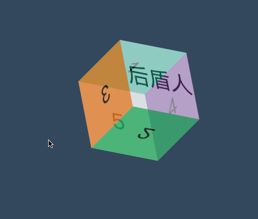
#立方体
效果如下
<style>
    * {
        padding: 0;
        margin: 0;
        box-sizing: border-box;
        list-style: none;
    }

    body {
        background: #34495e;
    }

    main {
        position: absolute;
        left: 50%;
        top: 50%;
        width: 200px;
        height: 200px;
        transform-style: preserve-3d;
        transform-origin: 50% 50% 50px;
        transform: translate(-50%, -50%) rotateY(0deg);
        transition: 2s;
    }

    main:hover {
        transform: translate(-50%, -50%) rotate3d(1, 1, 0, 180deg);
    }

    div {
        position: absolute;
        width: 200px;
        height: 200px;
        background: #000;
        display: flex;
        justify-content: center;
        align-items: center;
        font-size: 4em;
    }

    div:nth-child(1) {
        transform-origin: right;
        background: #1abc9c;
        transform-origin: bottom;
        transform: translateY(-200px) rotateX(-90deg);
        opacity: .8;
    }

    div:nth-child(2) {
        transform-origin: right;
        background: #27ae60;
        transform-origin: top;
        transform: translateY(200px) rotateX(90deg);
        opacity: .8;
    }

    div:nth-child(3) {
        transform-origin: bottom;
        background: #e67e22;
        transform-origin: right;
        transform: translateX(-200px) rotateY(90deg);
        opacity: .8;
    }

    div:nth-child(4) {
        transform-origin: top;
        background: #8e44ad;
        transform-origin: left;
        transform: translateX(200px) rotateY(-90deg);
        opacity: .8;
    }

    div:nth-child(5) {
        transform-origin: left bottom;
        background: #ecf0f1;
        opacity: .8;
    }

    div:nth-child(6) {
        transform-origin: left bottom;
        background: #ecf0f1;
        opacity: .5;
        transform: translateZ(200px);
    }
</style>

<main>
    <div>1</div>
    <div>2</div>
    <div>3</div>
    <div>4</div>
    <div>5</div>
    <div>厚道人</div>
</main>
#隐藏背面
#backface-visibility
使用 backface-visibility 用于控制是否可以看到元素的背面。
- 一般设置在元素上而不是舞台元素上
- 需要舞台元素(父级元素)设置
transform-style: preserve-3d
| 选项 | 说明 |
|---|---|
| visible | 背面可见 |
| hidden | 背面隐藏 |
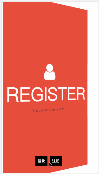
#翻转卡片
下面使用隐藏背面与透视技术制作的翻转卡片效果。
<script src='https://code.jquery.com/jquery-3.3.1.slim.min.js'></script>
<link rel="stylesheet" href="https://maxcdn.bootstrapcdn.com/font-awesome/4.7.0/css/font-awesome.min.css">
<style>
    * {
        padding: 0;
        margin: 0;
        box-sizing: border-box;
    }

    main {
        position: absolute;
        width: 100vw;
        height: 100vh;
        transition: 2s;
        transform-style: preserve-3d;
    }

    main.login {
        transform: perspective(900px) rotateY(0deg);
    }

    main.register {
        transform: perspective(900px) rotateY(180deg);
    }

    div {
        position: absolute;
        width: 100%;
        height: 100%;
        font-size: 5em;
        display: flex;
        flex-direction: column;
        justify-content: center;
        align-items: center;
        backface-visibility: hidden;
        transition: 2s;
        text-transform: uppercase;
        color: white;
    }

    div span {
        text-transform: lowercase;
        letter-spacing: .2em;
        font-size: .2em;
        color: #2c3e50;
    }

    div:nth-child(1) {
        background: #2ecc71;
        transform: rotateY(0deg);
    }

    div:nth-child(2) {
        background: #e74c3c;
        transform: rotateY(180deg);
    }

    nav {
        position: absolute;
        width: 100%;
        height: 100%;
        z-index: 99;
        text-align: center;
        display: flex;
        align-items: flex-end;
        justify-content: center;
        padding-bottom: 30px;
    }

    nav a {
        padding: 10px;
        text-decoration: none;
        font-size: 1em;
        background: #000;
        color: white;
        margin-right: 10px;
        cursor: pointer;
        left: 0;
        top: 0;
    }
</style>

<main>
    <div>
        <i class="fa fa-home" aria-hidden="true"></i>
        login
        <span>houdunren.com</span>
    </div>
    <div>
        <i class="fa fa-user" aria-hidden="true"></i>
        register
        <span>houdunren.com</span>
    </div>
</main>
<nav>
    <a href="javascript:;" onclick="change('login')">登录</a>
    <a href="javascript:;" onclick="change('register')">注册</a>
</nav>
<script>
    function change(t) {
        switch (t) {
            case 'login':
                $("main").removeClass().addClass('login');
                break;
            case 'register':
                $("main").removeClass().addClass('register');
                break;
        }
    }
</script>
#常见问题
如果发现元素不能点击,可能是父级设置了 transform-style: preserve-3d 属性,且同级元素设置了 3D 变化特性,造成对点击元素有遮挡。有以下两种方式解决
- 对变形元素设置
pointer-events: none;使用其不接受点击事件 - 删除父级的
transform-style: preserve-3d属性
基础知识
默认情况下 CSS 属性的变化是瞬间完成的(其实也有时间只是毫秒级的,人眼很难感知到),而使用本章节学习的 CSS 过渡可以控制让变化过程平滑。
有关变形动画已经讲的很丰富了,请在 厚道人 (opens new window)查看相应章节。
#动画属性
不是所有 css 属性都有过渡效果,查看支持动画的 CSS 属性 (opens new window),一般来讲有中间值的属性都可以设置动画如宽度、透明度等。
案例分析
下面例子中边框的变化是没有中间值的,所以没有过渡效果。但线宽度是数值类型有中间值所以会有过渡效果。
<style>
    * {
        padding: 0;
        margin: 0;
    }

    body {
        background: #2c3e50;
        display: flex;
        flex-direction: column;
        justify-content: center;
        align-items: center;
        box-sizing: border-box;
        width: 100vw;
        height: 100vh;
        padding: 80px;
    }

    main {
        width: 400px;
        height: 400px;
    }

    div {
        width: 150px;
        height: 150px;
        background-color: #fff;
        border: solid 20px #ddd;
        transition: 2s;
    }

    div:hover {
        border-radius: 50%;
        border: dotted 60px #ddd;
        background-color: #e67e22;
    }
</style>

<main>
    <div></div>
</main>
#元素状态
#初始形态
指当页面加载后的样式状态,下面是表单设置的初始样式。

<style>
    * {
        padding: 0;
        margin: 0;
    }

    body {
        background: #2c3e50;
        display: flex;
        flex-direction: column;
        justify-content: center;
        align-items: center;
        box-sizing: border-box;
        width: 100vw;
        height: 100vh;
        padding: 20px;
    }

    input {
        border: solid 5px #e67e22;
        height: 60px;
        width: 100%;
        margin-bottom: 20px;
    }

    input:checked {
        position: relative;
        width: 60px;
        height: 60;
        border: none;
    }

    input:checked::before {
        content: '⩗';
        color: white;
        display: flex;
        justify-content: center;
        align-items: center;
        font-size: 3em;
        position: absolute;
        left: 0;
        top: 0;
        right: 0;
        bottom: 0;
        box-sizing: border-box;
        background: #3498db;
    }
</style>

<input type="text">
<input type="checkbox" checked>
#变化形态
指元素由初始状态变化后的状态,比如鼠标放上、表单获得焦点后的形态。
<style>
    * {
        padding: 0;
        margin: 0;
    }

    body {
        background: #2c3e50;
        display: flex;
        flex-direction: column;
        justify-content: center;
        align-items: center;
        box-sizing: border-box;
        width: 100vw;
        height: 100vh;
         padding: 20px;
    }

    input {
        border: solid 5px #e67e22;
        height: 60px;
        width: 100%;
        margin-bottom: 20px;
        transition: 2s;
    }

    input:hover {
        border: solid 5px #000 !important;
    }

    input:focus {
        background: #e67e22;
    }

    input:checked {
        position: relative;
        width: 60px;
        height: 60;
        border: none;
    }

    input:checked::before {
        content: '⩗';
        color: white;
        display: flex;
        justify-content: center;
        align-items: center;
        font-size: 3em;
        position: absolute;
        left: 0;
        top: 0;
        right: 0;
        bottom: 0;
        box-sizing: border-box;
        background: #3498db;
    }
</style>

<input type="text">
<input type="checkbox" checked>
#transition-property
用于设置哪些属性应用过渡效果。
- 默认值为
all即所有属性都发生过渡效果 - 多个属性使用逗号分隔
#属性设置
<style>
    * {
        padding: 0;
        margin: 0;
    }

    body {
        background: #2c3e50;
        display: flex;
        flex-direction: column;
        justify-content: center;
        align-items: center;
        box-sizing: border-box;
        width: 100vw;
        height: 100vh;
        padding: 80px;
    }

    main {
        width: 400px;
        height: 400px;
    }

    div {
        width: 150px;
        height: 150px;
        background-color: #e67e22;
        border-radius: 50%;
        transition-property: background-color, transform, opacity, border-radius;
        transition-duration: 3s;
    }

    main:hover div {
        border-radius: 0;
        transform: scale(2) rotate(180deg);
        background-color: #e67e22;
    }
</style>

<main>
    <div></div>
</main>
#禁用属性
<style>
    * {
        padding: 0;
        margin: 0;
    }

    body {
        background: #2c3e50;
        display: flex;
        flex-direction: column;
        justify-content: center;
        align-items: center;
        box-sizing: border-box;
        width: 100vw;
        height: 100vh;
        padding: 80px;
    }

    main {
        width: 400px;
        height: 400px;
    }

    div {
        width: 200px;
        height: 200px;
        background: #e74c3c;
        transition-property: background, transform;
        transition-duration: 2s;
        margin-bottom: 50px;
    }

    main:hover div{
        transform: scale(1.5) rotate(180deg);
        background: #9b59b6;
    }

    div:last-child {
        transition-property: none;
    }
</style>

<main>
    <div></div>
    <div></div>
</main>
#transitionend
用于控制过渡结束后执行的 JS 事件,简写属性会触发多次如 border-radius 会触发四次事件,不难理解因为可以为border-bottom-left-radius 等四个属性独立设置过渡,所以就会有四次事件。
| 属性 | 说明 |
|---|---|
| propertyName | 结束过渡样式 |
| elapsedTime | 过渡需要的时间 |
| pseudoElement | 过渡的伪元素 |
| isTrusted | true:用户触发,false:脚本触发 |
<style>
    * {
        padding: 0;
        margin: 0;
    }

    body {
        width: 100vw;
        height: 100vh;
        background: #34495e;
        display: flex;
        justify-content: center;
        align-items: center;
    }

    main {
        width: 400px;
        height: 400px;
    }

    div {
        width: 200px;
        height: 200px;
        position: relative;
        display: flex;
        flex-direction: column;
        align-items: center;
        justify-content: center;
        flex-wrap: nowrap;
    }

    div::before {
        content: '厚道人';
        font-size: 3em;
        color: #2c3e50;
        background: #95a5a6;
        width: 200px;
        height: 200px;
        display: flex;
        justify-content: center;
        align-items: center;
        border-radius: 10%;
        transition-duration: 2s;
        cursor: pointer;
    }

    div:hover::before {
         transition-duration: 1.5s;
                 border-radius: 50%;
                 background: #f1c40f;
         transform: rotate(360deg);
    }

    div::after {
        content: 'houdunren.com';
        text-transform: uppercase;
        position: absolute;
        bottom: -60px;
        font-size: 2em;
        color: #95a5a6;
        text-align: center;
        transform: translateX(-999px) skew(45deg);
        transition-duration: 1s;
    }

    div.move::after {
        transform: translateX(0px) skew(0deg);
    }
</style>

<main>
    <div>

    </div>
</main>
<script>
    document.querySelector('div').addEventListener('transitionend', function (e) {
        console.log(e);
        document.querySelector('div').className = 'move';
    })
</script>
#transition-duration
用于设置过渡时间,需要注意以下几点
- 可使用单位为 ms 毫秒、s 秒
- 默认值为 0s 不产生过渡效果
- 一个值时,所有属性使用同样的时间
- 二个值时,奇数属性使用第一个,偶数属性使用第二个
- 变化属性数量大于时间数量时,后面的属性再从第一个时间开始重复使用
#统一时间
<style>
    * {
        padding: 0;
        margin: 0;
    }

    body {
        background: #2c3e50;
        display: flex;
        flex-direction: column;
        justify-content: center;
        align-items: center;
        box-sizing: border-box;
        width: 100vw;
        height: 100vh;
        padding: 80px;
    }

    main {
        width: 400px;
        height: 400px;
    }

    div {
        width: 150px;
        height: 150px;
        background-color: #34495e;
        border-radius: 50%;
        opacity: 0.2;
        transition-property: background-color, transform, opacity, border-radius;
        transition-duration: 3s;
    }

    div:hover {
        opacity: 1;
        border-radius: 0;
        transform: scale(2) rotate(180deg);
        background-color: #e67e22;
    }
</style>

<main>
    <div></div>
</main>
#两个时间
下面共有四个属性并设置了两个时间值,1,3 属性使用第一个值,2,4 属性使用第二个值。
... div {
  width: 150px;
  height: 150px;
  background-color: #34495e;
  border-radius: 50%;
  opacity: 0.2;
  transition-property: background-color, transform, opacity, border-radius;
  transition-duration: 200ms, 5s;
}
...;
#多个时间
下面共有四个属性并设置了三个时间值,1,2,3 属性使用 1,2,3 时间值,第四个属性再从新使用第一个时间值。
... div {
  width: 150px;
  height: 150px;
  background-color: #34495e;
  border-radius: 50%;
  opacity: 0.2;
  transition-property: background-color, transform, opacity, border-radius;
  transition-duration: 200ms, 5s, 2s;
}
...;
#不同时间
可以为初始与变化状态设置不同的时间。
下面是将hover 设置为 3s,当鼠标放上时变化时间为 3s。为初始设置为 1s 即表示变化到初始状态需要 1s。
<style>
    * {
        padding: 0;
        margin: 0;
    }

    body {
        background: #2c3e50;
        display: flex;
        flex-direction: column;
        justify-content: center;
        align-items: center;
        box-sizing: border-box;
        width: 100vw;
        height: 100vh;
        padding: 80px;
    }

    main {
        width: 400px;
        height: 400px;
    }

    div {
        width: 150px;
        height: 150px;
        background-color: #e67e22;
        border-radius: 50%;
        transition-property: background-color, transform, opacity, border-radius;
        transition-duration: 1s;
    }

    div:hover {
        border-radius: 0;
        transform: scale(2) rotate(180deg);
        background-color: #e67e22;
        transition-duration: 3s;
    }
</style>

<main>
    <div></div>
</main>
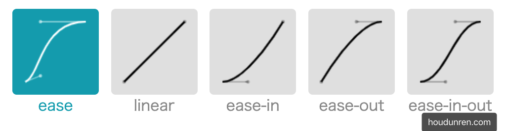
#transition-timing-function
用于设置过渡效果的速度,可在 https://cubic-bezier.com (opens new window)网站在线体验效果差异。
#默认参数
| 值 | 描述 |
|---|---|
| linear | 规定以相同速度开始至结束的过渡效果(等于 cubic-bezier(0,0,1,1))。 |
| ease | 开始慢,然后快,慢下来,结束时非常慢(cubic-bezier(0.25,0.1,0.25,1)) |
| ease-in | 开始慢,结束快(等于 cubic-bezier(0.42,0,1,1)) |
| ease-out | 开始快,结束慢(等于 cubic-bezier(0,0,0.58,1)) |
| ease-in-out | 中间快,两边慢(等于 cubic-bezier(0.42,0,0.58,1)) |
| cubic-bezier(n,n,n,n) | 在 cubic-bezier 函数中定义自己的值 |
<style>
    * {
        padding: 0;
        margin: 0;
    }

    body {
        background: #2c3e50;
        display: flex;
        flex-direction: column;
        justify-content: center;
        align-items: center;
        box-sizing: border-box;
        width: 100vw;
        height: 100vh;
        padding: 80px;
    }

    main {
        width: 400px;
        height: 400px;
    }

    div {
        width: 150px;
        height: 150px;
        background-color: #e67e22;
        border-radius: 50%;
        transition-property: background-color, transform, opacity, border-radius;
        transition-duration: 3s;
        transition-timing-function: ease;
    }

    div:hover {
        border-radius: 0;
        transform: scale(2) rotate(180deg);
        background-color: #e67e22;
    }
</style>

<main>
    <div></div>
</main>
#贝塞尔曲线
需要设置四个值 cubic-bezier(<x1>, <y1>, <x2>, <y2>),来控制曲线速度,可在 https://cubic-bezier.com (opens new window)网站在线体验效果。
... div {
  width: 150px;
  height: 150px;
  background-color: #e67e22;
  border-radius: 50%;
  transition-property: background-color, transform, opacity, border-radius;
  transition-duration: 3s;
  transition-timing-function: cubic-bezier(0.17, 0.67, 0.86, 0.49);
}
...;
#步进速度
过渡使用阶梯化呈现,有点像现实生活中的机械舞,下面是把过渡分五步完成。
| 选项 | 说明 |
|---|---|
| steps(n,start) | 设置 n 个时间点,第一时间点变化状态 |
| steps(n,end) | 设置 n 个时间点,第一时间点初始状态 |
| step-start | 等于 steps(1,start),可以理解为从下一步开始 |
| step-end | 等于 steps(1,end),可以理解为从当前步开始 |
#steps
<head>
    <style>
        body {
            width: 100vw;
            height: 100vh;
            display: flex;
            justify-content: center;
            align-items: center;
            background: #34495e;
        }

        ul {
            width: 800px;
            height: 300px;
            list-style: none;
            display: flex;
            justify-content: space-between;
            position: relative;
        }

        li {
            flex: 1;
            border: solid 1px #ddd;
            text-align: center;
            padding-top: 20px;
        }

        li::before {
            content: 'houdunren.com';
            font-size: 1.2em;
            text-align: center;
            color: white;
            opacity: .3;
        }

        ul::before,
        ul::after {
            text-align: center;
            font-size: 2em;
            line-height: 100px;
            color: white;
            z-index: 2;
        }

        ul::before {
            content: 'start';
            position: absolute;
            width: 200px;
            height: 100px;
            background: #e67e22;
            transition-duration: 2s;
            transition-timing-function: steps(4, start);
            box-sizing: border-box;
            border-left: solid 10px #fff;
        }

        ul::after {
            content: 'end';
            position: absolute;
            bottom: 0;
            width: 200px;
            height: 100px;
            background: #9b59b6;
            transition-duration: 2s;
            transition-timing-function: steps(4, end);
            box-sizing: border-box;
            border-right: solid 10px #fff;
        }

        ul:hover::before {
            transform: translateX(800px);
        }

        ul:hover::after {
            transform: translateX(800px);
        }
    </style>
</head>

<body>
    <ul>
        <li></li>
        <li></li>
        <li></li>
        <li></li>
    </ul>
</body>
#时钟效果
<head>
    <style>
        body {
            width: 100vw;
            height: 100vh;
            display: flex;
            flex-direction: column;
            justify-content: center;
            align-items: center;
            background: #34495e;
        }

        main {
            width: 400px;
            height: 400px;
            background: #ecf0f1;
            border-radius: 50%;
            position: relative;
        }

        main::before {
            content: '';
            width: 20px;
            height: 20px;
            background: #333;
            position: absolute;
            left: 50%;
            top: 50%;
            border-radius: 50%;
            transform: translate(-50%, -50%)
        }

        main::after {
            content: '';
            width: 5px;
            height: 50%;
            background: #333;
            position: absolute;
            left: 50%;
            bottom: 50%;
            transform: translateX(-50%);
            transform-origin: bottom;
            transition-duration: 60s;
            transition-timing-function: steps(60, end);
        }

        body:hover main::after {
            transform: translateX(-50%) rotate(360deg);
        }
    </style>
</head>

<body>
    <main>
    </main>
    <h3>houdunren.com</h3>
</body>
#step-start/end

<head>
    <style>
        body {
            width: 100vw;
            height: 100vh;
            display: flex;
            justify-content: center;
            align-items: center;
            background: #34495e;
        }

        ul {
            width: 400px;
            height: 300px;
            list-style: none;
            display: flex;
            justify-content: space-between;
            position: relative;
        }

        li {
            flex: 1;
            border: solid 1px #ddd;
            text-align: center;
            padding-top: 20px;
        }

        li::before {
            content: 'houdunren.com';
            font-size: 1.2em;
            text-align: center;
            color: white;
            opacity: .3;
        }

        ul::before,
        ul::after {
            text-align: center;
            font-size: 2em;
            line-height: 100px;
            color: white;
            z-index: 2;
        }

        ul::before {
            content: 'start';
            position: absolute;
            width: 200px;
            height: 100px;
            background: #e67e22;
            transition-duration: 1s;
            transition-timing-function: step-start;
            box-sizing: border-box;
            border-left: solid 10px #fff;
        }

        ul::after {
            content: 'end';
            position: absolute;
            bottom: 0;
            width: 200px;
            height: 100px;
            background: #9b59b6;
            transition-duration: 1s;
            transition-timing-function: step-end;
            box-sizing: border-box;
            border-right: solid 10px #fff;
        }

        ul:hover::before {
            transform: translateX(200px);
        }

        ul:hover::after {
            transform: translateX(200px);
        }
    </style>
</head>

<body>
    <ul>
        <li></li>
        <li></li>
    </ul>
</body>
#步进形态
<style>
    * {
        padding: 0;
        margin: 0;
    }

    body {
        background: #2c3e50;
        display: flex;
        flex-direction: column;
        justify-content: center;
        align-items: center;
        box-sizing: border-box;
        width: 100vw;
        height: 100vh;
        padding: 80px;
    }

    main {
        width: 400px;
        height: 400px;
    }

    div {
        width: 150px;
        height: 150px;
        background-color: #e67e22;
        border-radius: 50%;
        transition-property: background-color, transform, opacity, border-radius;
        transition-duration: 3s;
        transition-timing-function: steps(5, end);
    }

    div:hover {
        border-radius: 0;
        transform: scale(2) rotate(180deg);
        background-color: #e67e22;
    }
</style>

<main>
    <div></div>
</main
#变化广告
<head>
    <style>
        body {
            width: 100vw;
            height: 100vh;
            display: flex;
            flex-direction: column;
            justify-content: center;
            align-items: center;
            background: #34495e;
        }

        main {
            width: 400px;
            height: 200px;
            position: relative;
            overflow: hidden;
        }

        section {
            width: 800px;
            height: 200px;
            display: flex;
            transition-duration: 1s;
            transition-timing-function: step-start;
        }

        div {
            width: 400px;
            height: 200px;
            overflow: hidden;
        }

        main:hover section {
            transform: translateX(-400px);
        }
    </style>
</head>

<body>
    <main>
        <section>
            <div><img src="3.jpg" alt=""></div>
            <div><img src="5.jpg" alt=""></div>
        </section>
    </main>
</body>
#transition-delay
用于设置延迟过渡的时间。
- 默认为 0s 即立刻开始过渡
- 值可以为负数
- 变化属性数量大于时间数量时,后面的属性再从第一个时间开始重复使用
#基本使用
下面设置了延迟时间为 1s,当鼠标放上
<style>
    * {
        padding: 0;
        margin: 0;
    }

    body {
        background: #2c3e50;
        display: flex;
        flex-direction: column;
        justify-content: center;
        align-items: center;
        box-sizing: border-box;
        width: 100vw;
        height: 100vh;
        padding: 80px;
    }

    main {
        width: 400px;
        height: 400px;
    }

    div {
        width: 150px;
        height: 150px;
        background-color: #e67e22;
        border-radius: 50%;
        transition-property: background-color, transform, opacity, border-radius;
        transition-duration: 1s;
        transition-delay: 1s;
    }

    div:hover {
        border-radius: 0;
        transform: scale(2) rotate(180deg);
        background-color: #e67e22;
    }
</style>

<main>
    <div></div>
</main>
#多值延迟
可以设置不同属性的延迟时间。
<style>
    * {
        padding: 0;
        margin: 0;
    }

    body {
        background: #2c3e50;
        display: flex;
        flex-direction: column;
        justify-content: center;
        align-items: center;
        box-sizing: border-box;
        width: 100vw;
        height: 100vh;
        padding: 80px;
    }

    main {
        width: 400px;
        height: 400px;
    }

    div {
        width: 150px;
        height: 150px;
        background-color: #fff;

        transition-property: background-color, transform, border-radius;
        transition-duration: 1s, 2s, 3s;
        transition-delay: 1s, 3s, 5s;
    }

    div:hover {
        border-radius: 50%;
        transform: scale(2) rotate(180deg);
        background-color: #e67e22;
    }
</style>

<main>
    <div></div>
</main>
#使用负值
下例圆角属性的过渡时间为 4s,设置延迟为 -4s,表示鼠标放上时直接显示在 4s 上的效果。如果设置为-2s 显示圆角变形一半的效果。

<style>
    * {
        padding: 0;
        margin: 0;
    }

    body {
        background: #2c3e50;
        display: flex;
        flex-direction: column;
        justify-content: center;
        align-items: center;
        box-sizing: border-box;
        width: 100vw;
        height: 100vh;
        padding: 80px;
    }

    main {
        width: 400px;
        height: 400px;
    }

    div {
        width: 150px;
        height: 150px;
        background-color: #fff;

        transition-property: background-color, transform, border-radius;
        transition-duration: 1s, 2s, 4s;
        transition-delay: 1s, 2s, -4s;
    }

    div:hover {
        border-radius: 50%;
        transform: scale(2) rotate(180deg);
        background-color: #e67e22;
    }
</style>

<main>
    <div></div>
</main>
#transition
可以使用transition 指令将过渡规则统一设置,需要注意以下几点。
- 必须设置过渡时间
- 延迟时间放在逗号或结束前
transition: border-radius linear 2s 0s, background 2s 2s, width linear 2s 4s, height
    linear 2s 4s;
#点赞案例
 <link rel="stylesheet" href="https://maxcdn.bootstrapcdn.com/font-awesome/4.7.0/css/font-awesome.min.css">
<script src='https://code.jquery.com/jquery-3.3.1.slim.min.js'></script>
<style>
    body {
        width: 100vw;
        height: 100vh;
        display: flex;
        justify-content: center;
        align-items: center;
        background: #ecf0f1;
    }

    div {
        position: relative;
        width: 100px;
        height: 100px;
        cursor: pointer;
        display: flex;
        justify-content: center;
        align-items: center;
    }

    div i.fa {
        font-size: 100px;
        position: absolute;
        transition: all .5s;
        color: #ddd;
    }

    div.heart i.fa {
        font-size: 400px;
        color: #e74c3c;
        opacity: 0;
    }

    div.heart i.fa:nth-child(2) {
        font-size: 80px;
        color: #e74c3c;
        opacity: 1;
    }
</style>

<body>
    <div onclick="heart()">
        <i class="fa fa-heart" aria-hidden="true"></i>
        <i class="fa fa-heart" aria-hidden="true"></i>
    </div>
    <script>
        function heart() {
            $("div").toggleClass('heart');
        }
    </script>
</body>
基础知识
通过定义一段动画中的关键点、关键状态来创建动画。Keyframes 相比 transition 对动画过程和细节有更强的控制。
过渡动画是两个状态间的变化,帧动画可以处理动画过程中不同时间的细节变化,不过对过渡动画理解后再不习帧动画会非常容易,也可以把帧动画理解为多个帧之间的过渡动画。
#关键帧
使用@keyframes 规则配置动画中的各个帧
- from 表示起始点
- to 表示终点
- 可以使用百分数如 20%动画运行到 20%时间时
#基本使用
下面使用 @keyframes 定义了动画叫 hd 并配置了两个帧动作from/to ,然后在 div 元素中使用animation-name 引用了动画并使用animation-duration声明执行三秒。
- 动画命名不要使用 CSS 关键字如
none
<style>
    * {
        padding: 0;
        margin: 0;
    }

    body {
        background: #2c3e50;
        display: flex;
        flex-direction: column;
        justify-content: center;
        align-items: center;
        box-sizing: border-box;
        width: 100vw;
        height: 100vh;
        padding: 80px;
    }

    main {
        width: 400px;
        height: 400px;
    }

    div {
        width: 150px;
        height: 150px;
        background-color: #fff;
        border: solid 20px #ddd;
        animation-name: hd;
        animation-duration: 3s;
    }

    @keyframes hd {
        from {
            opacity: 0;
            transform: scale(.1);
        }

        to {
            opacity: 1;
        }
    }
</style>

<main>
    <div></div>
</main>
#时间点
帧动画需要定义在不同时间执行的动作,开始与结束可以使用 form/to 或 0%/100% 声明。
- 必须添加百分号,25%是正确写法
- 时间点没有顺序要求,即 100%写在 25%前也可以
- 未设置
0%与100%时将使用元素原始状态
#物体移动
下面定义不同时间点来让物体元素移动一圈,下例中可以不设置from/to 系统将定义为元素初始状态。
<style>
    * {
        padding: 0;
        margin: 0;
    }

    body {
        background: #2c3e50;
        display: flex;
        flex-direction: column;
        justify-content: center;
        align-items: center;
        box-sizing: border-box;
        width: 100vw;
        height: 100vh;
        padding: 80px;
    }

    main {
        width: 400px;
        height: 400px;
        border: solid 2px white;
    }

    div {
        width: 100px;
        height: 100px;
        background-color: #e67e22;
        animation-name: hd;
        animation-duration: 3s;
    }

    @keyframes hd {
        0% {}

        25% {
            transform: translateX(300%);
        }

        50% {
            transform: translate(300%, 300%);
        }

        75% {
            transform: translate(0, 300%);
        }

        to {}
    }
</style>

<main>
    <div></div>
</main>
#同时声明
时间点可以动画样式一样时可以一起声明,下面将 25%/75%背景一起声明。

<style>
    * {
        padding: 0;
        margin: 0;
    }

    body {
        background: #2c3e50;
        display: flex;
        flex-direction: column;
        justify-content: center;
        align-items: center;
        box-sizing: border-box;
        width: 100vw;
        height: 100vh;
        padding: 80px;
    }

    main {
        width: 400px;
        height: 400px;
        border: solid 2px white;
    }

    div {
        width: 100px;
        height: 100px;
        background-color: #e67e22;
        animation-name: hd;
        animation-duration: 3s;
    }

    @keyframes hd {
        25% {
            transform: translateX(300%);
        }

        50% {
            transform: translate(300%, 300%);
        }

        75% {
            transform: translate(0, 300%);
        }

        25%,
        75% {
            background: #9b59b6;
            border-radius: 50%;
        }

        50%,
        100% {
            background: #e67e22;
        }
    }
</style>

<main>
    <div></div>
</main>
#使用动画
使用animation-name 规则可以在元素身上同时使用多个动画。
- 使用多个动画时用逗号分隔
- 多个动画有相同属性时,后面动画的属性优先使用
#基本使用
<style>
    main {
        width: 400px;
        height: 400px;
        border: solid 5px #95a5a6;
    }

    div {
        width: 100px;
        height: 100px;
        background-color: #e67e22;
        animation-name: hd, scale;
        animation-duration: 3s;
    }

    @keyframes hd {
        25% {
            transform: translateX(300%);
        }

        50% {
            transform: translate(300%, 300%);
        }

        75% {
            transform: translate(0, 300%);
        }

        25%,
        75% {
            background: #9b59b6;
        }

        50%,
        100% {
            background: #e67e22;
        }

    }

    @keyframes scale {
        from {
            border-radius: 0;
        }

        75% {
            border-radius: 50%;
        }

        to {
            border-radius: 0;
        }
    }
</style>

<main>
    <div></div>
</main>
#动画时间
使用 animation-duration 可以声明动画播放的时间,即把所有帧执行一遍所需要的时间。
- 可以使用 m 秒,ms 毫秒时间单位
- 可为不同动画单独设置执行时间
- 如果动画数量大于时间数量,将重新从时间列表中计算
#炫彩背景
下面实例声明三个动画,使用 animation-duration为每个动画设置不同执行的时间。

<style>
    main {
        background: #34495e;
        animation-name: scale, colors, rotate;
        animation-duration: 1s, 5s, 1s;
        animation-fill-mode: forwards;
    }

    @keyframes scale {
        from {
            width: 0;
            height: 0;
        }

        to {
            width: 100vw;
            height: 100vh;
        }
    }

    @keyframes colors {
        0% {
            background: #e67e22;
        }

        50% {
            background: #34495e;
        }

        100% {
            background: #16a085;
        }
    }

    @keyframes rotate {
        0% {
            transform: rotate(0deg);
        }

        50% {
            transform: rotate(-360deg);
        }

        100% {
            transform: rotate(360deg);
        }
    }
</style>

<body>
    <main></main>
</body>
#属性重叠
如果多个帧动画设置了相同的属性,不同浏览器的对待方式略有不同。比如 chrome/edge 最新版本对动画的计算就有变化。
我们先来看代码
<!DOCTYPE html>
<html lang="en">
  <head>
    <meta charset="UTF-8" />
    <meta name="viewport" content="width=device-width, initial-scale=1.0" />
    <title>厚道人</title>
    <style>
      * {
        padding: 0;
        margin: 0;
      }

      body {
        width: 100vw;
        height: 100vh;
        background: #34495e;
        display: flex;
        justify-content: center;
        align-items: center;
      }

      main {
        width: 400px;
        height: 400px;
        border: solid 1px #ddd;
      }

      div {
        width: 100px;
        height: 100px;
        background: #f1c40f;
        animation-name: translate, background;
        animation-duration: 4s, 4s;
      }

      @keyframes translate {
        25% {
          transform: translateX(300px);
        }

        50% {
          transform: translate(300px, 300px);
        }

        75% {
          transform: translateY(300px);
        }
      }

      @keyframes background {
        25% {
          background: #2ecc71;
          transform: translateX(300px);
        }

        50% {
          background: #e67e22;
        }

        75% {
          background: #9b59b6;
        }
      }
    </style>
  </head>

  <body>
    <main>
      <div></div>
    </main>
  </body>
</html>
上面的示例在早期 chrome 与 safari 浏览器效果是相同的。
- 后面的 background 动画优先级高,4 秒时长的动画都用 background 动画来控制 translate 属性
在最新版本的 chrome/edge 中执行过程将两个帧动画结合处理
- 前 25%帧使用 background 的动画
- 25%帧后综合使用 background 与 translate 动画
所以建议尽量不要在两个动画中控制相同的属性
#动画属性
不是所有 css 属性都有过渡效果,查看支持动画的 CSS 属性 (opens new window),一般来讲有中间值的属性都可以设置动画如宽度、透明度等。
#属性体验
下例中的边框变化没有中间值,所以是瞬间改变也没有产生动画效果。

<head>
    <style>
        * {
            padding: 0;
            margin: 0;
        }

        h2 {
            color: #f39c12;
        }

        body {
            width: 100vw;
            height: 100vh;
            background: #34495e;
            display: flex;
            flex-direction: column;
            justify-content: center;
            align-items: center;
        }

        main {
            width: 100px;
            height: 100px;
            background: white;
            animation-name: hd;
            animation-duration: 2s;
        }

        @keyframes hd {
            0% {
                background: #9b59b6;
                border: solid 10px #000;
            }

            100% {
                width: 200px;
                height: 200px;
                background: #e74c3c;
                border: double 10px #000;
            }
        }
    </style>
</head>

<body>
    <main></main>
    <h2>houdunren.com</h2>
</body>
#中间值
下面是例子尺寸没有产生动画,因为0%帧设置的尺寸单位与 100% 设置的尺寸没有中间值,解析器没有办法计算,最终效果如下:

正确效果应该是这样

<head>
    <style>
        * {
            padding: 0;
            margin: 0;
        }

        h2 {
            color: #f39c12;
        }

        body {
            width: 100vw;
            height: 100vh;
            background: #34495e;
            display: flex;
            flex-direction: column;
            justify-content: center;
            align-items: center;
        }

        main {
            width: 100px;
            height: 100px;
            background: white;
            animation-name: hd;
            animation-duration: 2s;
        }

        @keyframes hd {
            0% {
                width: auto;
                height: auto;
                background: #9b59b6;
            }

            100% {
                width: 200px;
                height: 200px;
                background: #e74c3c;
            }
        }
    </style>
</head>

<body>
    <main></main>
    <h2>houdunren.com</h2>
</body>
#重复动画
使用animation-iteration-count 规则设置动画重复执行次数,设置值为 infinite 表示无限循环执行。
- 可同时设置元素的多个动画重复,使用逗号分隔
- 如果动画数量大于重复数量定义,后面的动画将重新计算重复
#心动感觉
下面是画心的步骤
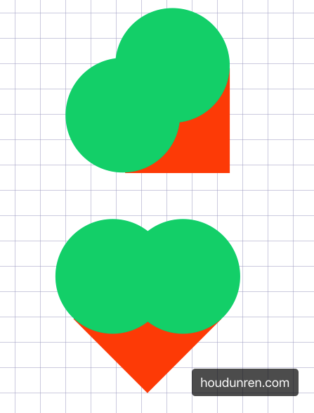
使用循环动画绘制心动效果

<style>
    .heart {
        width: 200px;
        height: 200px;
        background: #e74c3c;
        transform: rotate(45deg);
        position: relative;
        animation-name: heart;
        animation-duration: 1s;
        animation-iteration-count: 100;
    }

    .heart::before {
        content: '';
        width: 200px;
        height: 200px;
        border-radius: 50%;
        background: #e74c3c;
        position: absolute;
        transform: translate(-50%, 0px);
    }

    .heart::after {
        content: '';
        width: 200px;
        height: 200px;
        border-radius: 50%;
        background: #e74c3c;
        position: absolute;
        transform: translate(0%, -50%);
    }

    @keyframes heart {
        from {
            transform: scale(.3) rotate(45deg);
        }

        to {
            transform: scale(1) rotate(45deg);
        }
    }
</style>

<main>
    <div class="heart"></div>
</main>
#动画方向
使用 animation-direction 控制动画运行的方向。
| 选项 | 说明 |
|---|---|
| normal | 从 0%到 100%运行动画 |
| reverse | 从 100%到 0%运行动画 |
| alternate | 先从 0%到 100%,然后从 100%到 0% |
| alternate-reverse | 先从 100%到 0%,然后从 0%到 100% |
#效果比较
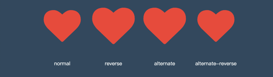
<head>
    <link rel="stylesheet" href="https://maxcdn.bootstrapcdn.com/font-awesome/4.7.0/css/font-awesome.min.css">
    <style>
        * {
            padding: 0;
            margin: 0;
        }

        h2 {
            color: #f39c12;
        }

        body {
            width: 100vw;
            height: 100vh;
            background: #34495e;
            display: flex;
            flex-direction: column;
            justify-content: center;
            align-items: center;
        }

        ul {
            width: 400px;
            height: 100px;
            display: flex;
        }

        li {
            list-style: none;
            text-align: center;
            display: flex;
            flex-direction: column;
            flex: 1;
            justify-content: space-between;
        }

        li span {
            font-size: 10px;
            color: #ecf0f1;
        }

        i.fa {
            font-size: 30px;
            margin: 5px;
            color: #e74c3c;
            animation-name: hd;
            animation-duration: 2s;
            animation-iteration-count: infinite;
        }

        li:nth-child(1)>i.fa {
            animation-direction: normal;
        }

        li:nth-child(2)>i.fa {
            animation-direction: reverse;
        }

        li:nth-child(3)>i.fa {
            animation-direction: alternate;
        }

        li:nth-child(4)>i.fa {
            animation-direction: alternate-reverse;
        }

        @keyframes hd {
            from {}

            to {
                opacity: 1;
                transform: scale(3);
            }
        }
    </style>
</head>

<body>
    <ul>
        <li>
            <i class="fa fa-heart" aria-hidden="true"></i>
            <span>normal</span>
        </li>
        <li>
            <i class="fa fa-heart" aria-hidden="true"></i>
            <span>reverse</span>
        </li>
        <li>
            <i class="fa fa-heart" aria-hidden="true"></i>
            <span>alternate</span>
        </li>
        <li>
            <i class="fa fa-heart" aria-hidden="true"></i>
            <span>alternate-reverse</span>
        </li>
    </ul>
</body>
#reverse
根据上面的心动例子改变方向为 100%~0%

#alternate
根据上面的心动例子改变方向为 0%~~100%然后 100%~~0%

animation-direction: alternate-reverse;
#alternate-reverse
通过使用合适的运动方向 alternate-reverse 制作跳动的小球
<style>
    main {
        display: flex;
        flex-direction: column;
        justify-content: center;
        align-items: center;
    }

    div {
        width: 200px;
        height: 200px;
        border-radius: 50%;
        background: #e67e22;
        animation-name: ball;
        animation-duration: 2s;
        animation-iteration-count: infinite;
        animation-direction: alternate-reverse;
    }

    @keyframes ball {
        0% {}

        100% {
            transform: translateY(-600px);
        }
    }

    section {
        width: 400px;
        height: 10px;
        border-radius: 50%;
        animation-name: shadow;
        animation-duration: 2s;
        animation-iteration-count: infinite;
        animation-direction: alternate;
    }

    @keyframes shadow {
        from {
            background: #000;
            transform: scale(1);
            filter: blur(35px);
        }

        to {
            background: #aaa;
            filter: blur(10px);
        }
    }
</style>

<main>
    <div></div>
    <section></section>
</main>
#延迟动画
使用 animation-delay 规则定义动画等待多长时间后执行。
#微场景

<style>
    body {
        width: 100vw;
        height: 100vh;
        display: flex;
        flex-direction: column;
        justify-content: space-between;
    }

    header {
        width: 100vw;
        height: 10vh;
        font-size: 2.5em;
        color: white;
        background: #e74c3c;
        text-align: center;
        line-height: 10vh;
        animation-name: hd-translate;
        animation-duration: 500ms;
    }

    main {
        flex: 1;
        width: 100vw;
        height: 300px;
        left: 0;
        bottom: 0;
        background: url("5.jpg") no-repeat right bottom;
        background-size: cover;
        display: flex;
        flex-direction: column;
        justify-content: center;
        align-items: center;
        transform: translateX(-100vw);
        animation-name: hd-rotate;
        animation-duration: 1s;
        animation-fill-mode: forwards;
    }

    main>* {
        opacity: .8;
        font-size: 1.2em;
        line-height: 2em;
        color: #f3f3f3;
        padding: 20px;
        border-radius: 10px;
        box-shadow: 0 0 5px rgba(0, 0, 0, .6);
    }

    main>.lesson {
        width: 80vw;
        height: 40vw;
        background: #8e44ad;
        transform: translate(-100vw, -100vh);
        animation-name: hd-rotate;
        animation-duration: 1s;
        animation-delay: 1s;
        animation-fill-mode: forwards;
    }

    main>.video {
        margin-top: 20px;
        width: 60vw;
        height: 40vw;
        background: #2980b9;
        animation-name: hd-translate;
        animation-duration: 1s;
        animation-delay: 2s;
        transform: translate(-100vw, -100vh);
        animation-fill-mode: forwards;
    }

    footer {
        width: 100vw;
        height: 10vh;
        font-size: 1.5em;
        color: white;
        background: #27ae60;
        text-align: center;
        line-height: 10vh;
        animation-name: hd-skew;
        animation-duration: 500ms;
        animation-delay: 3s;
        transform: translateX(-100vw);
        animation-fill-mode: forwards;
    }

    @keyframes hd-translate {
        from {
            transform: translate(-100vw, -100vh);
        }

        to {
            transform: translateY(0);
        }
    }

    @keyframes hd-rotate {
        from {
            transform: translate(-100%, -100%);
        }

        to {
            transform: translateX(0) rotate(360deg);
        }
    }

    @keyframes hd-skew {
        from {
            transform: translateX(-100%) skew(-45deg);
        }

        to {
            transform: skewX(0deg);
        }
    }
</style>

<body>
    <header>
        厚道人
    </header>
    <main>
        <div class="lesson">
            系统课程是多个实战课程的组合,用来全面掌握一门语言或软件的使用,尤其适合刚入门的新手系统牢固的掌握知识。
        </div>
        <div class="video hd-translate">
            系统课程是多个实战课程的组合,用来全面掌握一门语言或软件的使用,尤其适合刚入门的新手系统牢固的掌握知识。
        </div>
    </main>
    <footer>
        houdunren.com
    </footer>
</body>
#动画速率
#系统属性
| 值 | 描述 |
|---|---|
| linear | 规定以相同速度开始至结束的过渡效果(等于 cubic-bezier(0,0,1,1))。 |
| ease | 开始慢,然后快,慢下来,结束时非常慢(cubic-bezier(0.25,0.1,0.25,1)) |
| ease-in | 开始慢,结束快(等于 cubic-bezier(0.42,0,1,1)) |
| ease-out | 开始快,结束慢(等于 cubic-bezier(0,0,0.58,1)) |
| ease-in-out | 中间快,两边慢(等于 cubic-bezier(0.42,0,0.58,1)) |
| cubic-bezier(n,n,n,n) | 在 cubic-bezier 函数中定义自己的值 |
- 可以在帧中单独定义,将影响当前帧的速率
#贝塞尔曲线
需要设置四个值 cubic-bezier(<x1>, <y1>, <x2>, <y2>),来控制曲线速度,可在 https://cubic-bezier.com (opens new window)网站在线体验效果。
#体验效果
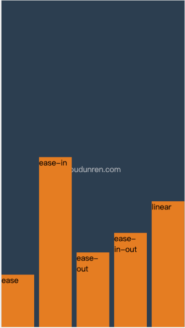
<head>
    <meta charset="UTF-8">
    <meta name="viewport" content="width=device-width, initial-scale=1.0">
    <title>厚道人</title>
    <style>
        * {
            padding: 0;
            margin: 0;
        }

        body {
            width: 100vw;
            height: 100vh;
            background: #2c3e50;
            display: grid;
            grid-template-columns: 1fr;
        }

        body::before {
            content: 'houdunren.com';
            color: white;
            position: absolute;
            left: 50%;
            top: 50%;
            transform: translateX(-50%);
            opacity: .5;
        }

        ul {
            box-sizing: border-box;
            list-style: none;
            display: grid;
            grid-template-columns: repeat(5, 1fr);
            gap: 10px;
        }

        li {
            box-sizing: border-box;
            background: #e67e22;
            animation-name: move;
            animation-duration: 3s;
            animation-iteration-count: infinite;
            color: #333333;
        }

        li:nth-child(1) {
            animation-timing-function: ease;
        }

        li:nth-child(2) {
            animation-timing-function: ease-in;
        }

        li:nth-child(3) {
            animation-timing-function: ease-out;
        }

        li:nth-child(4) {
            animation-timing-function: ease-in-out;
        }

        li:nth-child(5) {
            animation-timing-function: linear;
        }

        @keyframes move {
            to {
                transform: translateY(90vh);
            }
        }
    </style>
</head>

<body>
    <ul>
        <li>ease</li>
        <li>ease-in</li>
        <li>ease-out</li>
        <li>ease-in-out</li>
        <li>linear</li>
    </ul>
</body>
#弹跳小球
<head>
    <style>
        body {
            width: 100vw;
            height: 100vh;
            display: flex;
            flex-direction: column;
            justify-content: flex-end;
            align-items: flex-start;
            background: #2c3e50;
        }

        div {
            position: absolute;
            width: 100px;
            height: 100px;
            left: 30%;
            top: 0px;
            transform: translate(0vw, 0);
            background: radial-gradient(at right top, #f39c12, #d35400);
            border-radius: 50%;
            animation-name: jump;
            animation-duration: 2s;
            animation-iteration-count: infinite;
            animation-timing-function: ease-in;
        }

        div:nth-child(2) {
            animation-delay: .2s;
            left: 60%;
        }

        @keyframes jump {
            0% {
                transform: translateY(0);
                animation-timing-function: ease-in;
            }

            30% {
                transform: translateY(10vh);
                animation-timing-function: ease-in;
            }

            60% {
                transform: translateY(40vh);
                animation-timing-function: ease-in;
            }

            80% {
                transform: translateY(60vh);
                animation-timing-function: ease-in;
            }

            95% {
                transform: translateY(75vh);
                animation-timing-function: ease-in;
            }

            15%,
            45%,
            70%,
            85%,
            100% {
                transform: translateY(80vh);
                animation-timing-function: ease-out;
            }
        }
    </style>
</head>

<body>
    <div></div>
    <div></div>
</body>
#魔术小球
<style>
    body {
        width: 100vw;
        height: 100vh;
        display: flex;
        flex-direction: column;
        justify-content: flex-end;
        align-items: flex-start;
        background: #2c3e50;
    }

    div {
        position: absolute;
        width: 100px;
        height: 100px;
        transform: translate(-20vw, -300%);
        background: radial-gradient(at right top, #f39c12, #d35400);
        border-radius: 50%;
        animation-name: jump;
        animation-duration: 1.5s;
        animation-iteration-count: infinite;
        animation-timing-function: ease-in;
    }

    div:nth-child(2) {
        animation-delay: .2s;
    }

    div:nth-child(3) {
        animation-delay: 1s;
    }

    @keyframes jump {
        0% {
            transform: translate(-20vw, -300%);
        }

        10% {
            transform: scaleY(.9) translate(15vw, 0%);
        }

        20% {
            transform: translate(20vw, -200%);
        }

        30% {
            transform: scaleY(.9) translate(30vw, 0%);
        }

        40% {
            transform: translate(40vw, -120%);
        }

        50% {
            transform: scaleY(.9) translate(50vw, 0%);
        }

        60% {
            transform: translate(60vw, -70%);
        }

        70% {
            transform: scaleY(.9) translate(70vw, 0%);
        }

        80% {
            transform: translate(80vw, -50%);
        }

        90% {
            transform: scaleY(.9) translate(90vw, 0%);
        }

        95% {
            transform: translate(95vw, -30%);
        }

        100% {
            transform: scaleY(.9) translate(100vw, 0%);
        }
    }

    @keyframes move {
        0% {
            /* transform: translateY(-400%); */
        }

        100% {
            /* right: 100px; */
        }
    }
</style>

<body>
    <div></div>
    <div></div>
    <div></div>
</body>
#按钮提交

<head>
    <style>
        body {
            width: 100vw;
            height: 100vh;
            display: flex;
            justify-content: center;
            align-items: center;
            background: #34495e;
        }

        button {
            padding: 10px 50px;
            outline: none;
            background: #e67e22;
            font-size: 2em;
            border: solid 5px white;
            color: white;
        }

        button::after {
            content: '';
            display: inline-block;
            height: 3px;
            width: 3px;
            box-shadow: 3px 0 currentColor, 9px 0 currentColor, 15px 0 currentColor;
            animation-name: point;
            animation-duration: 1s;
            animation-iteration-count: infinite;
            animation-timing-function: linear;
            margin-left: 5px;
        }

        @keyframes point {
            from {
                box-shadow: none;
            }

            30% {
                box-shadow: 3px 0 currentColor;
            }

            60% {
                box-shadow: 3px 0 currentColor, 9px 0 currentColor;
            }

            90% {
                box-shadow: 3px 0 currentColor, 9px 0 currentColor, 15px 0 currentColor;
            }
        }
    </style>
</head>

<body>
    <button>
        <i class="fa fa-code" aria-hidden="true"></i>
        提交
    </button>
</body>
#步进速度
过渡使用阶梯化呈现,有点像现实生活中的机械舞,下面是把过渡分五步完成。
| 选项 | 说明 |
|---|---|
| steps(n,start) | 设置 n 个时间点,第一时间点变化状态 |
| steps(n,end) | 设置 n 个时间点,第一时间点初始状态 |
| step-start | 等于 steps(1,start),可以理解为从下一步开始 |
| step-end | 等于 steps(1,end),可以理解为从当前步开始 |
#steps
steps(n,start) 可以简单理解为从第二个开始,steps(n,end) 从第一个开始。
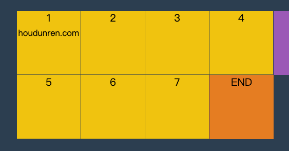
<head>
    <meta charset="UTF-8">
    <meta name="viewport" content="width=device-width, initial-scale=1.0">
    <title>厚道人</title>
    <style>
        * {
            padding: 0;
            margin: 0;
        }

        body {
            width: 100vw;
            height: 100vh;
            background: #2c3e50;
            display: grid;
            /* justify-content: center;
            align-content: center; */
        }

        main {
            justify-self: center;
            align-self: center;
            width: 400px;
            height: 200px;
            display: grid;
            grid-template: repeat(2, 1fr)/repeat(4, 1fr);
        }

        div {
            background: #f1c40f;
            text-align: center;
            position: relative;
            border-right: solid 1px #2c3e50;
            border-bottom: solid 1px #2c3e50;
            box-sizing: border-box;
        }

        div:nth-child(5)::before {
            content: 'END';
            position: absolute;
            width: 100px;
            height: 100px;
            background: #e67e22;
            left: 0;
            animation-name: move;
            animation-duration: 2s;
            z-index: 2;
            animation-timing-function: steps(4, end);
            animation-iteration-count: infinite;
        }

        div:nth-child(1)::after {
            content: 'START';
            position: absolute;
            width: 100px;
            height: 100px;
            background: #9b59b6;
            animation-name: move;
            animation-duration: 2s;
            animation-timing-function: steps(4, start);
            animation-iteration-count: infinite;
            z-index: 2;
            left: 0;
            top: 0;
        }

        @keyframes move {
            to {
                transform: translateX(400px);
            }
        }
    </style>
</head>

<body>
    <main>
        <div>1 <small>houdunren.com</small></div>
        <div>2</div>
        <div>3</div>
        <div>4</div>
        <div>5</div>
        <div>6</div>
        <div>7</div>
        <div>8</div>
    </main>
</body>
#step-start
step-start 效果等于 steps(1,start) ,step-end 效果等同于 steps(1,end)。
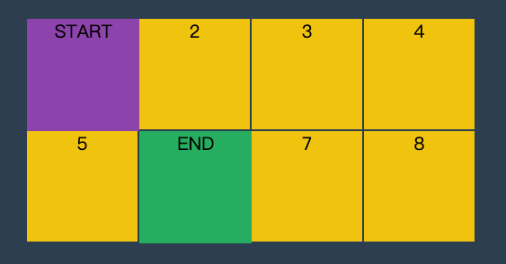
<head>
    <meta charset="UTF-8">
    <meta name="viewport" content="width=device-width, initial-scale=1.0">
    <title>厚道人</title>
    <style>
        * {
            padding: 0;
            margin: 0;
        }

        body {
            width: 100vw;
            height: 100vh;
            background: #2c3e50;
            display: grid;
        }

        main {
            align-self: center;
            justify-self: center;
            width: 400px;
            height: 200px;
            display: grid;
            grid-template: repeat(2, 1fr)/repeat(4, 1fr);
        }

        div {
            text-align: center;
            background: #f1c40f;
            border: solid 1px #2c3e50;
            box-sizing: border-box;
            position: relative;
        }

        div:nth-child(1)::before,
        div:nth-child(5)::before {
            animation-name: hd;
            animation-iteration-count: infinite;
            animation-duration: .5s;
            z-index: 2;
        }

        div:nth-child(1)::before {
            content: 'START';
            width: 100px;
            height: 100px;
            background: #8e44ad;
            position: absolute;
            left: 0;
            top: 0;
            animation-timing-function: step-start;
        }

        div:nth-child(5)::before {
            content: 'END';
            width: 100px;
            height: 100px;
            background: #27ae60;
            position: absolute;
            left: 0;
            top: 0;
            animation-timing-function: step-end;
        }

        @keyframes hd {
            50% {
                transform: translateX(100px);
            }

            to {
                transform: translateX(0px);
            }
        }
    </style>
</head>

<body>
    <main>
        <div>1</div>
        <div>2</div>
        <div>3</div>
        <div>4</div>
        <div>5</div>
        <div>6</div>
        <div>7</div>
        <div>8</div>
    </main>
</body>
#播放状态
使用 animation-play-state 可以控制动画的暂停与运行。
| 选项 | 说明 |
|---|---|
| paused | 暂停 |
| running | 运行 |
#幻灯片
下面是使用无 JS 脚本参与的图片轮换效果,图片切换使用steps 步进与animation-play-state播放状态技术。
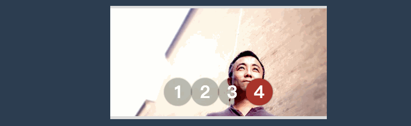
<head>
    <link rel="stylesheet" href="https://maxcdn.bootstrapcdn.com/font-awesome/4.7.0/css/font-awesome.min.css">
    <script src='https://code.jquery.com/jquery-3.3.1.slim.min.js'></script>
    <style>
        * {
            padding: 0;
            margin: 0;
        }

        body {
            width: 100vw;
            height: 100vh;
            display: flex;
            justify-content: center;
            align-items: center;
            background: #2c3e50;
        }

        main {
            width: 400px;
            border: solid 5px #ddd;
            border-width: 5px 0 5px 0;
            overflow: hidden;
            position: relative;
        }

        main:hover section {
            animation-play-state: paused;
        }

        main:hover ul::before {
            animation-play-state: paused;
        }

        section {
            width: 1600px;
            height: 200px;
            display: flex;
            flex-direction: row;
            animation-name: slide;
            animation-duration: 4s;
            animation-iteration-count: infinite;
            animation-timing-function: steps(4, end);
        }

        section div {
            width: 400px;
            height: 200px;
            overflow: hidden;
        }

        section div img {
            width: 100%;
        }

        ul {
            width: 200px;
            position: absolute;
            list-style: none;
            display: flex;
            justify-content: center;
            align-items: center;
            z-index: 3;
            bottom: 20px;
            left: 50%;
            transform: translateX(-50%);
        }

        ul li {
            font-size: 2em;
            font-weight: bold;
            color: white;
            width: 50px;
            height: 50px;
            border-radius: 50%;
            border: solid 3px transparent;
            box-sizing: border-box;
            display: flex;
            justify-content: center;
            align-items: center;
            z-index: 2;
            background: rgba(0, 0, 0, .3);
            box-shadow: 0 0 3px rgba(0, 0, 0, 1);
        }

        ul::before {
            content: '';
            width: 50px;
            height: 50px;
            border-radius: 50%;
            position: absolute;
            background: #e74c3c;
            left: 0;
            animation-name: num;
            animation-duration: 4s;
            animation-iteration-count: infinite;
            animation-timing-function: steps(4, end);
            z-index: 1;
        }

        @keyframes slide {
            from {
                transform: translateX(0px);
            }

            to {
                transform: translateX(-100%);
            }
        }

        @keyframes num {
            100% {
                transform: translateX(200px);
            }
        }
    </style>
</head>

<body>
    <main>
        <section>
            <div>
                <img src="1.jpg" alt="">
            </div>
            <div>
                <img src="2.jpg" alt="">
            </div>
            <div>
                <img src="3.jpg" alt="">
            </div>
            <div>
                <img src="5.jpg" alt="">
            </div>
        </section>
        <ul>
            <li>1</li>
            <li>2</li>
            <li>3</li>
            <li>4</li>
        </ul>
    </main>
</body>
#填充模式
animation-fill-mode 用于定义动画播放结束后的处理模式,是回到原来状态还是停止在动画结束状态。
| 选项 | 说明 |
|---|---|
| none | 需要等延迟结束,起始帧属性才应用 |
| backwards | 动画效果在起始帧,不等延迟结束 |
| forwards | 结束后停留动画的最后一帧 |
| both | 包含 backwards 与 forwards 规则,即动画效果在起始帧,不等延迟结束,并且在结束后停止在最后一帧 |
#效果对比
<head>
    <style>
        * {
            padding: 0;
            margin: 0;
        }

        body {
            width: 100vw;
            height: 100vh;
            background: #34495e;
            display: flex;
            flex-direction: column;
            justify-content: center;
            align-items: center;
        }

        ul {
            display: flex;
            justify-content: center;
            align-items: center;
        }

        li {
            list-style: none;
            width: 200px;
            height: 200px;
            background: #ecf0f1;
            border-radius: 50%;
            animation-name: hd;
            animation-delay: 2s;
            animation-duration: 2s;
            text-align: center;
            font-size: 2em;
            line-height: 200px;
            margin: 10px;
        }

        li:nth-child(1) {
            animation-fill-mode: none;
        }

        li:nth-child(2) {
            animation-fill-mode: backwards;
        }

        li:nth-child(3) {
            animation-fill-mode: forwards;
        }

        li:nth-child(4) {
            animation-fill-mode: both;
        }

        @keyframes hd {
            0% {
                border-radius: 0;
                background: #9b59b6;
            }

            100% {
                border-radius: 50%;
                background: #e74c3c;
            }
        }
    </style>
</head>

<body>
    <ul>
        <li>none</li>
        <li>backwards</li>
        <li>forwards</li>
        <li>both</li>
    </ul>
    <h2>houdunren.com</h2>
</body>
#组合定义
和 CSS 中的其他属性一样,可以使用animation组合定义帧动画。animation 属性是一个简写属性,用于设置六个动画属性:
- animation-name
- animation-duration
- animation-timing-function
- animation-delay
- animation-iteration-count
- animation-direction
必须存在 animation-duration属性,否则过渡时间为 0 没有动画效果。
媒体查询
Media Queries 能在不同的条件下使用不同的样式,使页面在不同在终端设备下达到不同的渲染效果。
#viewport
手机是在电脑后出现的,早期网页设置没有考虑到手机的存在。把一个电脑端访问的网页拿到手机上浏览,我们需要告诉手机该怎么做。
我们不能让手机浏览器使用 PC 端的分辨率来展示网页,这会让高分辨率的手机上造成文字过小。
使用 viewport 可以将手机物理分辨率合理转为浏览器分辨率。
viewport 是虚拟窗口,虚拟窗口大于手机的屏幕尺寸。手机端浏览器将网页放在这个大的虚拟窗口中,我们就可以通过拖动屏幕看到网页的其他部分。
但有时需要控制 viewport 虚拟窗口的尺寸或初始的大小,比如希望 viewport 完全和屏幕尺寸一样宽。就需要学习 viewport 的知识了。
#媒体设备
下面是常用媒体类型,当然主要使用的还是 screen
| 选项 | 说明 |
|---|---|
| all | 所有媒体类型 |
| screen | 用于电脑屏幕,平板电脑,智能手机等 |
| 打印设备 | |
| speech | 应用于屏幕阅读器等发声设备 |
注:tty, tv, projection, handheld, braille, embossed, aural 设备类型已经被废弃
- 可以使用 link 与 style 中定义媒体查询
- 也可以使用
@import url(screen.css) screen形式媒体使用的样式 - 可以用逗号分隔同时支持多个媒体设备
- 未指定媒体设备时等同于 all
#style
下面是在屏幕显示与打印设备上不同的 CSS 效果
<head>
    <meta charset="UTF-8">
    <meta name="viewport" content="width=device-width, initial-scale=1.0">
    <title>厚道人</title>
    <style media="screen">
        h1 {
            font-size: 3em;
            color: blue;
        }
    </style>
    <style media="print">
        h1 {
            font-size: 8em;
            color: red;
        }

        h2,
        hr {
            display: none;
        }
    </style>
</head>

<body>
    <h1>houdunren.com</h1>
    <hr>
    <h2>厚道人</h2>
</body>
#link
在 link 标签中通过 media 属性可以设置样式使用的媒体设备。
common.css没有指定媒体所以全局应用screen.css应用在屏幕设备print.css应用在打印设备
<head>
    <meta charset="UTF-8">
    <meta name="viewport" content="width=device-width, initial-scale=1.0">
    <title>厚道人</title>
    <link rel="stylesheet" href="common.css">
    <link rel="stylesheet" href="screen.css" media="screen">
    <link rel="stylesheet" href="print.css" media="print">
</head>

<body>
    <h1>houdunren.com</h1>
    <hr>
    <h2>厚道人</h2>
</body>
common.css
h1 {
  outline: solid 5px #e74c3c;
}
screen.css
h1 {
  font-size: 3em;
  color: blue;
}
print.css
h1 {
  font-size: 8em;
  color: red;
}

h2,
hr {
  display: none;
}
可以在 CSS 文件中使用 @media 再定义媒体样式
#@import
使用@import 可以引入指定设备的样式规则。文件中引入一个样式文件,在这个文件中再引入其他媒体的样式文件。
<link rel="stylesheet" href="style.css">
style.css
@import url(screen.css) screen;
@import url(print.css) print;
具体的 screen.css 与 print.css 与上面介绍的一样,在这里就不重复罗列了
#@media
可以使用 @media 做到更细的控制,即在一个样式表中为多个媒体设备定义样式。
<head>
    <meta charset="UTF-8">
    <meta name="viewport" content="width=device-width, initial-scale=1.0">
    <title>厚道人</title>
    <style>
        @media screen {
            h1 {
                font-size: 3em;
                color: blue;
            }
        }

        @media print {
            h1 {
                font-size: 8em;
                color: red;
            }

            h2,
            hr {
                display: none;
            }
        }
    </style>
</head>

<body>
    <h1>houdunren.com</h1>
    <hr>
    <h2>厚道人</h2>
</body>
#多设备支持
可以用逗号分隔同时支持多个媒体设备。
@import url(screen.css) screen, print;

<link rel="stylesheet" href="screen.css" media="screen,print" > @media screen,
print {
  ...;
}
#设备方向
使用 orientation 属性可以定义设备的方向
| 值 | 说明 |
|---|---|
| portrait | 竖屏设备即高度大于宽度 |
| landscape | 横屏设备即宽度大于高度 |
下面是尺寸小于 768px 或是横屏时使用蓝色字体
<style media="screen and (min-width: 768px),screen and (orientation:landscape)">
  body {
    color: blue;
  }
</style>
<h1>baidu</h1>
#查询条件
可以使用不同条件限制使用的样式
- 条件表达式需要放在扩号中
#逻辑与
需要满足多个条件时才使用样式,多个条件使用and 连接。下例中满足以下要求才使用样式。
- 横屏显示
- 宽度不能超过 600px
<head>
    <meta charset="UTF-8">
    <meta name="viewport" content="width=device-width, initial-scale=1.0">
    <title>厚道人</title>
    <style>
        @media screen and (orientation: landscape) and (max-width: 600px) {
            body {
                background: #8e44ad;
            }

            h1 {
                font-size: 3em;
                color: white;
            }
        }
    </style>
</head>

<body>
    <h1>houdunren.com</h1>
</body>
#逻辑或
多个或 条件查询使用逗号连接,不像其他程序中使用 or 语法。
下面的示例中如果设备是横屏显示或宽度不超 600px 时就使用样式规则。
<head>
    <meta charset="UTF-8">
    <meta name="viewport" content="width=device-width, initial-scale=1.0">
    <title>厚道人</title>
    <style>
        @media screen and (orientation: landscape),
        screen and (max-width: 600px) {
            body {
                background: #8e44ad;
            }

            h1 {
                font-size: 3em;
                color: white;
            }
        }
    </style>
</head>

<body>
    <h1>houdunren.com</h1>
</body>
#不应用
not 表示不应用样式,即所有条件都满足时不应用样式。
- 必须将 not 写在查询的最前面
<head>
    <meta charset="UTF-8">
    <meta name="viewport" content="width=device-width, initial-scale=1.0">
    <title>厚道人</title>
    <style>
        @media not screen and (orientation: landscape) and (max-width:600px) {
            body {
                background: #8e44ad;
            }

            h1 {
                font-size: 3em;
                color: white;
            }
        }
    </style>
</head>

<body>
    <h1>houdunren.com</h1>
</body>
#only
用来排除不支持媒体查询的浏览器。
- 对支持媒体查询的设备,正常调用样式,此时就当 only 不存在
- 对不支持媒体查询的设备不使用样式
- only 和 not 一样只能出现在媒体查询的开始
@media only screen and (orientation: landscape) and (max-width: 600px) {
  ...;
}
#查询特性
根据查询特性筛选出使用样式的设备。
#常用特性
下面列出常用的媒体查询特性
| 特性 | 说明 | | ---------------------- | -------- | ----------------------------- | | orientation: landscape | portrait | landscape 横屏,portrait 竖屏 | | width | 设备宽度 | | height | 设备高度 | | min-width | 最小宽度 | | max-width | 最大宽度 | | min-height | 最小高度 | | max-height | 最大高度 |
#使用示例
在设备宽度为 568px 时使用样式
@media only screen and (width: 568px) {
  ...;
}
在设备不小于 569px 时使用样式
@media only screen and (min-width: 569px) {
  ...;
}
橫屏设备并且宽度大于 569px 时使用样式
@media only screen and (orientation: landscape) and (min-width: 569px) {
  ...;
}
#实战案例
请在版本库查看 https://gitee.com/houdunren/code/tree/master/video/css/media/hd
响应计算
通过本章的学习来掌握开发中针对不同尺寸设备的响应式处理。
#viewport
移动端浏览器将网页放置在虚拟的 viewport 中,不同手机分辨率对视口进行缩放即可全屏显示内容。不同浏览器定义的 viewport 尺寸不同。
#视口概念
所以 viewport 也可以理解为屏幕有多少像素来显示内容,这和电脑端是不同的。
- 电脑端是显示器的多大分辨率多少就用多少像素来显示
- 移动端是 viewport 分辨率多少就用多少像素来显示
- viewport 是可以改变的,就像显示器的分辨率可以改变一样
#查看尺寸
主流浏览器的默认 viewport 大小(因为浏览器间不统一,所以也没有必要关注下面的尺寸,只做为了解就行)
| 浏览器 | 尺寸 |
|---|---|
| Safari iPhone | 980px |
| Opera | 850px |
| Android WebKit | 800px |
| IE | 974px |
可以在控制台查看到 viewport 大小
<!DOCTYPE html>
<html lang="en">
  <head>
    <meta charset="UTF-8" />
  </head>
  <body>
      厚道人十年来我们录制了大量制作精良的课程,并且依然在不段迭代更新中,首先感谢老朋友们十年来的支持,也欢迎新朋友们观看我们的视频教程。
  </body>
</html>
在浏览器打开上面网页,并通过控制台查看结果如下
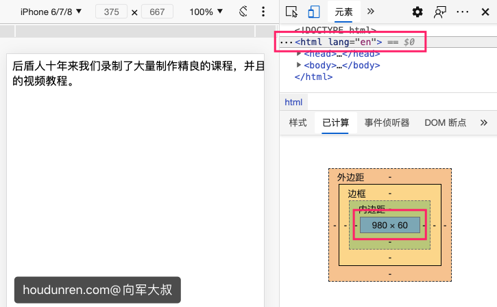
#改变视口
使用<meta name="viewport" content="width=2000px" />可以调整视口,这有点像设置相同尺寸桌面显示不同的分辨率。
下面是将视口定义为 2000 与 300 的差别,这类似于同样 27 寸分辨率下 4K 与 1080 显示的区别。
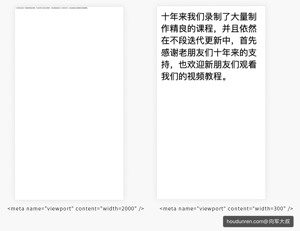
#媒体查询
@media 是根据分辨率来响应式布局的,所以 viewport 尺寸的不同将影响媒体查询的使用。
下面代码用于在分辨率小于 500px 时更改内容颜色,但是因为没有设置 viewport,而使用浏览器默认的视口,这会造成在手机上无法进行响应操作,因为 viewport 尺寸大于 500px。
<!DOCTYPE html>
<html lang="en">
  <head>
    <meta charset="UTF-8" />
  </head>
  <body>
    <style>
      @media (max-width: 500px) {
        body {
          color: red;
        }
      }
    </style>
    厚道人十年来我们录制了大量制作精良的课程,并且依然在不段迭代更新中,首先感谢老朋友们十年来的支持,也欢迎新朋友们观看我们的视频教程。
  </body>
</html>
面当我们设置好 viewport 后就可以进行响应处理了,下面是将 viewport 设置为 500px
<meta name="viewport" content="width=500"/>
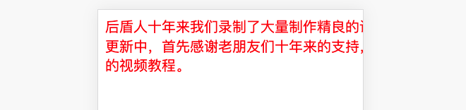
#设备尺寸
像上面通过人为设置像素值,显示是不可取的。如果响应布局当然希望 viewport 与设备尺寸一至,可喜的是,系统为我们提供了device-width变量值用于识别设备宽度。
<meta name="viewport" content="width=device-width" />
#其他属性
下面介绍其他可用在 meta 标签上的属性
| 属性 | 说明 |
|---|---|
| initial-scale=1 | 初始缩放比例 |
| minimum-scale=.5 | 允许用户最小缩放比例 |
| _maximum-scale_=2.5 | 允许用户最大缩放比例 |
| user-scalable=yes | 是否允许用户绽放 |
mac 用户在 chrome 中使用 option+shift+鼠标按住移动进行缩放
#JS 延迟
设置 user-scalable=no 时可以 js 解决 300 延迟的问题,你也可以理解为当设置 user-scalable=yes 时,系统要识别两只手指,所以要有个宽容时间。
<!DOCTYPE html>
<html lang="en">
  <head>
    <meta charset="UTF-8" />
    <meta name="viewport" content="width=device-width, initial-scale=1.0,user-scalable=yes" />
  </head>
  <body>
    <style>
      body {
        width: 100vw;
        height: 100vh;
      }
    </style>
    <script>
      let i = 1
      document.body.addEventListener('click', () => console.log(i++))
    </script>
  </body>
</html>
#rem/em
em 理解为继承(相对)单位,它需要一个参考的继承属性。
#em
我们知道字体大小是可以继承的,我们对下面例子进行说明
- span 没有设置字体大小,将继续父级 article 标签定义的大小 15px
- strong 定义了 2em 字体大小,因为使用了 em 单位即是父级 15px X 2=30px
可以通过 edge 或 chrome 浏览器调试工具的已计算标签查看
<style>
  article {
    font-size: 15px;
  }
  strong {
    font-size: 2em;
  }
</style>

<article>
  <span>houdunren.com</span>
  <strong>厚道人</strong>
</article>
#多级继承
下面代码是多层次的嵌套,如果使用 em 单位定义 font-size 会向上一直查找定义了 font-size 的父级来进行计算。直到找到 html 标签为止。
所以下面的 strong 定义的 2em 计算结果依然是 30px 即 article 标签的 font-size:15px 乘以 2。
<style>
  article {
    font-size: 15px;
  }
  strong {
    font-size: 2em;
  }
</style>

<article>
  <div>
    <span>houdunren.com</span>
    <strong>厚道人</strong>
  </div>
</article>
#padding/margin
font-size 本身是可以继承的,所以 em 参考父级元素定义的 font-size。但 padding/margin 在 CSS 中不会继承父级定义的 padding/margin。
如果 padding/margin 使用 em 单位将参考本元素的 font-size。
下面示例中最终 strong 标签的 padding 与 margin 都是 60px,因为定义了 2em 所以最终结果为当前标签的 font-size*2
<style>
  article {
    font-size: 15px;
  }
  strong {
    font-size: 2em;
    padding: 2em;
    margin: 2em;
  }
</style>

<article>
  <div>
    <span>houdunren.com</span>
    <strong>厚道人</strong>
  </div>
</article>
#rem
rem 本向也有 em 的特性即参考继承,只不过它只参考根元素(root)即 html 标签定义的 font-size。我们来通过下面的示例详细说明。
- 为 html 标签定义了 font-size:30px,页面中使用 rem 单位的元素将 30px 为参考,即 1rem=30px
- span 标签使用了 font-size:2em,会参考父级 article 定义的 font-size,最后计算结果为 font-size:30px
- strong 标签定义了 font-size:2rem,会参考 html 标签的 font-size,最后计算结果为 60px
- strong 标签定义了 padding:2rem,计算结果也是 60px
- strong 标签定义了 margin:2em,将会参考本身元素的 font-size,上面已经说明 strong 的 font-size 为 60px,所以最终 margin 结果为 120px
<style>
  html {
    font-size: 30px;
  }
  article {
    font-size: 15px;
  }
  span {
    font-size: 2em;
  }
  strong {
    display: block;
    font-size: 2rem;
    padding: 2rem;
    margin: 2em;
  }
</style>

<article>
  <div>
    <span>houdunren.com</span>
    <strong>厚道人</strong>
  </div>
</article>
#使用建议
em 与 rem 都是不错的响应单位,根据需要进行选择。em 具有继承特性,rem 的参考元素是唯一 HTML,所以 rem 操作简单。em 继承关系会相对复杂。
布局上的 margin/padding 使用 rem 是不错的选择,字体大小等使用 em 与 rem 都可以。
#尺寸响应
#问题分析
下面是尺寸为 375x600 的设计稿,绿色区域为 200px 红色为 175px 宽度
使用固定像素定义时在 iphone6 与 iphon6 plus 中的显示效果并不相同
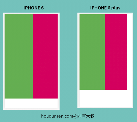
实例代码
<!DOCTYPE html>
<html lang="en">
  <head>
    <meta charset="UTF-8" />
    <meta name="viewport" content="width=device-width, initial-scale=1.0" />
    <link rel="stylesheet" href="https://cdnjs.cloudflare.com/ajax/libs/meyer-reset/2.0/reset.min.css" />
  </head>
  <body>
    <div class="left"></div>
    <div class="right"></div>
  </body>
  <style>
    div {
      height: 600px;
    }
    .left {
      width: 200px;
      background: #76ba65;
      float: left;
    }
    .right {
      width: 175px;
      background: #df0f71;
      float: left;
    }
  </style>
</html>
#自动响应
实际操作中不同设备只能取宽或高一个尺寸为响应处理,一般情况下我们取宽度响应,高度自动处理。小尺寸时高度产生垂直滚动条,这并不影响什么。
计算公式
使用 rem 单位来处理响应,因为改变 rem 单位会影响所有使用 rem 的元素,这确实非常的方便。
- rem 是在根元素中定义的 font-size
- rem 用来在多个设备响应处理时使用
- html 元素也可以使用:root 选择器选择
下面展示的设计稿为 375px 宽,下面公式表示 1px 所占的屏幕尺寸宽度,有以下几点需要说明
- 100vw 表示 100%视口宽度
- 因为使用了 vw 宽度系统会根据不同设备自动计算 rem
:root {
  font-size: calc(100vw / 375);
}
完整代码如下
<!DOCTYPE html>
<html lang="en">
  <head>
    <meta charset="UTF-8" />
    <meta name="viewport" content="width=device-width, initial-scale=1.0" />
    <title>houdunren.com</title>
    <link rel="stylesheet" href="https://cdnjs.cloudflare.com/ajax/libs/meyer-reset/2.0/reset.min.css" />
  </head>
  <body>
    <div class="left"></div>
    <div class="right"></div>
  </body>
  <style>
    :root {
      font-size: calc(100vw / 375);
    }
    div {
      height: 600rem;
    }
    .left {
      width: 200rem;
      background: #76ba65;
      float: left;
    }
    .right {
      width: 175px;
      background: #df0f71;
      float: left;
    }
  </style>
</html>
现在使用不同设备时宽度已经自动可以响应设置了
字体图标
网站开发中会使用非常多的小图标,以往使用 png 图来完成,但不方便设置图标颜色、大小等操作。而使用失量的图标字体可以很好的解决这个问题。
常用失量字体
#阿里图标
iconfont 提供了丰富的图标库,也允许个人上传分享图标,非常复合中文视觉体验。
首先登录图标库网站 https://www.iconfont.cn(opens new window)
#添加图标
然后通过关键词搜索图标,并添加到购物车或收藏夹中
将购物车中的图标添加到项目
#使用图标
点击顶部菜单 图标管理>我的项目
- 首先生成网页 css 代码,然后复制到网页代码中
<link rel="stylesheet" href="//at.alicdn.com/t/font_3434ycaug24x9.css" />
- 在项目中复制代码链接
- 网站中按以下格式使用
<i class="iconfont icongongzhonghao"></i>
#fontawesome
fontawesome (opens new window)图标库是使用非常多的免费图标库
- 首先推荐在编辑器中安装插件实现代码提示
在页面中引入链接
<link rel="stylesheet" href="https://cdnjs.cloudflare.com/ajax/libs/font-awesome/4.7.0/css/font-awesome.min.css" />
html 中使用方式如下
<i class="fa fa-user-circle-o" aria-hidden="true"></i>