css:盒子模型;背景样式;渐变;表格列表;浮动;定位;弹性盒;
盒子模型
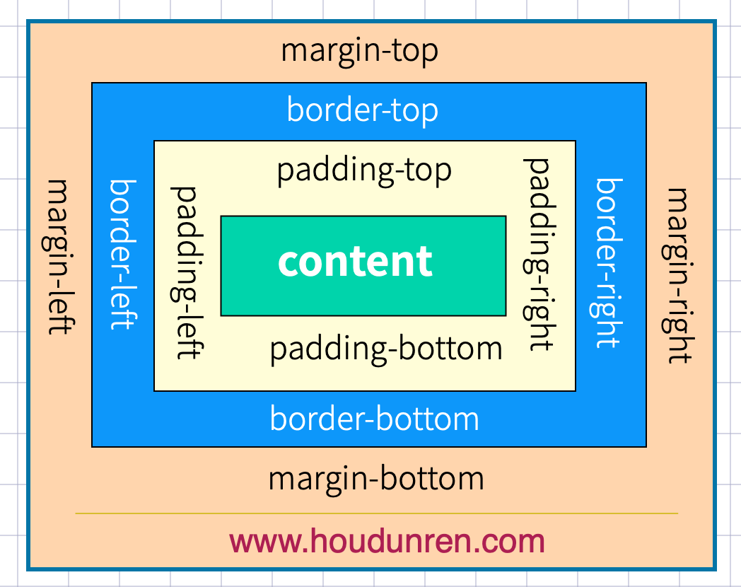
下而是基本使用示例
<style>
  a {
    display: inline-block;
    border: solid 1px #ddd;
    text-align: center;
    padding: 10px 20px;
    margin-right: 30px;
  }
</style>
...

<a href="">MYSQL</a>
<a href="">LINUX</a>
<a href="">PHP</a>
#外边距
#声明定义
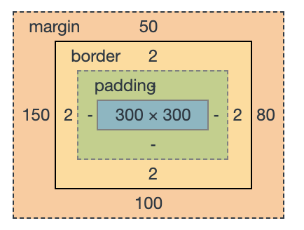
边距顺序依次为:上、右、下、左。
<style>
  main {
    border: solid 1px red;
    width: 500px;
    height: 500px;
    margin: 0 auto;
  }

  h2 {
    border: solid 2px green;
    width: 300px;
    height: 300px;
    margin: 50px 80px 100px 150px;
  }
</style>
...

<main>
<h2>houdunren.com</h2>
</main>
下例定义上下50px边距,左右80px边距
margin: 50px 80px;
下面将边距全部定义为 100px
margin: 100px;
#居中设置
margin 设置 auto 后,浏览器会自动
<style>
article {
    border: solid 1px red;
}

h2,h3 {
    border: solid 10px #ddd;
}

h2 {
  width: 300px;
  margin-left: 200px;
  margin-right: 200px;
}

h3 {
  width: 500px;
  margin-left: auto;/*左边剩余空间*/
  margin-right: auto;/*右边剩余空间*/
}
</style>
...

<article>
<h2>houdunren.com</h2>
<h3>hdcms.com</h3>
</article>
#负值设置
<style>
  main {
    border: solid 1px red;
    width: 300px;
    margin: 0 auto;
  }

  h2 {
    border: solid 2px green;
    margin-left: -50px;
    margin-right: -50px;
    text-align: center;
  }
</style>
...

<main>
    <h2>houdunren.com</h2>
</main>
#边距合并
相邻元素的纵向外边距会进行合并
<style>
    h2 {
    border: solid 2px green;
    margin-bottom: 20px;
  }

  h3 {
    border: solid 2px green;
    height: 20px;
  }
</style>
...

<h2>houdunren.com</h2>
<h2>hdcms.com</h2>
<h3></h3>
#内边距
内边距使用 padding 进行定义,使用语法与 margin 相似。
#基本使用
<style>
  a {
    padding: 10px 30px;
    border: solid 1px #ddd;
    border-radius: 5px;
  }

  a:hover {
    background: rgb(3, 78, 110);
    color: white;
  }
</style>
...

<a href="">MYSQL</a>
<a href="">CSS</a>
#BOX-SIZING
宽度与高度包括内边距与边框。
h2 {
  border: solid 10px #ddd;
  height: 60px;
  width: 200px;
  padding: 50px;
  box-sizing: border-box;
}
... <h2 > houdunren.com</h2 >;
#边框设计
#样式选择
| 类型 | 描述 |
|---|---|
| none | 定义无边框。 |
| dotted | 定义点状边框。在大多数浏览器中呈现为实线。 |
| dashed | 定义虚线。在大多数浏览器中呈现为实线。 |
| solid | 定义实线。 |
| double | 定义双线。双线的宽度等于 border-width 的值。 |
| groove | 定义 3D 凹槽边框。其效果取决于 border-color 的值。 |
| ridge | 定义 3D 垄状边框。其效果取决于 border-color 的值。 |
| inset | 定义 3D inset 边框。其效果取决于 border-color 的值。 |
| outset | 定义 3D outset 边框。其效果取决于 border-color 的值。 |
一次定义四个边
h2 {
  border-style: double;
}
样式顺序为上、右、下、左,可以分别进行定义
h2 {
  border-style: outset solid dotted double;
  border-width: 8px;
}
单独设置一边样式
| 规则 | 说明 |
|---|---|
| border-top-style | 顶边 |
| border-right-style | 右边 |
| border-bottom-style | 下边 |
| border-left-style | 左边 |
| border-style | 四边 |
h2 {
  border-top-style: double;
  border-width: 8px;
}
#边框宽度
边框可以通过以下规则来设置
| 规则 | 说明 |
|---|---|
| border-top-width | 顶边 |
| border-right-width | 右边 |
| border-bottom-width | 下边 |
| border-left-width | 左边 |
| border-width | 四边 |
#边框颜色
| 规则 | 说明 |
|---|---|
| border-top-color | 顶边 |
| border-right-color | 右边 |
| border-bottom-color | 下边 |
| border-left-color | 左边 |
| border-color | 四边 |
#简写规则
| 规则 | 说明 |
|---|---|
| border-top | 顶边 |
| border-right | 右边 |
| border-bottom | 下边 |
| border-left | 左边 |
| border | 四边 |
设置底部边框
border-bottom: solid 5px red;
#行元素边框
行元素也可以进行边框设置
em {
  border-bottom: solid 2px red;
}
#圆角边框
使用 border-radius 规则设置圆角,可以使用px | % 等单位。也支持四个边分别设置。
| 选项 | 说明 |
|---|---|
| border-top-left-radius | 上左 |
| border-top-right-radius | 上右 |
| border-bottom-left-radius | 下载 |
| border-bottom-right-radius | 下右 |
h2 {
  border-radius: 10px;
  border: solid 2px red;
}
通过边框绘制圆
div {
  width: 100px;
  height: 100px;
  border: solid 3px red;
  border-radius: 50%;
}
定义不同边
border-radius: 10px 30px 50px 100px;
行元素绘制圆角
em {
  border-radius: 50%;
  border-bottom: solid 2px red;
}
#轮廓线
元素在获取焦点时产生,并且轮廓线不占用空间。可以使用伪类 :focus 定义样式。
- 轮廓线显示在边框外面
- 轮廓线不影响页面布局
#线条样式
| 值 | 描述 |
|---|---|
| none | 默认。定义无轮廓。 |
| dotted | 定义点状的轮廓。 |
| dashed | 定义虚线轮廓。 |
| solid | 定义实线轮廓。 |
| double | 定义双线轮廓。双线的宽度等同于 outline-width 的值。 |
| groove | 定义 3D 凹槽轮廓。此效果取决于 outline-color 值。 |
| ridge | 定义 3D 凸槽轮廓。此效果取决于 outline-color 值。 |
| inset | 定义 3D 凹边轮廓。此效果取决于 outline-color 值。 |
| outset | 定义 3D 凸边轮廓。此效果取决于 outline-color 值。 |
outline-style: double;
#线宽设置
outline-width: 10px;
#线条颜色
outline-color: red;
#组合定义
outline: red solid 2px;
#表单轮廓线
表单默认具有轮廓线,但有时并不好看,使用以下样式规则去除。
input:focus {
  outline: none;
}
#DISPLAY
#控制显示隐藏
使用 display 控制元素的显示机制。
| 选项 | 说明 |
|---|---|
| none | 隐藏元素 |
| block | 显示为块元素 |
| inline | 显示为行元素,不能设置宽/高 |
| inline-block | 行级块元素,允许设置宽/高 f |
#行转块元素
a {
  border: solid 1px #ddd;
  display: block;
  margin-bottom: 5px;
}
...
  <a
  href=""
  > houdunren.com</a
  > <a
  href=""
  > houdunren.com</a
  > <a
  href=""
  > houdunren.com</a
  >;
#块转为行元素
ul > li {
  display: inline;
  padding: 5px 10px;
  border: solid 1px #ddd;
}

ul > li:hover {
  background: green;
  color: white;
  cursor: pointer;
}
...
  <ul
  > <li
  > hdcms.com</li
  > <li
  > houdunren.com</li
  > <li
  > 厚道人</li
  > </ul
  >;
#行级块使用
a {
  display: inline-block;
  width: 30%;
  height: 50px;
  border: solid 1px #ddd;
  text-align: center;
  line-height: 3em;
}
... <a href="" > MYSQL</a > <a href="" > LINUX</a > <a href="" > PHP</a >;
#VISIBILITY
控制元素的显示隐藏,在隐藏后空间位也保留。

<style>
    article {
    padding: 30px;
    border: solid 2px red;
    width: 200px;
  }
  article div {
    width: 100px;
    height: 100px;
    border: solid 2px red;
    padding: 20px;
  }
  article div:nth-of-type(1) {
    visibility: hidden;
  }
</style>

<article>
    <div></div>
    <div></div>
</article>
#溢出控制
#隐藏控制
| 选项 | 说明 |
|---|---|
| hidden | 溢出内容隐藏 |
| scroll | 显示滚动条(有些浏览器会一直显示,有些在滚动时显示) |
| auto | 根据内容自动处理滚动条 |
溢出隐藏
div {
  width: 400px;
  height: 100px;
  border: solid 2px #ddd;
  padding: 20px;
  overflow: hidden;
}
溢出产生滚动条
不同浏览器处理方式不同,有些直接显示出来,有些在滚动时才显示。
div {
  width: 400px;
  height: 100px;
  border: solid 2px #ddd;
  padding: 20px;
  overflow: scroll;
}
#文本溢出
单行文本溢出

div {
  width: 400px;
  height: 100px;
  border: solid 2px #ddd;
  padding: 20px;
  overflow: hidden;
  text-overflow: ellipsis;
  white-space: nowrap;
}
多行文本溢出控制
div {
  width: 200px;
  overflow: hidden;
  display: -webkit-box;
  -webkit-line-clamp: 3;
  -webkit-box-orient: vertical;
}
#尺寸定义
可以使用多种方式为元素设置宽、高尺寸。
| 选项 | 说明 |
|---|---|
| width | 宽度 |
| height | 高度 |
| min-width | 最小宽度 |
| min-height | 最小高度 |
| max-width | 最大宽度 |
| max-height | 最大高度 |
| fill-available | 撑满可用的空间 |
| fit-content | 根据内容适应尺寸 |
#min&max
正文中不希望图片太大造成溢出窗口,也不希望太小影响美观,使用以下代码可以做到约束。
<style>
    div {
    width: 600px;
    border: solid 2px #ddd;
    padding: 20px;
  }
  div img {
    min-width: 50%;
    max-width: 90%;
  }
</style>
#fill-available
在chrome 浏览器中使用前缀 -webkit 书写样式。
下面是行块元素可以撑满可用空间后的效果。

<head>
    <meta charset="UTF-8">
    <meta name="viewport" content="width=device-width, initial-scale=1.0">
    <style>
        * {
            padding: 0;
            margin: 0;
        }

        body {
            width: 100vw;
            height: 100vh;
            background: #2c3e50;
        }

        main {
            background: #9b59b6;
            height: 100px;
            padding: 20px;
            box-sizing: border-box;
        }

        span {
            background: #e67e22;
            display: inline-block;
            width: -webkit-fill-available;
            height: -webkit-fill-available;
        }
    </style>
</head>

<body>
    <main>
        <span>
            houdunren.com
        </span>
    </main>
</body>
#fit-content
下面是根据内容自动适应宽度,让元素居中显示的效果。

<head>
    <meta charset="UTF-8">
    <meta name="viewport" content="width=device-width, initial-scale=1.0">
    <style>
        * {
            padding: 0;
            margin: 0;
        }

        body {
            width: 100vw;
            height: 100vh;
            background: #2c3e50;
        }

        h2 {
            text-align: center;
            background: #f1c40f;
            width: fit-content;
            margin: auto;
        }
    </style>
</head>

<body>
    <h2>houdunren.com</h2>
</body>
#min-content
使用min-content 将容器尺寸按最小元素宽度设置。

<head>
    <meta charset="UTF-8">
    <meta name="viewport" content="width=device-width, initial-scale=1.0">
    <style>
        * {
            padding: 0;
            margin: 0;
        }

        body {
            width: 100vw;
            height: 100vh;
            background: #2c3e50;
        }

        main {
            width: min-content;
            margin: auto;
        }

        div {
            margin-bottom: 20px;
            background: #f1c40f;
            word-break: break-all;
            padding: 10px;
        }

        div:nth-child(1) {
            width: 100px;
        }
    </style>
</head>

<body>
    <main>
        <div>houdunren.com</div>
        <div>hdcms.com</div>
    </main>
</body>
#max-content
容器尺寸按子元素最大宽度设置。
<head>
    <meta charset="UTF-8">
    <meta name="viewport" content="width=device-width, initial-scale=1.0">
    <style>
        * {
            padding: 0;
            margin: 0;
        }

        body {
            width: 100vw;
            height: 100vh;
            background: #2c3e50;
        }

        main {
            width: max-content;
            margin: auto;
        }

        div {
            margin-bottom: 20px;
            background: #f1c40f;
            word-break: break-all;
            padding: 10px;
        }
    </style>
</head>

<body>
    <main>
        <div>在线视频教程学习网站。houdunren.com</div>
        <div>hdcms.com</div>
    </main>
</body>
背景样式
#背景颜色
背景颜色可以使用 rga | rgba | 十六进制 等颜色格式
<style>
  h2 {
        background-color: red;
  }
</style>
...

<h2>houdunren.com</h2>
#背景图片
可以使用 png| gif |jpeg 等图片做为背景使用
background-image: url(icon-s.jpg);
#背景裁切
| 选项 | 说明 |
|---|---|
| border-box | 包括边框 |
| padding-box | 不含边框,包括内边距 |
| content-box | 内容区域 |
background-clip: border-box;
#背景重复
用于设置背景重复的规则
| 选项 | 说明 |
|---|---|
| repeat | 水平、垂直重复 |
| repeat-x | 水平重复 |
| repeat-y | 垂直重复 |
| no-repeat | 不重复 |
| space | 背景图片对称均匀分布 |
background-repeat: repeat-y;
#背景滚动
用于设置在页面滚动时的图片处理方式
| 选项 | 说明 |
|---|---|
| scroll | 背景滚动 |
| fixed | 背景固定 |
background-attachment: fixed;
#背景位置
用于设置背景图片的水平、垂直定位。
| 选项 | 说明 |
|---|---|
| left | 左对齐 |
| right | 右对齐 |
| center | 居中对齐 |
| top | 顶端对齐 |
| bottom | 底部对齐 |
居中对齐
background-position: center;
或
background-position: 50% 50%;
水平居右,垂直居中
background-position: right center;
或
background-position: 100% 50%;
使用具体数值定义
background-position: 100px 100px;
也支持使用负值
background-position: -200px 100px;
#背景尺寸
| 选项 | 说明 |
|---|---|
| cover | 背景完全覆盖,可能会有背景溢出 |
| contain | 图片不溢出的放在容器中,可能会漏出部分区域 |
指定数值定义宽高尺寸
background-size: 50% 100%;
或
background-size: 200px 200px;
宽度固定高度自动
background-size: 50% auto;
#多个背景
后定义的背景置于底层
background-image: url(xj-small.png), url(bg.png);
多属性定义
background-image: url(xj-small.png), url(bg.png);
background-repeat: no-repeat;
background-position: top left, right bottom;
可以一次定义多个背景图片。
background: url(xj-small.png) left 50% no-repeat, url(bg.png) right 100%
    no-repeat red;
#组合设置
可以使用一条指令设置背景
background: red url(xj-small.png) no-repeat right 50% fixed;
#盒子阴影
可以使用 box-shadow 对盒子元素设置阴影,参数为 水平偏移,垂直偏移,模糊度,颜色 构成。

box-shadow: 10px 10px 5px rgba(100, 100, 100, 0.5);
#颜色渐变
#线性渐变
激变一般用在背景颜色中使用
background: linear-gradient(red, green);
渐变角度
background: linear-gradient(30deg, red, green);
向右渐变
background: linear-gradient(to right, red, green);
向左渐变
background: linear-gradient(to left, red, green);
左上渐变
background: linear-gradient(to top left, red, green);
右下渐变
background: linear-gradient(to right bottom, red, green);
设置多个颜色
background: linear-gradient(red, rgb(0, 0, 200), green, rgba(122, 211, 100, 0));
#径向渐变
设置渐变
background: radial-gradient(red, blue, green);
设置渐变宽度与高度
background: radial-gradient(100px 200px, red, blue, green);
左下渐变
background: radial-gradient(at bottom left, red, blue);
右下渐变
background: radial-gradient(at bottom right, red, blue);
左侧向中心渐变
background: radial-gradient(at center left, red, blue);
底部向中心渐变
background: radial-gradient(at 50% 100%, red, blue);
#标识位
颜色未指定标识时,颜色会平均分布。
红色与蓝色在 50%gc 60%间发生激变.

background: linear-gradient(45deg, red 50%, blue 0%);
标识位相同时将没有过渡效果

background: linear-gradient(45deg, red 0, red 50%, blue 50%);
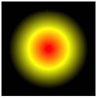
径向标识位绘制小太阳
width: 150px;
height: 150px;
background: radial-gradient(red 0, yellow 30%, black 60%, black 100%);
通过在两个颜色间中间点定义过渡位置
background: linear-gradient(45deg, red, 50%, blue);
###渐变重复
下例定义从 0 到 25 为蓝色,25px 到 50px 的红色,并进行重复后产生渐变的进度条。

background: repeating-linear-gradient(
  90deg,
  blue,
  25px,
  yellow 25px,
  25px,
  red 50px
);
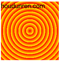
#径向重复
width: 200px;
height: 200px;
background: repeating-radial-gradient(
  100px 100px,
  red 0%,
  yellow 40%,
  black 60%,
  black 200%
);
表格
表格可以非常快速的部署数据,灵活控制表格样式是必要的。表格不能设置外边距。
#定制表格
除了使用 table 标签绘制表格外,也可以使用样式绘制。
| 样式规则 | 说明 |
|---|---|
| table | 对应 table |
| table-caption | 对应 caption |
| table-row | 对表 tr |
| table-row-group | 对应 tbody |
| table-header-group | 对应 thead |
| table-footer-group | 对应 tfoot |
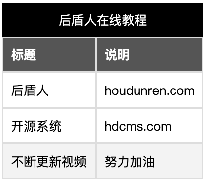
<style>
    .table {
    display: table;
    border: solid 1px #ddd;
  }

  .table nav {
    display: table-caption;
    text-align: center;
    background: black;
    color: white;
    padding: 10px;
  }

  .table section:nth-of-type(1) {
    font-weight: bold;
    display: table-header-group;
    background: #555;
    color: white;
  }

  .table section:nth-of-type(2) {
    display: table-row-group;
  }

  .table section:nth-of-type(3) {
    display: table-footer-group;
    background: #f3f3f3;
  }

  .table section ul {
    display: table-row;
  }

  .table section ul li {
    padding: 10px;
    display: table-cell;
    border: solid 1px #ddd;
  }
</style>

<article class="table">
        <nav>厚道人在线教程</nav>
        <section>
            <ul>
                <li>标题</li>
                <li>说明</li>
            </ul>
        </section>
        <section>
            <ul>
                <li>厚道人</li>
                <li>houdunren.com</li>
            </ul>
            <ul>
                <li>开源系统</li>
                <li>hdcms.com</li>
            </ul>
        </section>
        <section>
            <ul>
                <li>不断更新视频</li>
                <li>努力加油</li>
            </ul>
        </section>
</article>
#表格标题
通过 caption-side 可以设置标题位置,值可以设置为 top | bootom。
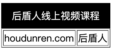
<style>
  table caption {
    background: black;
    color: white;
    padding: 10px;
    caption-side: top;
  }
</style>

<table border="1">
        <caption>厚道人线上视频课程</caption>
        <tr>
            <td>houdunren.com</td>
            <td>厚道人</td>
        </tr>
</table>
#内容对齐
水平对齐使用 text-align 文本对齐规则
<style>
    table tr td {
    height: 100px;
    text-align: center;
  }
</style>
垂直对齐使用 vertical-align 处理
| 属性 | 说明 |
|---|---|
| top | 顶对齐 |
| middle | 垂直居中 |
| bottom | 底部对齐 |
<style>
    table tr td {
    height: 100px;
    vertical-align: bottom;
    text-align: center;
  }
</style>
#颜色设置
为表格设置颜色与普通标签相似,可以为 table | thead | tbody | caption | tfoot| tr| td 设置颜色样式。
<style>
    table tr {
    color: white;
  }
  table tr:nth-child(odd) {
    background: red;
  }
  table tr td:nth-child(even) {
    background: #067db4;
  }
</style>
使用选择器设置表格隔行变色
<style>
        table thead tr {
            background: #118d68;
            color: #fff;
        }

        table tbody tr:nth-child(odd) {
            background: #1bb385;
            color: white;
        }
</style>
#边框间距
设置单元格间距,设置间距上下 10px ,左右 50px。
table {
  border-spacing: 50px 10px;
}
#边框合并
默认表格边框间是有间距的,以下示例将边框合并形成细线表格。

table {
  border-collapse: collapse;
}
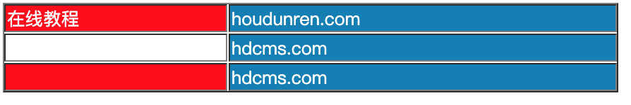
#隐藏单元格
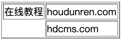
<style>
  table {
      empty-cells: hide;
  }
</style>
...

<table border="1">
        <tr>
            <td>在线教程</td>
            <td>houdunren.com</td>
        </tr>
        <tr>
            <td></td>
            <td>hdcms.com</td>
        </tr>
</table>
#无边框表格
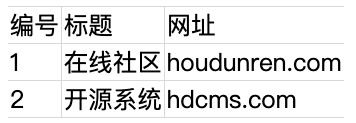
<style>
table {
border: none;
border-collapse: collapse;
}
table td {
border: none;
border-right: solid 1px #ddd;
border-bottom: solid 1px #ddd;
}
table tr:first-child td {
border-top: solid 1px #ddd;
}
table td:last-child {
border-right: none;
}
</style>
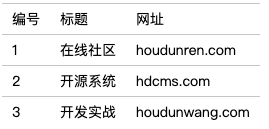
...
<table border="1">
<thead>
<tr>
<td>编号</td>
<td>标题</td>
<td>网址</td>
</tr>
</thead>
<tbody>
<tr>
<td>1</td>
<td>在线社区</td>
<td>houdunren.com</td>
</tr>
<tr>
<td>2</td>
<td>开源系统</td>
<td>hdcms.com</td>
</tr>
</tbody>
</table>
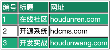
#数据表格
可以为表格元素使用伪类控制样式,下例中使用 hover 伪类样式
<style>
        table,
        td {
            border: none;
            font-size: 14px;
            border-collapse: collapse;
        }

        table tr:hover {
            background: #ddd;
            cursor: pointer;
        }

        table td {
            border-top: solid 1px #ccc;
            padding: 10px;
        }
</style>

<table border="1">
        <thead>
            <tr>
                <td>编号</td>
                <td>标题</td>
                <td>网址</td>
            </tr>
        </thead>
        <tbody>
            <tr>
                <td>1</td>
                <td>在线社区</td>
                <td>houdunren.com</td>
            </tr>
            <tr>
                <td>2</td>
                <td>开源系统</td>
                <td>hdcms.com</td>
            </tr>
            <tr>
                <td>3</td>
                <td>开发实战</td>
                <td>houdunwang.com</td>
            </tr>
</table>
#列表
#列表符号
使用 list-style-type 来设置列表样式,规则是继承的,所以在ul 标签上设置即可。
| 值 | 描述 |
|---|---|
| none | 无标记。 |
| disc | 默认。标记是实心圆。 |
| circle | 标记是空心圆。 |
| square | 标记是实心方块。 |
| decimal | 标记是数字。 |
| decimal-leading-zero | 0 开头的数字标记。(01, 02, 03, 等。) |
| lower-roman | 小写罗马数字(i, ii, iii, iv, v, 等。) |
| upper-roman | 大写罗马数字(I, II, III, IV, V, 等。) |
| lower-alpha | 小写英文字母 The marker is lower-alpha (a, b, c, d, e, 等。) |
| upper-alpha | 大写英文字母 The marker is upper-alpha (A, B, C, D, E, 等。) |
| lower-greek | 小写希腊字母(alpha, beta, gamma, 等。) |
| lower-latin | 小写拉丁字母(a, b, c, d, e, 等。) |
| upper-latin | 大写拉丁字母(A, B, C, D, E, 等。) |
| hebrew | 传统的希伯来编号方式 |
| armenian | 传统的亚美尼亚编号方式 |
| georgian | 传统的乔治亚编号方式(an, ban, gan, 等。) |
| cjk-ideographic | 简单的表意数字 |
| hiragana | 标记是:a, i, u, e, o, ka, ki, 等。(日文片假名) |
| katakana | 标记是:A, I, U, E, O, KA, KI, 等。(日文片假名) |
| hiragana-iroha | 标记是:i, ro, ha, ni, ho, he, to, 等。(日文片假名) |
| katakana-iroha | 标记是:I, RO, HA, NI, HO, HE, TO, 等。(日文片假名) |
隐藏列表符号
ul {
  list-style-type: none;
}
自定义列表样式
ul li {
  /* list-style-image: url(xj-small.png);
  list-style-image: radial-gradient(10px 10px, red, black); */

  list-style-image: linear-gradient(45deg, red, black);
}
#符号位置
控制符号显示在内容外面还是内部
| 选项 | 说明 |
|---|---|
| inside | 内部 |
| outside | 外部 |
ul {
  list-style-position: inside;
}
#组合定义
可以一次定义列表样式
ul {
  list-style: circle inside;
}
#背景符号
ul li {
  background: url(xj-small.png) no-repeat 0 6px;
  background-size: 10px 10px;
  list-style-position: inside;
  list-style: none;
  text-indent: 15px;
}
多图背景定义
<style>
        ul {
            list-style-type: none;
        }

        ul li {
            background-image: url(xj-small.png), url(houdunren.jpg);
            background-repeat: no-repeat, repeat;
            background-size: 10px 10px, 100%;
            background-position: 5px 7px, 0 0;
            text-indent: 20px;
            border-bottom: solid 1px #ddd;
            margin-bottom: 10px;
            padding-bottom: 5px;

        }
</style>
#追加内容
#基本使用
使用伪类 ::before 向前添加内容,使用 ::after 向后面添加内容。
a::after {
  content: " (坚持努力) ";
}
#提取属性
使用属性值添加内容,可以使用标准属性与自定义属性。
<style>
  a::after {
    content: attr(href);
  }
</style>

<a href="houdunren.com">厚道人</a>
通过属性值添加标签提示

a {
  position: relative;
}

a:hover {
  &::before {
    content: "URL: " attr(data-url);
    background: #555;
    color: white;
    position: absolute;
    top: 20px;
    padding: 3px 10px;
    border-radius: 10px;
  }
}
#自定义表单

{{<style>
    body {
        padding: 80px;
    }

    .field {
        position: relative;
    }

    input {
        border: none;
        outline: none;
    }

    .field::after {
        content: '';
        background: linear-gradient(to right, white, red, green, blue, white);
        height: 30px;
        position: relative;
        width: 100%;
        height: 1px;
        display: block;
        left: 0px;
        right: 0px;
    }

    .field:hover::before {
        content: attr(data-placeholder);
        position: absolute;
        top: -20px;
        left: 0px;
        color: #555;
        font-size: 12px;
    }
</style>

...
<div class="field" data-placeholder="请输入少于100字的标题">
    <input type="text" id="name">
</div>}}
浮动布局
float 属性定义元素在哪个方向浮动。以往这个属性总应用于图像,使文本围绕在图像周围,不过在 CSS 中,任何元素都可以浮动。浮动元素会生成一个块级框,而不论它本身是何种元素。
在网站开发中需要一行排列多个元素,使用浮动可以方便实现。下面是使用浮动排列多个元素
#FLOAT
使用浮动可以控制相邻元素间的排列关系。
| 选项 | 说明 |
|---|---|
| left | 向左浮动 |
| right | 向右浮动 |
| none | 不浮动 |
#文档流
没有设置浮动的块元素是独占一行的。

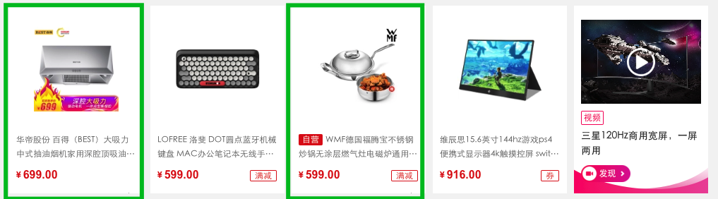
浮动是对后面元素的影响,下图中第二个元素设置浮动对第一个元素没有影响
div:first-of-type {
  border: solid 2px red;
}

div:last-of-type {
  float: left;
  background: green;
}
#丢失空间
如果只给第一个元素设置浮动,第二个元素不设置,后面的元素会占用第一个元素空间。

div:first-of-type {
  float: left;
  border: solid 2px red;
}

div:last-of-type {
  background: green;
}
#使用浮动
两个元素都设置浮动后,会并排显示

div:first-of-type {
  float: left;
  border: solid 2px red;
}

div:last-of-type {
  float: left;
  background: green;
}
为第二个元素设置右浮动时将移动到右边

div:first-of-type {
  float: left;
  border: solid 2px red;
}

div:last-of-type {
  float: right;
  background: green;
}
#浮动边界
浮动元素边界不能超过父元素的 padding

main {
  width: 400px;
  border: solid 2px black;
  overflow: auto;
  padding: 50px;
  background-color: antiquewhite;
  background-clip: content-box;
}

div {
  width: 100px;
  height: 100px;
  box-sizing: border-box;
}

div:first-of-type {
  float: left;
  border: solid 2px red;
}

div:last-of-type {
  float: right;
  background: green;
}
#浮动转块
元素浮动后会变为块元素包括行元素如 span,所以浮动后的元素可以设置宽高
a {
  float: left;
  width: 300px;
}
#清除浮动
不希望元素受浮动元素影响时,可以清除浮动。
#CLEAR
CSS 提供了 clear 规则用于清除元素浮动影响。
| 选项 | 说明 |
|---|---|
| left | 左边远离浮动元素 |
| right | 右连远离浮动元素 |
| both | 左右都远离浮动元素 |
使用清除浮动

<style>
    div {
    width: 200px;
    height: 200px;
    margin-bottom: 10px;
  }

  div.green {
      border: solid 2px green;
      float: left;
  }

  div.red {
      border: solid 2px red;
      float: right;
  }

  div.blue {
      background: blue;
      clear: both;
  }
</style>
...

<div class="green"></div>
<div class="red"></div>
<div class="blue"></div>
在父元素内部最后面添加一个没有高度的了元素,并使用clear:both 。
<style>
    .clearfix {
      clear: both;
      height: 0;
  }

  div {
      width: 200px;
      height: 200px;
      margin-bottom: 10px;
  }


  div.green {
      border: solid 2px green;
      float: left;
  }

  div.red {
      border: solid 2px red;
      height: 200px;
      float: left;
  }

  div.blue {
      background: blue;
  }
</style>

<article>
        <div class="green"></div>
        <div class="red"></div>
        <div class="clear"></div>
    </article>
    <div class="blue"></div>
#AFTER
使用 ::after 伪类为父元素添加后标签,实现清除浮动影响。
.clearfix::after {
  content: "";
  display: block;
  clear: both;
}
#OVERFLOW
子元素使用浮动后将不占用空间,这时父元素高度为将为零。通过添加父元素并设置 overflow 属性可以清除浮动。
将会使用父元素产生 BFC 机制,即父元素的高度计算会包括浮动元素的高度。
<style > article {
  overflow: hidden;
}
...;
#页面布局
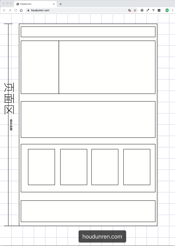
完成页面布局注意以下几点
- 首先根据设计稿确定页面大小(主要指宽度,移动端不需要考虑),如 1200px 宽度
- 水平分割页面主要区域
- 每个区域中按以上两步继续细分
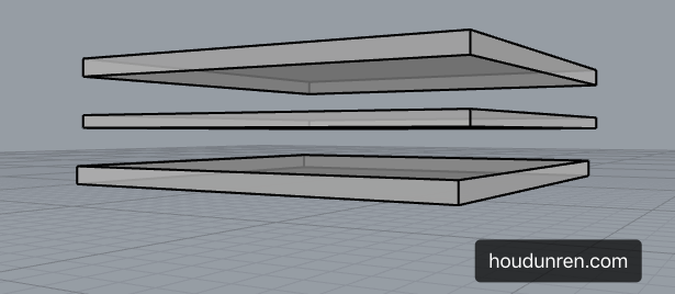
#父容器
一组浮动元素要放在一个父容器中,如下图绿线指父容器,里面的红线为浮动子元素。
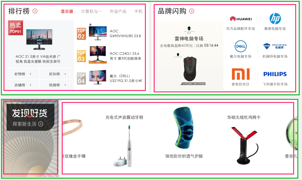
下面是上图的布局结构代码
<style>
    article {
      background: #f3f3f3;
      width: 1020px;
      height: auto;
      overflow: auto;
      padding: 20px;
  }

  article.hot section {
      background: #fff;
      box-shadow: 0 0 5px #777;
      height: 300px;
      width: 500px;
  }

  article.hot section:first-of-type {
      float: left;
  }

  article.hot section:last-of-type {
      float: right;
  }

  article.swiper section {
      height: 200px;
      background: #fff;
      box-shadow: 0 0 5px #777;
  }

  article.swiper section:first-of-type {
      width: 200px;
      float: left;
  }

  article.swiper section:last-of-type {
      width: 820px;
      float: left;
  }
</style>
...

 <article class="hot">
        <section></section>
        <section></section>
</article>
<article class="swiper">
        <section></section>
        <section></section>
</article>
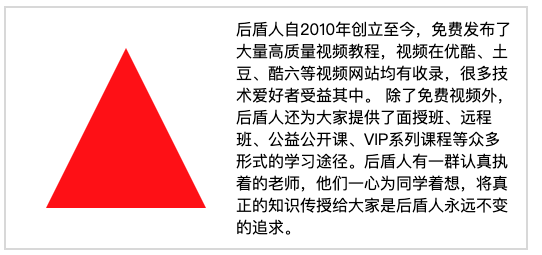
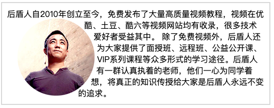
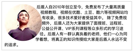
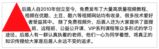
#形状浮动
通过形状浮动可以让内容围绕图片,类似于我们在 word 中的环绕排版。要求图片是有透明度的 PNG 格式。
#距离控制
| 选项 | 说明 |
|---|---|
| margin-box | 外边距环绕 |
| padding-box | 内边距环绕 |
| border-box | 边线环绕 |
| content-box | 内容环绕 |
外边距环绕
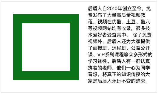
<style>
  span.shape {
      float: left;
      width: 100px;
      height: 100px;
      padding: 30px;
      margin: 30px;
      border: solid 30px green;
      shape-outside: margin-box;
  }
</style>
...


<p>
  <span class="shape"></span>
  厚道人自2010年创立至今,免费发布了大量高质量视频教程,视频在优酷、土豆、酷六等视频网站均有收录,很多技术爱好者受益其中。
  除了免费视频外,厚道人还为大家提供了面授班、远程班、公益公开课、VIP系列课程等众多形式的学习途径。厚道人有一群认真执着的老师,他们一心为同学着想,将真正的知识传授给大家是厚道人永远不变的追求。
</p>
边框环绕
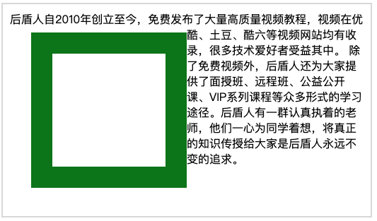
span.shape {
  float: left;
  width: 100px;
  height: 100px;
  padding: 30px;
  margin: 30px;
  border: solid 30px green;
  shape-outside: border-box;
}
#显示区域
| 选项 | 说明 |
|---|---|
| circle | 圆形 |
| ellipse | 椭圆 |
| polygon | 多边形 |
圆形
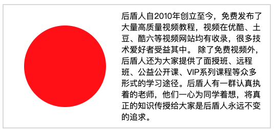
span.shape {
  float: left;
  width: 100px;
  height: 100px;
  padding: 30px;
  margin: 30px;
  background: red;
  clip-path: circle(50% at center);
}
椭圆
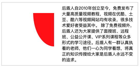
span.shape {
  float: left;
  width: 100px;
  height: 100px;
  padding: 30px;
  margin: 30px;
  background: red;
  clip-path: ellipse(50% 80% at 100% 0);
}
多边形
span.shape {
  float: left;
  width: 100px;
  height: 100px;
  padding: 30px;
  margin: 30px;
  background: red;
  clip-path: polygon(50% 0, 100% 100%, 0 100%);
}
#内移距离
使用 inset 属性控制环绕向内移动的距离。
span.shape {
  float: left;
  width: 100px;
  height: 100px;
  padding: 30px;
  margin: 30px;
  background: red;
  shape-outside: inset(50px 30px 80px 50px) padding-box;
}
#环绕模式
| 选项 | 说明 |
|---|---|
| circle | 圆形环绕 |
| ellipse | 椭圆环绕 |
| url | 图片环绕 |
| polygan | 多边环绕 |
圆形环绕
img {
  padding: 20px;
  float: left;
  shape-outside: circle(50%) padding-box;
}
椭圆环绕
img {
  padding: 20px;
  float: left;
  shape-outside: ellipse(80px 70px) padding-box;
}
图片环绕
img {
  float: left;
  shape-outside: url(xj.png);
}
多边环绕
span.shape {
  float: left;
  width: 100px;
  height: 100px;
  background: red;
  clip-path: polygon(50px 0px, 0 100px, 100px 100px);
  shape-outside: polygon(50px 0px, 0 100px, 100px 100px);
}
基础知识
定位的基本思想很简单,它允许你定义元素框相对于其正常位置应该出现的位置,或者相对于父元素、另一个元素甚至浏览器窗口本身的位置。
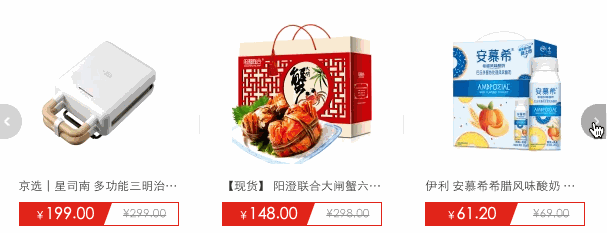
轮播图是典型的定位应用
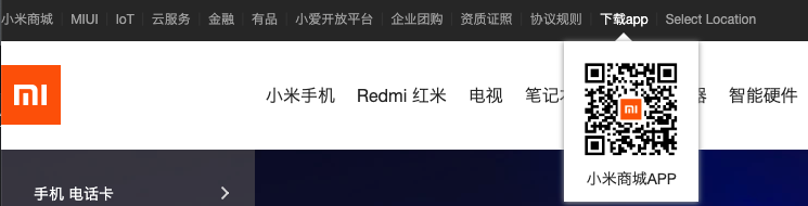
下面弹出的二维码也可以使用定位处理
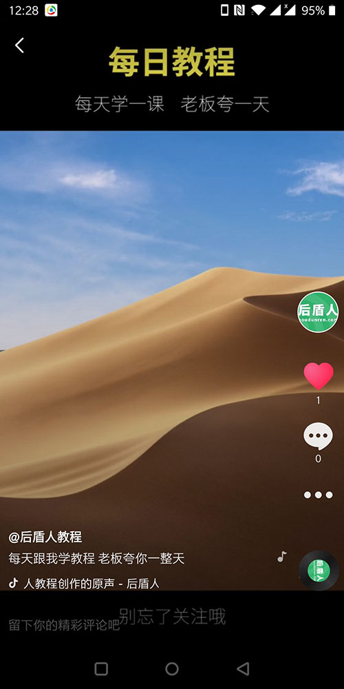
下面是抖音软件截图,如果布局类似的页面页面中的图标可以使用定位处理
#定位类型
| 选项 | 说明 |
|---|---|
| static | 默认形为,参考文档流 |
| relative | 相对定位 |
| absolute | 绝对定位 |
| fixed | 固定定位 |
| sticky | 粘性定位 |
#位置偏移
可以为部分类型的定位元素设置上、下、左、右 的位置偏移。
| 选项 | 说明 |
|---|---|
| top | 距离顶边 |
| bottom | 距离下边 |
| left | 距离左部 |
| right | 距离右边 |

<style>
  body {
    padding: 50px;
  }

  article {
      width: 300px;
      height: 200px;
      border: solid 6px blueviolet;
      margin: 20px;
  }

  div {
      font-size: 25px;
      background: #f2a67d;
      padding: 10px;
      position: absolute;
      top: 0;
  }
</style>
...

<article>
    <div>houdunren.com</div>
</article>
使用百分比单位时使用的是父级尺寸,比如下面的示例 left:100%会定位到最右边
<style>
  main {
    width: 200px;
    height: 200px;
    background: #1abc9c;
    position: relative;
  }
  main div {
    box-sizing: border-box;
    width: 200px;
    height: 200px;
    background-color: #f1c40f;
    background-clip: content-box;
    border: solid 1px #333;
    color: white;
    font-size: 2em;
    position: absolute;
    left:100%;
  }
</style>
<main>
  <div>hdcms.com</div>
</main>
#相对定位
相对定位是相对于元素原来的位置控制,当元素发生位置偏移时,原位置留白。
<style>
  body {
    padding: 50px;
  }
  article {
    width: 400px;
    height: 200px;
    border: solid 10px blueviolet;
    font-size: 14px;
    padding: 30px;
  }
  article img {
    width: 50px;
    position: relative;
    top: -20px;
  }

</style>
...

<article>
        <img src="xj.png" alt="">
        厚道人自2010年创立至今,免费发布了大量高质量视频教程,视频在优酷、土豆、酷六等视频网站均有收录,很多技术爱好者受益其中。除了免费视频外,厚道人还为大家提供了面授班、远程班、公益公开课、VIP系列课程等众多形式的学习途径。厚道人有一群认真执着的老师,他们一心为同学着想,将真正的知识传授给大家是厚道人永远不变的追求。
</article>
#绝对定位
绝对定义不受文档流影响,就像漂浮在页面中的精灵,绝对定位元素拥有行内块特性。
#参照元素
如果父级元素设置了 relative | fixed | sticky ,绝对定位子元素将参数此父元素进行定位。

<style>
    body {
    padding: 50px;
  }

  article {
      width: 400px;
      height: 100px;
      border: solid 6px blueviolet;
      position: relative;
  }

  div {
      font-size: 25px;
      background: #f2a67d;
      padding: 10px;
      position: absolute;
      top: 0;
      left: 0px;
  }
</style>
...

<article>
    <div>houdunren.com</div>
</article>
#默认位置
如果没有为定位元素设置偏移,将受父元素的 padding 等属性影响。但使用定位一般都会设置偏移位置。

body {
  padding: 50px;
}

article {
  width: 400px;
  height: 100px;
  border: solid 6px blueviolet;
  position: relative;
  padding: 20px;
}

div {
  background: #f2a67d;
  padding: 5px;
  position: absolute;
  top: 50px;
  left: 50px;
}
#设置尺寸
可以通过定位的偏移值设置元素的尺寸。

<style>
    body {
    padding: 50px;
  }
  article {
    width: 400px;
    height: 100px;
    border: solid 6px blueviolet;
    position: relative;
  }
  div {
    font-size: 25px;
    background: #f2a67d;
    padding: 10px;
    position: absolute;
    top: 50%;
    left: 50%;
    right: 0;
    bottom: 0;
  }
</style>
#居中定位
通过将 left 设置为 50% ,并向左偏移子元素宽度一半可以实现水平居中,垂直居中使用方式类似。

<style>
  body {
    padding: 50px;
  }
  article {
    width: 400px;
    height: 400px;
    border: solid 6px blueviolet;
    position: relative;
  }
  div {
    width: 200px;
    height: 200px;
    background: #f2a67d;
    position: absolute;
    left: 50%;
    margin-left: -100px;
    top: 50%;
    margin-top: -100px;
  }

</style>

<article>
        <div></div>
    </article>
#滚动行为
固定定位元素会随滚动条发生滚动。

<style>
  body {
    padding: 50px;
  }
  main {
    width: 300px;
    height: 200px;
    border: solid 10px blueviolet;
    position: relative;
    overflow: scroll;
  }
  main article {
    height: 600px;
  }
  main article div {
    width: 200px;
    height: 200px;
    position: absolute;
  }
  main article div:nth-of-type(1) {
    background: red;
    left: 0px;
    z-index: 2;
  }
</style>
...

<main>
    <article>
        <div></div>
    </article>
</main>
#图标定位
有了绝对定位我们可以很方便的控制元素在任何位置的摆放。
* {
  padding: 0;
  margin: 0;
}
main {
  height: 3000px;
  padding: 100px;
}
main div {
  width: 300px;
  border: solid 6px blueviolet;
  padding: 0;
  overflow: hidden;
  position: relative;
}
main div img {
  max-width: 300px;
  float: left;
}
main div span {
  display: inline-block;
  width: 30px;
  height: 30px;
  text-align: center;
  color: white;
  line-height: 2em;
  border-radius: 50%;
  background: blueviolet;
  position: absolute;
  top: 10px;
  left: 10px;
  box-shadow: 0 0 5px rgba(100, 100, 100, 0.8);
}

...
  <main
  > <div
  > <span
  > 热</span
  > <img
  src="houdunren.jpg"
  alt=""
  > </div
  > </main
  >;
#纵向重叠
如果元素重叠在一起,可以使用 z-index 控制元素的上下层级,数值越大越在上面。
父级子元素设置 z-index 没有意义,子元素永远在父元素上面的。
#层级改变

<style>
    body {
    padding: 50px;
  }

  article {
    width: 200px;
    height: 200px;
    border: solid 10px blueviolet;
    position: relative;
    cursor: pointer;
  }

  article:hover div:nth-of-type(2) {
    z-index: 2;
  }

  article div {
    width: 200px;
    height: 200px;
    position: absolute;
  }

  article div:nth-of-type(1) {
    background: red;
    left: 0px;
    z-index: 2;
  }

  article div:nth-of-type(2) {
    background: green;
    left: 50px;
    top: 50px;
  }
</style>
...

<article>
    <div></div>
    <div></div>
</article>
#购物车
因为事件捕获特性(请在 JS 系统课程了解)所要以把父级的 z-index 放在最下面。

<style>
  * {
    padding: 0;
    margin: 0;
  }
  main {
    width: 600px;
    padding: 100px;
    margin: 0 auto;
  }
  main article {
    width: 150px;
    position: relative;
    cursor: pointer;
    font-size: 14px;
    color: #555;
  }
  main article:hover div:nth-of-type(1) {
    border-bottom: none;
  }
  main article:hover div:nth-of-type(2) {
    display: block;
  }
  main article div {
    box-sizing: border-box;
    height: 50px;
    line-height: 3.5em;
    text-align: center;
    border: solid 2px blueviolet;
    background: white;
  }
  main article div:nth-of-type(1) {
    position: relative;
    z-index: 2;
  }
  main article div:nth-of-type(2) {
    display: none;
    position: absolute;
    right: 0;
    top: 48px;
    left: -150px;
    z-index: 1;
  }
</style>
...

<main>
    <article>
        <div>我的购物车</div>
        <div>购物车中暂无产品</div>
    </article>
</main>
#固定定位
元素相对于页面固定定位在某个位置,固定定位元素不会在滚动时改变位置 ,使用position: fixed 产生固定定位。

<style>
  header {
    height: 60px;
    border-bottom: solid 5px #7f35c9;
    box-shadow: 0 5px 8px rgba(100, 100, 100, 0.6);
    position: fixed;
    top: 0px;
    left: 0px;
    right: 0px;
  }
  article {
    height: 3000px;
    margin-top: 80px;
    background: #f3f3f3;
    border: solid 5px #ddd;
  }
</style>
...

<header></header>
<article></article>
#粘性定位
#同级定位
<style>
  * {
    padding: 0;
    margin: 0;
  }
  main {
    padding: 30px;
    font-size: 14px;
  }
  main article {
    width: 400px;
    height: 100px;
    border: solid 5px blueviolet;
    overflow: scroll;
  }
  main article h2 {
    background: #db1f77;
    color: white;
    text-indent: 20px;
    position: sticky;
    top: 0;
  }
  main article h2:nth-of-type(1) {
    background: blueviolet;
  }
  main article section {
    height: 300px;
  }
</style>
...

<main>
    <article>
        <section></section>
        <h2>厚道人</h2>
        <section></section>
        <h2>HOUDUNREN</h2>
        <section></section>
    </article>
</main>
#非同级定位
不属于同一个父元素设置粘性定位时,后面的元素挤掉原来位置的元素如下例。
<style>
* {
padding: 0;
margin: 0;
}
main {
padding: 30px;
font-size: 14px;
}
main article {
width: 400px;
border: solid 5px blueviolet;
height: 200px;
overflow: scroll;
}
main article section:nth-of-type(odd) h2 {
background: blueviolet;
}
main article section h2 {
background: #db1f77;
color: white;
text-indent: 20px;
position: sticky;
top: 0;
}
main article section p {
padding: 20px;
}
</style>
...
<main>
<article>
<section>
<h2>hdcms.com</h2>
<p>
厚道人自2010年创立至今,免费发布了大量高质量视频教程,视频在优酷、土豆、酷六等视频网站均有收录,很多技术爱好者受益其中。除了免费视频外,厚道人还为大家提供了面授班、远程班、公益公开课、VIP系列课程等众多形式的学习途径。厚道人有一群认真执着的老师,他们一心为同学着想,将真正的知识传授给大家是厚道人永远不变的追求。
</p>
</section>
<section>
<h2>厚道人</h2>
<p>
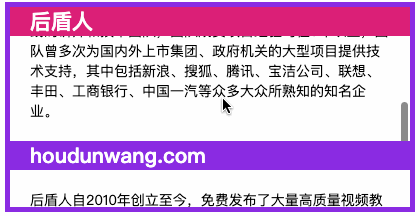
厚道人隶属于北京后盾计算机技术培训有限责任公司,是专注于培养中国互联网精英PHP程序语言专业人才的专业型培训机构,拥有七年培训行业经验。厚道人拥有国内一线的讲师和技术团队,团队成员项目经验均在8年以上,团队曾多次为国内外上市集团、政府机关的大型项目提供技术支持,其中包括新浪、搜狐、腾讯、宝洁公司、联想、丰田、工商银行、中国一汽等众多大众所熟知的知名企业。
</p>
</section>
<section>
<h2>houdunwang.com</h2>
<p>
厚道人自2010年创立至今,免费发布了大量高质量视频教程,视频在优酷、土豆、酷六等视频网站均有收录,很多技术爱好者受益其中。除了免费视频外,厚道人还为大家提供了面授班、远程班、公益公开课、VIP系列课程等众多形式的学习途径。厚道人有一群认真执着的老师,他们一心为同学着想,将真正的知识传授给大家是厚道人永远不变的追求。
</p>
</section>
</article>
</main>
了解弹性
Flex 是 Flexible Box 的缩写,意为"弹性布局",可以轻松的控制元素排列、对齐和顺序的控制。
现在的终端类型非常多,使用弹性盒模型可以让元素在不同尺寸终端控制尺寸。
#兼容性
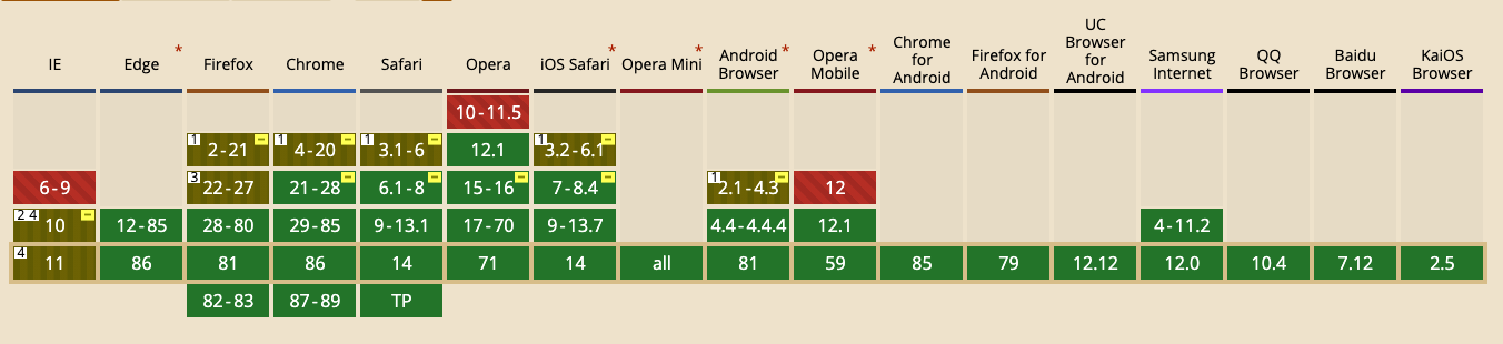
下面是 FLEX 系统兼容性数据,你也可以在 https://caniuse.com/ (opens new window)网站查看,绝大多数设备尤其是移动端都很好的支持 FLEX,所以可以放心使用。
#响应体验
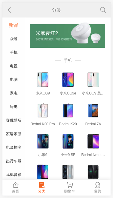
通过下面小米移动端中间区域水平排列元素,来体验一下响应布局带来的便利性。

<style>
  * {
    padding: 0;
    margin: 0;
  }
  div.container {
    display: flex;
    height: 100vh;
    justify-content: space-evenly;
  }
  div.container div {
    border: solid 1px #ddd;
  }
  div.container div:nth-of-type(1) {
    min-width: 80px;
    background: #4E9166;
  }
  div.container div:nth-of-type(2) {
    flex: 1;
    background: #ddd;
  }
</style>
...

<div class="container">
    <div></div>
    <div></div>
</div>
#布局对比
下面通过微信界面的例子来对比传统布局与弹性布局的不同。
#传统布局
<style>
    * {
    padding: 0;
    margin: 0;
  }
  main,
  footer {
    border: solid 1px #ddd;
    box-sizing: border-box;
  }
  main {
    background: #ddd;
    height: 100vh;
    padding-bottom: 55px;
    background-clip: content-box;
  }
  footer {
    position: fixed;
    bottom: 0;
    left: 0;
    right: 0;
    height: 50px;
  }
  footer div {
    width: 33%;
    float: left;
    text-align: center;
    line-height: 3em;
    height: 100%;
    background: linear-gradient(to bottom, #f3f3f3, #eee, #f3f3f3);
    cursor: pointer;
  }
  footer div:nth-child(n+2) {
    border-left: solid 1px #ddd;
  }
</style>
...

<body>
    <main></main>
    <footer>
        <div>1</div>
        <div>2</div>
        <div>3</div>
    </footer>
</body>
#弹性布局
<style>
    * {
    padding: 0;
    margin: 0;
  }
  body {
    display: flex;
    flex-direction: column;
    height: 100vh;
  }
  main {
    border: solid 1px #ddd;
    background: #ddd;
    background-clip: content-box;
    margin-bottom: 5px;
    flex: 1;
  }
  footer {
    flex: 0;
    display: flex;
    justify-content: space-evenly;
    border-top: solid 1px #ddd;
    min-height: 50px;
  }
  footer div {
    flex: 1;
    text-align: center;
    line-height: 3em;
    background: linear-gradient(to bottom, #f3f3f3, #eee, #f3f3f3);
    cursor: pointer;
  }
  footer div:nth-child(n+2) {
    border-left: solid 1px #ddd;
  }
</style>
...
<body>
    <main></main>
    <footer>
        <div>1</div>
        <div>2</div>
        <div>3</div>
    </footer>
</body>
#弹性盒子
#声明定义
容器盒子里面包含着容器元素,使用 display:flex 或 display:inline-flex 声明为弹性盒子。
声明块级弹性盒子

<style>
  * {
    padding: 0;
    margin: 0;
  }
  article {
    height: 150px;
    margin-left: 100px;
    margin-top: 100px;
    outline: solid 5px silver;
    display: flex;
    padding: 20px;
  }
  article div {
    outline: solid 5px blueviolet;
    text-align: center;
    font-size: 28px;
    line-height: 5em;
    width: 300px;
  }
</style>
...

<article>
  <div>1</div>
    <div>2</div>
    <div>3</div>
</article>
声明内联级弹性盒子

<style>
  ...
  article {
       ...
    display: inline-flex;
    ...
  }
  ...
</style>
#flex-direction
用于控制盒子元素排列的方向。
| 值 | 描述 |
|---|---|
| row | 从左到右水平排列元素(默认值) |
| row-reverse | 从右向左排列元素 |
| column | 从上到下垂直排列元素 |
| column-reverse | 从下到上垂直排列元素 |
row-reverse

<style>
  * {
    padding: 0;
    margin: 0;
  }
  body {
    margin: 100px;
    font-size: 14px;
    color: #555;
  }
  article {
    width: 500px;
    border: solid 5px silver;
    display: flex;
    box-sizing: border-box;
    padding: 10px;
    flex-direction: row-reverse;
  }
  article * {
    border: solid 5px blueviolet;
    padding: 10px;
    margin: 10px;
  }
</style>
...

<article>
    <h4>厚道人</h4>
    <span>hdcms.com</span>
    <p>houdunren.com</p>
</article>
column-reverse

article {
    ...
    flex-direction: column-reverse;
    ...
}
#flex-wrap
flex-wrap 属性规定 flex 容器是单行或者多行,同时横轴的方向决定了新行堆叠的方向。
| 选项 | 说明 |
|---|---|
| nowrap | 元素不拆行或不拆列(默认值) |
| wrap | 容器元素在必要的时候拆行或拆列。 |
| wrap-reverse | 容器元素在必要的时候拆行或拆列,但是以相反的顺序 |
行元素换行

<style>
    * {
    padding: 0;
    margin: 0;
    outline: solid 1px silver;
    padding: 10px;
    margin: 10px;
  }
  head {
    display: block;
  }
  body {
    font-size: 14px;
    color: #555;
  }
  article {
    width: 500px;
    border: solid 5px silver;
    box-sizing: border-box;
    padding: 10px;
    display: flex;
    flex-direction: row;
    flex-wrap: wrap;
  }
  article div {
    border: solid 5px blueviolet;
    padding: 30px 80px;
    margin: 10px;
    text-align: center;
    font-size: 28px;
  }
</style>
...

<article>
    <div>1</div>
    <div>2</div>
    <div>3</div>
</article>
水平排列反向换行

...
flex-direction: row;
flex-wrap: wrap-reverse;
...
垂直元素换行

...
flex-direction: column;
flex-wrap: wrap;
...
垂直元素反向换行

flex-direction: column;
flex-wrap: wrap-reverse;
#flex-flow
flex-flow 是 flex-direction 与 flex-wrap 的组合简写模式。
下面是从右向左排列,换行向上拆分行。

flex-flow: row-reverse wrap-reverse;
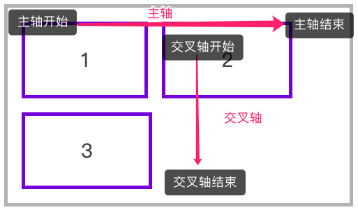
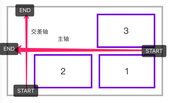
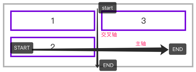
#轴说明
水平排列
下面是使用 flex-flow: row wrap 的主轴与交叉轴说明。
下面是使用 flex-flow: row-reverse wrap-reverse 的主轴与交叉轴说明。
垂直排列
下面是使用 flex-flow: column wrap 的主轴与交叉轴说明。
#justify-content
用于控制元素在主轴上的排列方式,再次强调是主轴的排列方式。
| 选项 | 说明 |
|---|---|
| flex-start | 元素紧靠主轴起点 |
| flex-end | 元素紧靠主轴终点 |
| center | 元素从弹性容器中心开始 |
| space-between | 第一个元素靠起点,最后一个元素靠终点,余下元素平均分配空间 |
| space-around | 每个元素两侧的间隔相等。所以,元素之间的间隔比元素与容器的边距的间隔大一倍 |
| space-evenly | 元素间距离平均分配 |
水平排列元素,并使用 justify-content: flex-end 对齐到主轴终点

<style>
  * {
    padding: 0;
    margin: 0;
    padding: 10px;
    margin: 10px;
  }
  body {
    font-size: 14px;
    color: #555;
  }
  article {
    border: solid 5px silver;
    box-sizing: border-box;
    display: flex;
    flex-flow: row wrap;
    justify-content: flex-end;
  }
  article div {
    width: 80px;
    border: solid 5px blueviolet;
    text-align: center;
    font-size: 28px;
  }
</style>
...

<article>
    <div>1</div>
    <div>2</div>
    <div>3</div>
</article>
使用 space-evenly 平均分配容器元素

... article {
  border: solid 5px silver;
  box-sizing: border-box;
  display: flex;
  flex-flow: row wrap;
  justify-content: space-evenly;
}
...;
垂直排列时对齐到主轴终点

... article {
  height: 400px;
  border: solid 5px silver;
  box-sizing: border-box;
  display: flex;
  flex-flow: column wrap;
  justify-content: flex-end;
}
...;
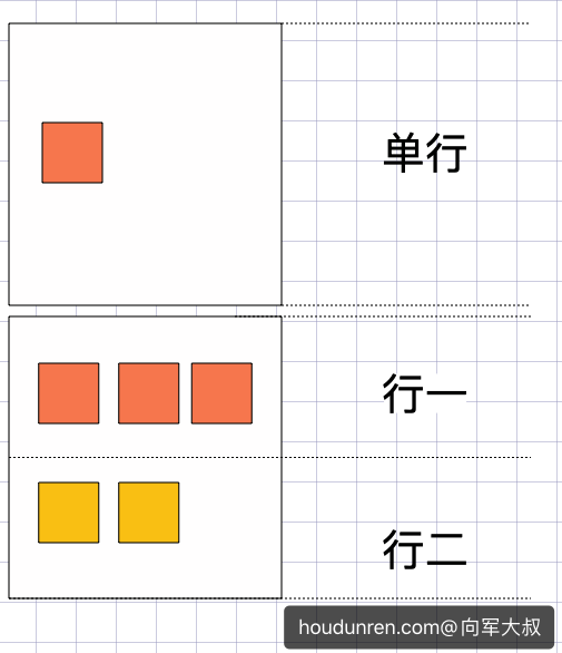
#交叉轴行
元素在交叉轴上有行的概念,理解这个概念会对理解 align-items 与 align-content 有更好的帮助。
- align-item 是控制元素在行上的排列
- align-content 是控制行在交差轴上的排列
#align-items
用于控制容器元素在交叉轴上的排列方式。
| 选项 | 说明 |
|---|---|
| stretch | 元素被拉伸以适应容器(默认值) |
| center | 元素位于容器的中心 |
| flex-start | 元素位于容器的交叉轴开头 |
| flex-end | 元素位于容器的交叉轴结尾 |
拉伸适应交叉轴
如果设置了 width | height | min-height | min-width | max-width | max-height ,将影响stretch 的结果,因为 stretch 优先级你于宽高设置。

<style>
  * {
    padding: 0;
    margin: 0;
    padding: 10px;
    margin: 5px;
  }
  head {
    display: block;
  }
  body {
    font-size: 14px;
    color: #555;
  }
  article {
    height: 200px;
    border: solid 5px silver;
    box-sizing: border-box;
    display: flex;
    flex-direction: row;
    align-items: stretch;
  }
  article div {
    width: 80px;
    border: solid 5px blueviolet;
    text-align: center;
    font-size: 28px;
  }
</style>
...

<article>
    <div>1</div>
    <div>2</div>
    <div>3</div>
</article>
对齐到交叉轴的顶部

...
flex-direction: row;
align-items: flex-start;
...
对齐到交叉轴底部

flex-direction: row;
align-items: flex-end;
对齐到交叉轴中心

flex-direction: row;
align-items: center;
纵向排列时交叉轴排列

<style>
  * {
    padding: 0;
    margin: 0;
    padding: 10px;
    margin: 5px;
  }

  article {
    height: 400px;
    border: solid 5px silver;
    box-sizing: border-box;
    display: flex;
    flex-direction: column;
    align-items: center;
  }

  article div {
    height: 50px;
    min-width: 100px;
    border: solid 5px blueviolet;
    text-align: center;
    font-size: 28px;
  }
</style>
...

<article>
  <div>1</div>
  <div>2</div>
  <div>3</div>
</article>
#align-content
只适用于多行显示的弹性容器,用于控制行(而不是元素)在交叉轴上的排列方式。
| 选项 | 说明 |
|---|---|
| stretch | 将空间平均分配给元素 |
| flex-start | 元素紧靠主轴起点 |
| flex-end | 元素紧靠主轴终点 |
| center | 元素从弹性容器中心开始 |
| space-between | 第一个元素靠起点,最后一个元素靠终点,余下元素平均分配空间 |
| space-around | 每个元素两侧的间隔相等。所以,项目之间的间隔比项目与边框的间隔大一倍 |
| space-evenly | 元素间距离平均分配 |
水平排列在交叉轴中居中排列

<style>
  * {
    padding: 0;
    margin: 0;
    padding: 10px;
    margin: 5px;
  }
  article {
    height: 500px;
    border: solid 5px silver;
    box-sizing: border-box;
    display: flex;
    flex-direction: row;
    flex-wrap: wrap;
    align-items: flex-start;
    align-content: center;
  }
  article div {
    width: 90px;
    border: solid 5px blueviolet;
    text-align: center;
    font-size: 28px;
  }
</style>
...

<article>
  <div>1</div>
  <div>2</div>
  <div>3</div>
</article>
垂直排列时交叉轴的排列

<style>
  * {
    padding: 0;
    margin: 0;
    padding: 10px;
    margin: 5px;
  }
  article {
    height: 300px;
    border: solid 5px silver;
    box-sizing: border-box;
    display: flex;
    flex-direction: column;
    flex-wrap: wrap;
    align-items: flex-start;
    align-content: center;
  }
  article div {
    min-width: 50px;
    min-height: 80px;
    border: solid 5px blueviolet;
    text-align: center;
    font-size: 28px;
  }
</style>
...

<article>
    <div>1</div>
    <div>2</div>
    <div>3</div>
</article>
#弹性元素
放在容器盒子中的元素即为容器元素。
- 不能使用 float 与 clear 规则
- 弹性元素均为块元素
- 绝对定位的弹性元素不参与弹性布局
#align-self
用于控制单个元素在交叉轴上的排列方式,align-items 用于控制容器中所有元素的排列,而 align-self 用于控制一个弹性元素的交叉轴排列。
| 选项 | 说明 |
|---|---|
| stretch | 将空间平均分配给元素 |
| flex-start | 元素紧靠主轴起点 |
| flex-end | 元素紧靠主轴终点 |
| center | 元素从弹性容器中心开始 |
<style>
  * {
    padding: 0;
    margin: 0;
    padding: 10px;
    margin: 5px;
  }
  article {
    height: 400px;
    border: solid 5px silver;
    box-sizing: border-box;
    display: flex;
    flex-direction: row;
    align-items: center;
  }
  article div {
    height: 50px;
    min-width: 50px;
    border: solid 5px blueviolet;
    text-align: center;
    font-size: 28px;
  }
  article div:nth-of-type(1) {
    align-self: flex-start;
  }
  article div:nth-of-type(3) {
    align-self: flex-end;
  }
</style>
...

<article>
    <div>1</div>
    <div>2</div>
    <div>3</div>
</article>
#flex-grow
用于将弹性盒子的可用空间,分配给弹性元素。可以使用整数或小数声明。
下例中为三个 DIV 弹性元素设置了 1、3、6 ,即宽度分成 10 等份,第三个元素所占宽度为(宽度/(1+3+6)) X 6。

<style>
    * {
        padding: 0;
        margin: 0;
    }

    body {
        padding-left: 50px;
        padding-top: 15px;
    }

    article {
        border: solid 5px silver;
        width: 550px;
        height: 100px;
        display: flex;
        flex-direction: row;
    }

    article * {
        flex-grow: 1;
        width: 100px;
        height: 100px;
        background: blueviolet;
        background-clip: content-box;
        padding: 10px;
        box-sizing: border-box;
        font-size: 35px;
        color: white;
    }
</style>
...

<article>
    <div>1</div>
    <div>2</div>
    <div>3</div>
</article>
如果弹性元素设置了宽度,将把(弹性盒子-弹性元素宽度和)后按照 flex-grow 进行分配 。

<style>
  * {
    padding: 0;
    margin: 0;
    padding: 10px;
    margin: 5px;
  }
  article {
    width: 600px;
    position: relative;
    height: 200px;
    border: solid 5px silver;
    display: flex;
  }
  article div {
    min-height: 80px;
    border: solid 5px blueviolet;
    text-align: center;
    font-size: 28px;
  }
  article div:nth-of-type(1) {
    width: 100px;
    flex-grow: 1;
  }
  article div:nth-of-type(2) {
    width: 100px;
    flex-grow: 3;
  }
  article div:nth-of-type(3) {
    width: 300px;
    flex-grow: 6;
  }
</style>
...
#flex-shrink
与 flex-grow 相反 flex-shrink 是在弹性盒子装不下元素时定义的缩小值。
下例在 600 宽的弹性盒子中放了 1000 宽的弹性元素。并为最后两个元素设置了缩放,最后一个元素的缩放比例为 500 -( ( (1000-600) / (100X1+400x3+500X6) ) x 3 ) X 500 = 220.9,计算公式说明如下:
缩小比例 = 不足的空间 / (元素 1 宽度 x 缩小比例) + (元素 2 宽度 x 缩小比例) ...
最终尺寸 = 元素三宽度 - (缩小比例 x  元素 3 的宽度) X 元素宽度

<style>
    * {
        padding: 0;
        margin: 0;
    }
    body {
        padding-left: 50px;
        padding-top: 15px;
    }
    article {
        border: solid 5px silver;
        width: 400px;
        height: 120px;
        display: flex;
        padding: 10px;
        box-sizing: content-box;
    }
    article div:nth-child(1) {
        flex-shrink: 0;
    }
    article div:nth-child(2) {
        flex-shrink: 1;
    }
    article div:nth-child(3) {
        flex-shrink: 3;
    }
    article * {
        width: 200px;
        height: 100px;
        overflow: hidden;
        background: blueviolet;
        background-clip: content-box;
        padding: 10px;
        border: solid 1px blueviolet;
        box-sizing: border-box;
        font-size: 30px;
        color: white;
    }
</style>

<article>
    <div>1</div>
    <div>2</div>
    <div>3</div>
</article>
#flex-basis
flex-basis 属性定义了在分配多余空间之前,项目占据的主轴空间(main size)。浏览器根据这个属性,计算主轴是否有多余空间。
可以是长度单位,也可以是百分比。flex-basis的优先级高于width、height属性。
优先级
flex-basis 优先级大于 width、height。

<style>
  * {
    padding: 0;
    margin: 0;
  }
  article {
    width: 600px;
    position: relative;
    height: 150px;
    margin-left: 100px;
    margin-top: 100px;
    outline: solid 5px silver;
    display: flex;
    padding: 20px;
  }
  article div {
    outline: solid 5px blueviolet;
    text-align: center;
    font-size: 28px;
    line-height: 5em;
  }
  article div:nth-of-type(1) {
    flex-basis: 100px;
    width: 200px;
  }
  article div:nth-of-type(2) {
    flex-basis: 200px;
  }
  article div:nth-of-type(3) {
    flex-basis: 200px;
  }
</style>
...

<article>
  <div>1</div>
  <div>2</div>
  <div>3</div>
</article>
#flex
flex 是 flex-grow、flex-shrink 、flex-basis 缩写组合。
建议使用 flex 面不要单独使用 flex-grow / flew-shrink / flex-basis 。
下例定义平均分配剩余空间,并不进行尺寸缩小,基础尺寸为 200px。

* {
  padding: 0;
  margin: 0;
}
article {
  width: 600px;
  position: relative;
  height: 150px;
  margin-left: 100px;
  margin-top: 100px;
  outline: solid 5px silver;
  display: flex;
  padding: 20px;
}
article div {
  outline: solid 5px blueviolet;
  text-align: center;
  font-size: 28px;
  line-height: 5em;
  flex: 1 0 100px;
}
#order
用于控制弹性元素的位置,默认为 order:0 数值越小越在前面,可以负数或整数。
下面是通过 J 动态改变 order 属性产生移动效果,因为本章节是讲 CSS 所以 JS 功能没有完善,只是体验一下 order。
<style>
* {
padding: 0;
margin: 0;
}
body {
padding-left: 50px;
padding-top: 15px;
}
article {
border: solid 5px silver;
width: 400px;
height: 400px;
padding: 10px;
display: flex;
flex-direction: column;
}
article section {
order: 1;
flex: 1 0 100px;
padding: 10px;
background: blueviolet;
background-clip: content-box;
display: flex;
flex-direction: column;
text-align: center;
color: white;
}
article section div {
flex: 1;
}
article section div {
display: flex;
flex-direction: column;
justify-content: center;
}
article section span {
flex: 0;
background: #000;
padding: 20px;
cursor: pointer;
}
</style>
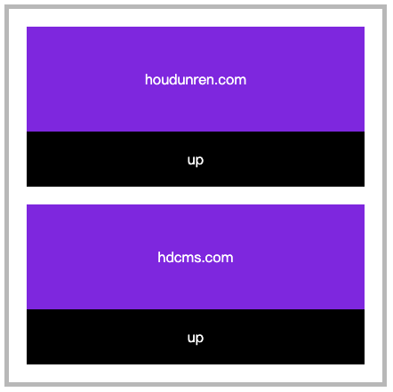
<article>
<section>
<div>houdunren.com</div>
<span onclick="up(this)">up</span>
</section>
<section>
<div>hdcms.com</div>
<span onclick="up(this)">up</span>
</section>
</article>
<script>
function up(el) {
el.parentElement.style.order = getOrder(el.parentElement) * 1 - 1;
console.log(getOrder(el.parentElement))
}
function getOrder(el) {
return getComputedStyle(el, null).order;
}
</script>
#弹性文本
文本节点也在弹性布局操作范围内。

<style>
    article {
        display: flex;
        flex-direction: row;
        justify-content: space-between;
        height: 100vh;
        align-items: center;
        font-size: 14px;
    }
</style>

<article>
    厚道人
    <span>houdunren</span>
    厚道人
</article>
#绝对定位
绝对定位的弹性元素不参与弹性布局

<style>
  * {
    padding: 0;
    margin: 0;
    padding: 10px;
    margin: 5px;
  }
  article {
    position: relative;
    height: 400px;
    border: solid 5px silver;
    box-sizing: border-box;
    display: flex;
    justify-content: space-evenly;
    align-items: flex-start;
  }
  article div {
    min-width: 50px;
    min-height: 80px;
    border: solid 5px blueviolet;
    text-align: center;
    font-size: 28px;
  }
  article div:nth-of-type(1) {
    position: absolute;
    top: 0;
  }
</style>
...

<article>
  <div>1</div>
  <div>2</div>
  <div>3</div>
</article>
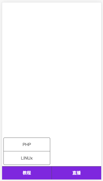
#微信公众号
下面来开发类似微信公众号布局,包括底部二级菜单的弹性布局。
<style>
    * {
        padding: 0;
        margin: 0;
    }

    body {
        display: flex;
        flex-direction: column;
        height: 100vh;
        color: #666;
    }

    main {
        flex: 1;
    }

    footer {
        height: 50px;
        background: blueviolet;
        display: flex;
        justify-content: space-evenly;
    }

    footer section {
        display: flex;
        flex: 1 0;
        flex-direction: column-reverse;
        border-right: solid 1px #555;
        border-top: solid 1px #555;
    }

    footer section:last-child {
        border-right: none;
    }

    footer section h4 {
        flex: 0 0 50px;
        display: flex;
        text-align: center;
        flex-direction: column;
        justify-content: center;
        cursor: pointer;
        color: white;
    }

    footer section ul {
        text-align: center;
        display: flex;
        flex-direction: column;
        border: solid 1px #555;
        margin-bottom: 5px;
        border-radius: 5px;
        margin: 5px;
    }

    footer section ul li {
        flex: 1 0 50px;
        border-bottom: solid 1px #555;
        display: flex;
        flex-direction: column;
        justify-content: center;
        cursor: pointer;
    }

    footer section ul li:last-child {
        border: none;
    }
</style>
...

<main></main>
<footer>
    <section>
        <h4>教程</h4>
        <ul>
            <li>PHP</li>
            <li>LINUx</li>
        </ul>
    </section>
    <section>
        <h4>直播</h4>
    </section>
</footer>
#自动空间
在弹性布局中对元素使用margin-right:auto 等形式可以自动撑满空间。下例为第一个 ul 设置 margin-right:auto 表示右侧空间自动撑满,第二个 ul 靠近父元素右边界。

<head>
    <meta charset="UTF-8">
    <meta name="viewport" content="width=device-width, initial-scale=1.0">
    <style>
        * {
            padding: 0;
            margin: 0;
        }

        .container {
            width: 1200px;
            margin: 0 auto;
        }

        nav {
            display: flex;
            border: solid 1px green;
            margin-top: 20px;
            align-items: center;
            height: 60px;
            box-shadow: 0 0 5px rgba(0, 0, 0, .2);
            background: #f3f3f3;
        }

        ul {
            list-style: none;
        }

        ul:nth-child(1) {
            display: flex;
            align-items: center;
            margin-right: auto;
        }

        ul:nth-child(1)>li {
            margin: 0 10px;
        }

        ul:nth-child(2)>li {
            width: 50px;
            height: 50px;
            border-radius: 50%;
            background: #9b59b6;
        }
    </style>
</head>

<body>
    <div class="container">
        <nav>
            <ul>
                <li>houdunren</li>
                <li>视频教程</li>
                <li>每晚直播</li>
                <li>在线文档</li>
            </ul>
            <ul>
                <li>
                </li>
            </ul>
        </nav>
    </div>
</body>