盒模型
. {
  /* ie6混杂模式盒模型 */
  box-sizing: border-box;
}
resize 改变元素大小,必须设置 overflow:scroll
. {
  resize: both;
  overflow: scroll;
}
common.css 一般写公共样式
* {
  margin: 0px;
  padding: 0px;
  list-style: none;
  box-sizing: border-box;
}
/* 因为上面的作用不到before和after */
*::before,
*::after {
  box-sizing: border-box;
}

a {
  /* 去掉a下划线 */
  text-decoration: none;
  /* 继承父元素的颜色 */
  color: inherit;
}
a:hover {
  color: #ff6700;
}
html {
  color: #333;
  min-width: 1226px;
  font-size: 14px;
  line-height: 1.5;
  /* font:14px/1.5 'Micro Hei'
  sans-serif
  */
}

.fl {
  float: left;
}
.fr {
  float: right;
}
.clearfix::after {
  content: "";
  display: block;
  clear: both;
}
/* 通用容器 */
.container {
  width: 1226px;
  margin-left: auto;
  margin-right: auto;
}
截图工具
- mac ishot
- win snipaste
z-index 规范
- 弹出菜单 2 位数
- 固定菜单 3 位数
回到顶部
<a href="javascript:scrollTo(0,0)"></a>
<!-- 或者 -->
<a href="#"></a>
变换
*::after {
  transform: rotate(45deg);
}
gpu
reflow:
改变窗口大小

改变文字大小
内容的改变 输入框输入文字
激活伪类 如:hover
操作class属性
脚本操作dom
计算offsetWidth和offsetheight
设置style属性 (尽量使用class一次将style属性改完)

repaint:
repaint:如果只是改变某一个元素的背景色
字颜色,边框颜色 ,不影响它走遍或内部布局的属性
repaint 熟读快于reflow

gpu层
哪些指令触发gpu层
如:opacity:   transform:translate3d() / translatez();都能触发
transform:translatez(0); hack 告诉浏览器起一个层
<!-- 标准的gpu加速方法 -->
高级属性will-change:tranform; 触发层


*{
  <!-- 会导致层太多更消耗性能 -->
  will-change:all;
}

优化按理:
例如:hover的时候先告诉浏览器起一个层,在执行转换
div:hover{
  will-change:transform;
}
div:active{
  transform:scale(2,3);
}
显示器的成像原理
空间混色法 rgb 光学三原色空间混合
每一个像素有三个色点
crt 显示屏(大头显示器)
- 点距 crt 显示屏求点距的方法的意义,是几乎所有屏幕都是通用的
lcd 显示屏
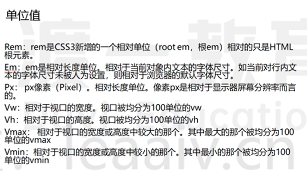
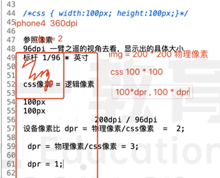
像素:相对单位
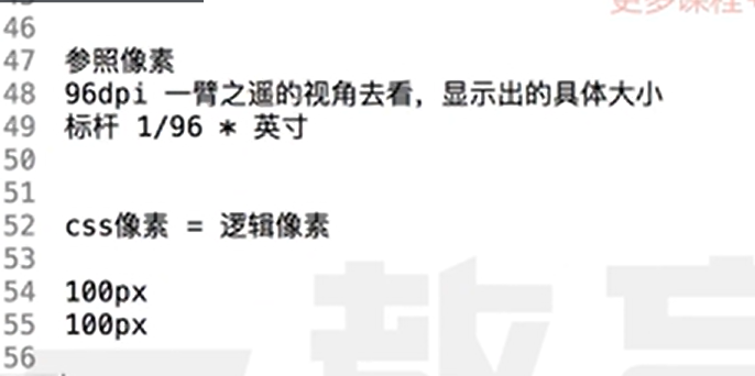
dpi 一英寸所能荣啦的像素点数 1 in=2.54cm 96dpi = 2.54 / 100 = 0.25mm 200dpi = 0.10mm / 0.15mm
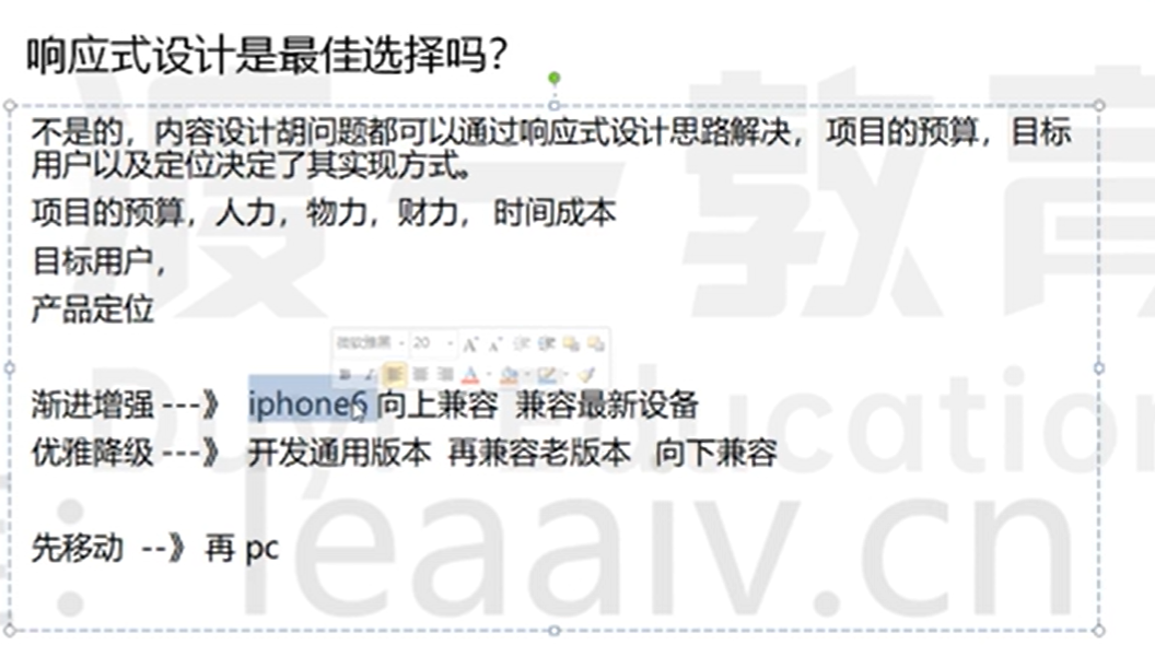
响应式
- 将页面大小更具分辨率不同进行响应式调价,以展示给用户的大小感觉差不多
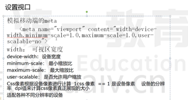
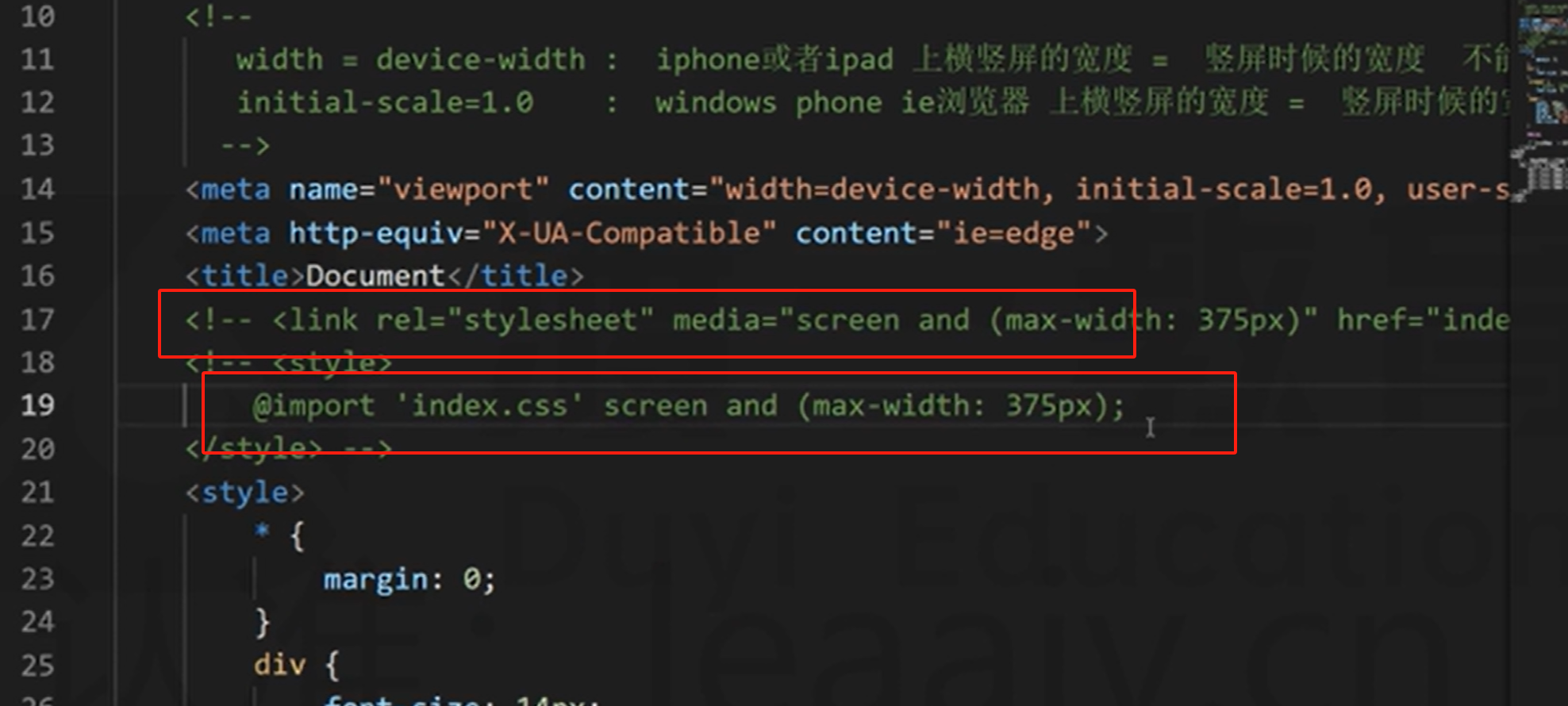
<!-- 默认视口980px -->
<!-- width=device-width 在iphone或者ipad上横竖屏的宽度=竖屏时候的宽度 不能自适应 -->
<!-- initial-scale=1.0  在window phone ie浏览器 横竖屏的宽度=竖屏时候的宽度 不能自适应-->
<meta name="viewport" content="width=device-width, initial-scale=1.0" />
<meta name="viewport" content="视口宽度=设备宽度,初始化的缩放比率=1.0" />
css 像素 !=设备像素(会更具屏幕分辨率调节) 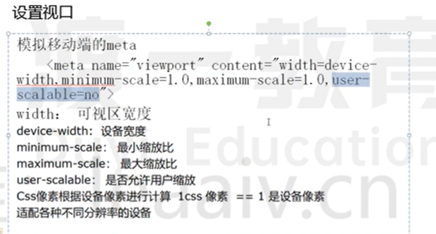
响应式网页开发方法
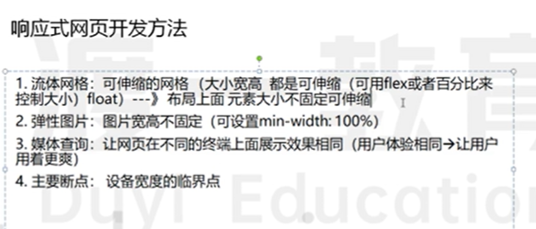
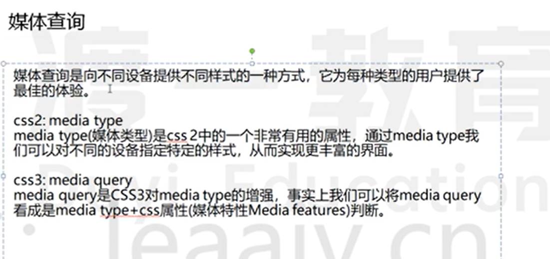
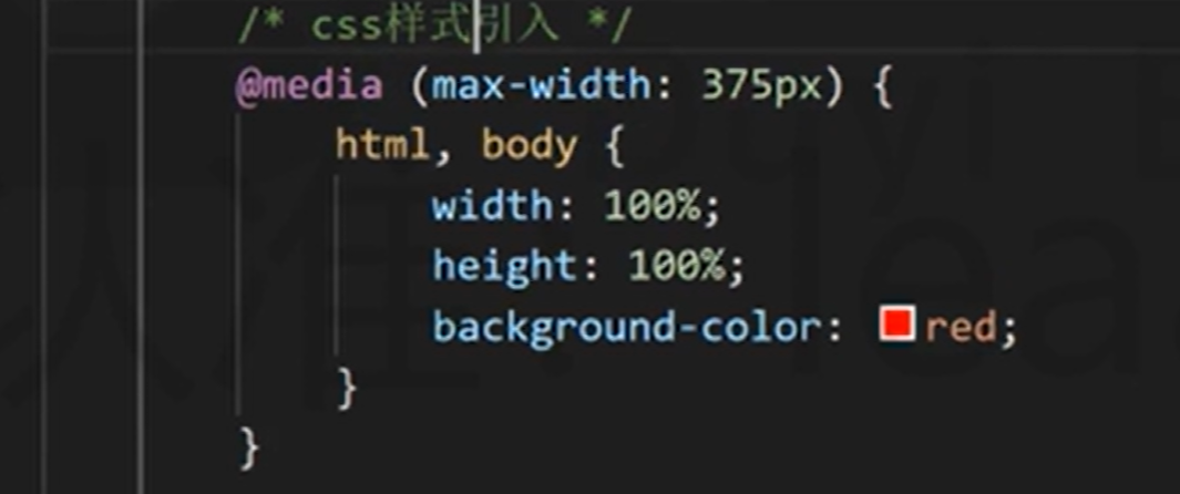
媒体查询不占用权重 一般媒体查询放 css 最后,防止作用无效 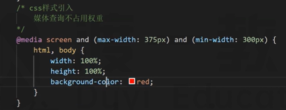 使用 and 是并且关系,使用逗号是或的关系