浮动布局
float 属性定义元素在哪个方向浮动。以往这个属性总应用于图像,使文本围绕在图像周围,不过在 CSS 中,任何元素都可以浮动。浮动元素会生成一个块级框,而不论它本身是何种元素。
在网站开发中需要一行排列多个元素,使用浮动可以方便实现。下面是使用浮动排列多个元素
FLOAT
使用浮动可以控制相邻元素间的排列关系。
| 选项 | 说明 |
|---|---|
| left | 向左浮动 |
| right | 向右浮动 |
| none | 不浮动 |
文档流
没有设置浮动的块元素是独占一行的。

浮动是对后面元素的影响,下图中第二个元素设置浮动对第一个元素没有影响
div:first-of-type {
    border: solid 2px red;
}

div:last-of-type {
         float: left;
    background: green;
}
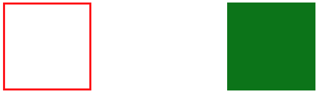
丢失空间
如果只给第一个元素设置浮动,第二个元素不设置,后面的元素会占用第一个元素空间。
div:first-of-type {
    float: left;
    border: solid 2px red;
}

div:last-of-type {
    background: green;
}
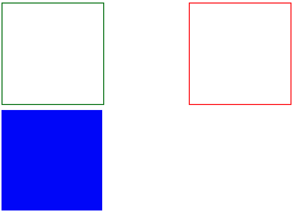
使用浮动
两个元素都设置浮动后,会并排显示
div:first-of-type {
    float: left;
    border: solid 2px red;
}

div:last-of-type {
    float: left;
    background: green;
}

为第二个元素设置右浮动时将移动到右边
div:first-of-type {
    float: left;
    border: solid 2px red;
}

div:last-of-type {
    float: right;
    background: green;
}
浮动边界
浮动元素边界不能超过父元素的padding
main {
    width: 400px;
    border: solid 2px black;
    overflow: auto;
    padding: 50px;
    background-color: antiquewhite;
    background-clip: content-box;
}

div {
    width: 100px;
    height: 100px;
    box-sizing: border-box;
}

div:first-of-type {
    float: left;
    border: solid 2px red;
}

div:last-of-type {
    float: right;
    background: green;
}

浮动转块
元素浮动后会变为块元素包括行元素如 span,所以浮动后的元素可以设置宽高
a {
    float: left;
    width: 300px;
}
清除浮动
CSS提供了 clear 规则用于清除元素浮动影响。
| 选项 | 说明 |
|---|---|
| left | 左边远离浮动元素 |
| right | 右连远离浮动元素 |
| both | 左右都远离浮动元素 |
使用清除浮动
<style>
    div {
    width: 200px;
    height: 200px;
    margin-bottom: 10px;
  }

  div.green {
      border: solid 2px green;
      float: left;
  }

  div.red {
      border: solid 2px red;
      float: right;
  }

  div.blue {
      background: blue;
      clear: both;
  }
</style>
...

<div class="green"></div>
<div class="red"></div>
<div class="blue"></div>
在父元素内部最后面添加一个没有高度的了元素,并使用clear:both 。
<style>
    .clearfix {
      clear: both;
      height: 0;
  }

  div {
      width: 200px;
      height: 200px;
      margin-bottom: 10px;
  }


  div.green {
      border: solid 2px green;
      float: left;
  }

  div.red {
      border: solid 2px red;
      height: 200px;
      float: left;
  }

  div.blue {
      background: blue;
  }
</style>

<article>
        <div class="green"></div>
        <div class="red"></div>
        <div class="clear"></div>
    </article>
    <div class="blue"></div>
AFTER
使用 ::after 伪类为父元素添加后标签,实现清除浮动影响。
伪类清楚浮动
.clearfix::after {
    content: "";
    display: block;
    clear: both;
}
OVERFLOW
子元素使用浮动后将不占用空间,这时父元素高度为将为零。通过添加父元素并设置 overflow 属性可以清除浮动。
将会使用父元素产生 BFC 机制,即父元素的高度计算会包括浮动元素的高度。
<style>
  article {
      overflow: hidden;
  }
...
页面布局
<style>
    article {
      background: #f3f3f3;
      width: 1020px;
      height: auto;
      overflow: auto;
      padding: 20px;
  }

  article.hot section {
      background: #fff;
      box-shadow: 0 0 5px #777;
      height: 300px;
      width: 500px;
  }

  article.hot section:first-of-type {
      float: left;
  }

  article.hot section:last-of-type {
      float: right;
  }

  article.swiper section {
      height: 200px;
      background: #fff;
      box-shadow: 0 0 5px #777;
  }

  article.swiper section:first-of-type {
      width: 200px;
      float: left;
  }

  article.swiper section:last-of-type {
      width: 820px;
      float: left;
  }
</style>
...

 <article class="hot">
        <section></section>
        <section></section>
</article>
<article class="swiper">
        <section></section>
        <section></section>
</article>
形状浮动
通过形状浮动可以让内容围绕图片,类似于我们在word 中的环绕排版。要求图片是有透明度的PNG格式。
距离控制
| 选项 | 说明 |
|---|---|
| margin-box | 外边距环绕 |
| padding-box | 内边距环绕 |
| border-box | 边线环绕 |
| content-box | 内容环绕 |
<style>
span.shape {
float: left;
width: 100px;
height: 100px;
padding: 30px;
margin: 30px;
border: solid 30px green;
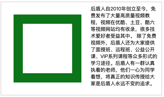
shape-outside: margin-box;
}
</style>
...
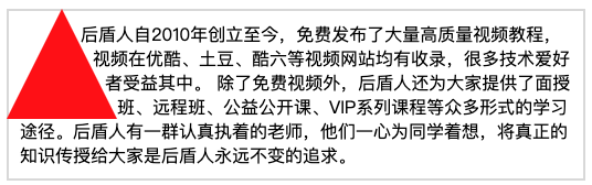
<p>
<span class="shape"></span>
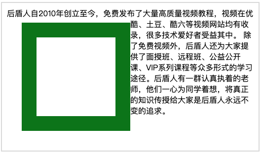
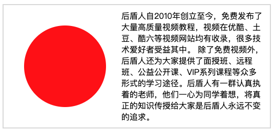
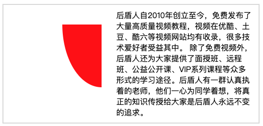
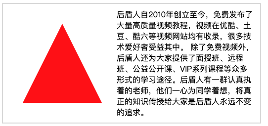
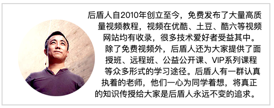
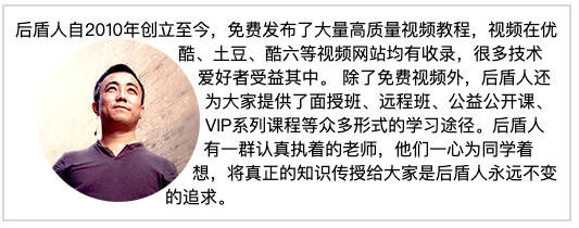
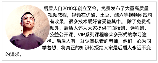
后盾人自2010年创立至今,免费发布了大量高质量视频教程,视频在优酷、土豆、酷六等视频网站均有收录,很多技术爱好者受益其中。
除了免费视频外,后盾人还为大家提供了面授班、远程班、公益公开课、VIP系列课程等众多形式的学习途径。后盾人有一群认真执着的老师,他们一心为同学着想,将真正的知识传授给大家是后盾人永远不变的追求。
</p>
边框环绕
span.shape {
    float: left;
    width: 100px;
    height: 100px;
    padding: 30px;
    margin: 30px;
    border: solid 30px green;
    shape-outside: border-box;
}
显示区域
| 选项 | 说明 |
|---|---|
| circle | 圆形 |
| ellipse | 椭圆 |
| polygon | 多边形 |
圆形
span.shape {
    float: left;
    width: 100px;
    height: 100px;
    padding: 30px;
    margin: 30px;
    background: red;
    clip-path: circle(50% at center);
}
椭圆
span.shape {
    float: left;
    width: 100px;
    height: 100px;
    padding: 30px;
    margin: 30px;
    background: red;
    clip-path: ellipse(50% 80% at 100% 0);
}
多边形
span.shape {
    float: left;
    width: 100px;
    height: 100px;
    padding: 30px;
    margin: 30px;
    background: red;
    clip-path: polygon(50% 0, 100% 100%, 0 100%)
}
内移距离
使用 inset 属性控制环绕向内移动的距离。
span.shape {
    float: left;
    width: 100px;
    height: 100px;
    padding: 30px;
    margin: 30px;
    background: red;
    shape-outside: inset(50px 30px 80px 50px) padding-box;
}
环绕模式
| 选项 | 说明 |
|---|---|
| circle | 圆形环绕 |
| ellipse | 椭圆环绕 |
| url | 图片环绕 |
| polygan | 多边环绕 |
圆形环绕
img {
    padding: 20px;
    float: left;
    shape-outside: circle(50%) padding-box;
}
椭圆环绕
img {
    padding: 20px;
    float: left;
    shape-outside: ellipse(80px 70px) padding-box;
}
图片环绕
img {
    float: left;
    shape-outside: url(xj.png);
}
多边环绕
span.shape {
    float: left;
    width: 100px;
    height: 100px;
    background: red;
    clip-path: polygon(50px 0px, 0 100px, 100px 100px);
    shape-outside: polygon(50px 0px, 0 100px, 100px 100px);
}